Datalift
Brand identity, design system and product UX redesign for Datalift,
an enterprise data-transfer platform
Datalift is a high-velocity data transportation and governance engine built by iDBi Solutions — a single, governed platform that lets enterprise teams move data in and out of complex systems without bespoke pipelines or engineering bottlenecks. It is currently in private beta.
Industry
Data Infrastructure
Location
UK
Deliverables
Brand Identity
Design System
UX Audit
Product UX/UI
Website Design
Highlights
iDBi engaged me as a freelance lead designer to take Datalift from a working product without a brand into a coherent, market-ready offering. Across a five-stage engagement, I built the brand identity from scratch, ran a Nielsen 10-heuristic evaluation of the existing product, redesigned the core flows and design system, and delivered the live marketing website and a new onboarding experience.
Freelance lead designer — brand identity, design system, heuristic UX audit, product redesign, marketing website, onboarding/login redesign
Engagement: Five-stage scope of work from brief through brand, audit, product UX, website and dev handoff
The Challenge
iDBi had built something real — a working data-transfer engine solving an expensive enterprise problem — but no design layer to carry it to market. The brief sat across three connected problems.
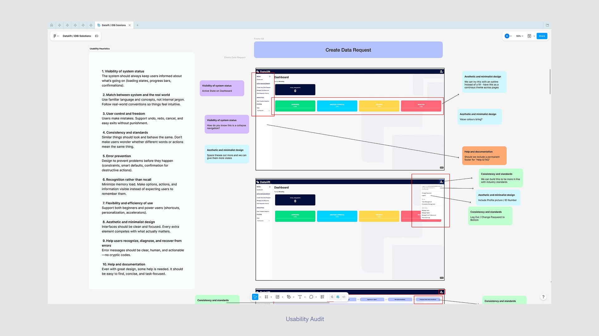
A product designed by engineers, for engineers. Datalift’s stated audience is non-technical users — business teams who currently wait days for IT to load data on their behalf. But the existing UI was built without a UX practice behind it: useable by experts, opaque to the people it’s meant to serve. The interface needed to be audited and rebuilt around the user it actually targets.
My Role
As the sole designer on the engagement, I owned:
Brand identity — from competitive research through to delivered visual system
Brand values — proposing five values that became the brand’s foundation
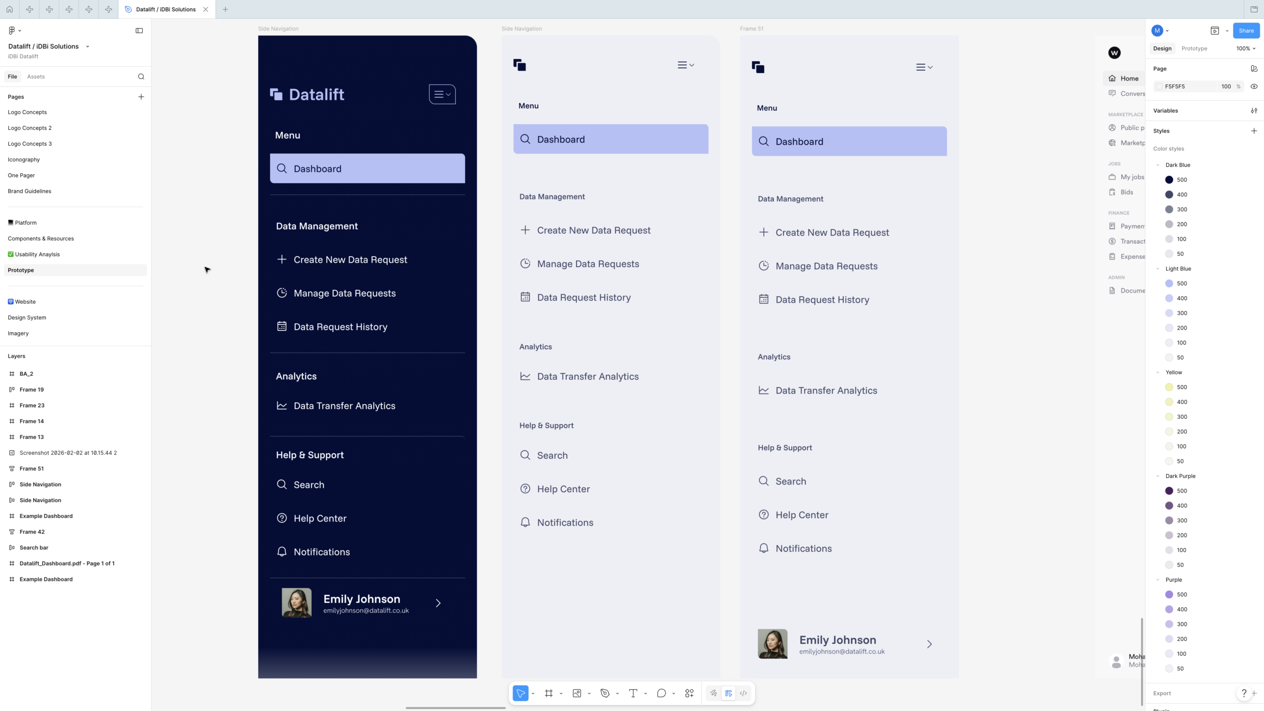
Design system — colour, typography, hierarchy, iconography and a reusable component set in Figma
UX audit — running a heuristic evaluation of the existing product against Nielsen’s 10 usability heuristics
Product redesign — wireframes, components and screen designs for the dashboard, side navigation, and Create Data Request flow
Marketing website — full design of the four-page site, handed off to a developer for WordPress build
Onboarding & login — designing and prototyping a new sign-in experience, iterated with client feedback
From iDBi to Datalift
The most consequential decision in the identity was that the Datalift mark shouldn’t be invented from nothing — it should be derived from the parent iDBi logo, signalling product-from-consultancy heritage without making Datalift feel like a sub-brand.
I documented the derivation as a visible step-by-step process: starting from the iDBi mark, isolating its core shape language, then evolving it through a sequence of staged transformations into Datalift’s two-overlapping-rounded-squares wordmark. The result is a logo that has visible lineage — a quiet design rationale a client can defend in a board meeting, and a piece of brand storytelling that demonstrates informed decision-making rather than arbitrary choice.
The system included horizontal and vertical lockups, dark- and light-tone variants, and a “+ Easy Data Movement” tagline lockup for marketing contexts — the full set a product brand needs to live across product UI, website and external touchpoints.
A complete brand system
The brand resolved into a system designed to do real work:
Colour. A primary palette anchored on a deep navy (the product’s authority and “compliant” register), paired with a soft lavender/periwinkle as the on-brand action colour, and a warm cream/yellow accent. A secondary palette of deep purples extended the system for marketing surfaces. Primary and secondary pairings were specified explicitly so non-designers across iDBi could apply the brand without misuse.
Typography. Funnel Sans as the primary display face, Hanken Grotesk as the body face — both Google Fonts, chosen deliberately for open licensing so the client could use them across product, web and documentation without commercial-font friction. Hierarchy rules were specified to a level developers could implement directly (e.g. subheadings at half the point size of large headings).
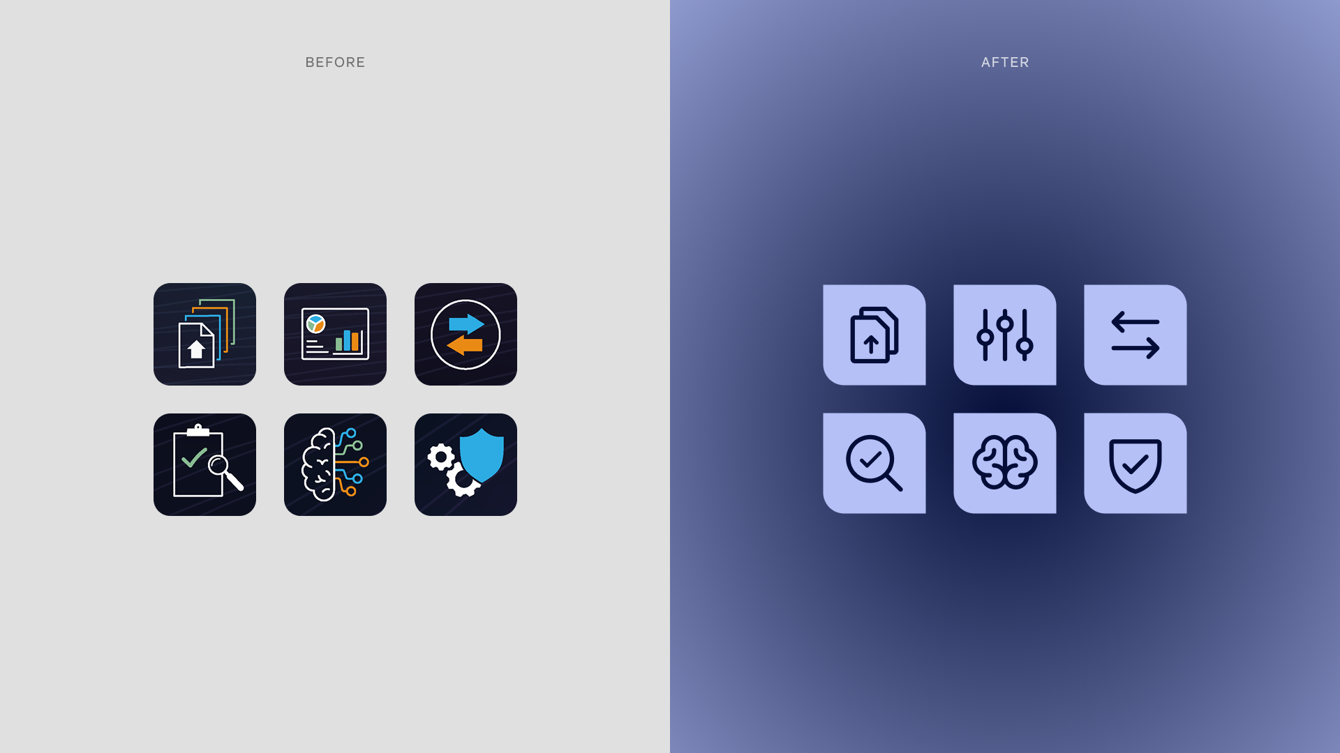
Iconography. A dedicated icon set, scoped to be used identically across the marketing site and the product interface — closing the visual gap that often opens between a SaaS brand and its app.
Components. A reusable component set in Figma — side navigation variants, search bar, tabs, status icons, dashboard cards — built so the engineering team had a single, consistent source of truth to work from.
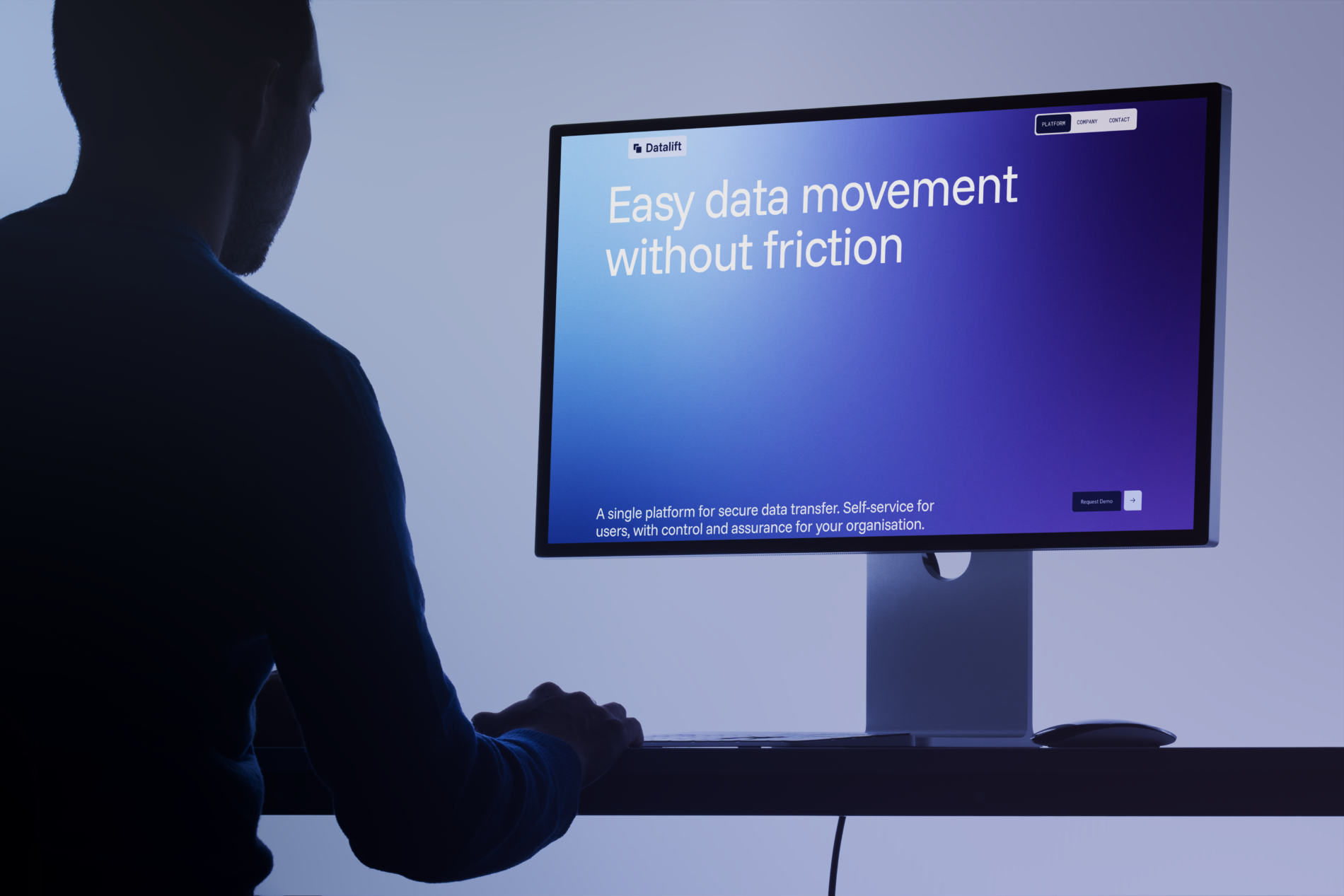
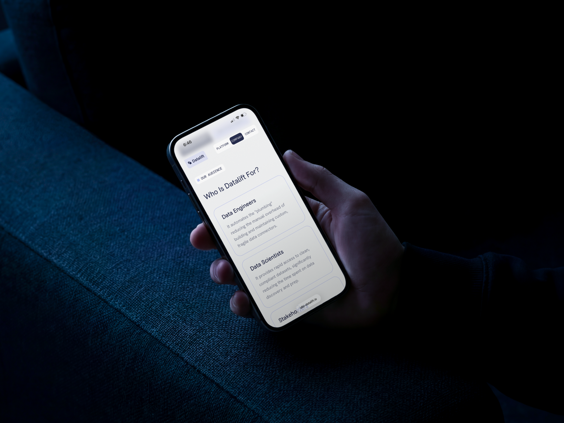
The marketing website
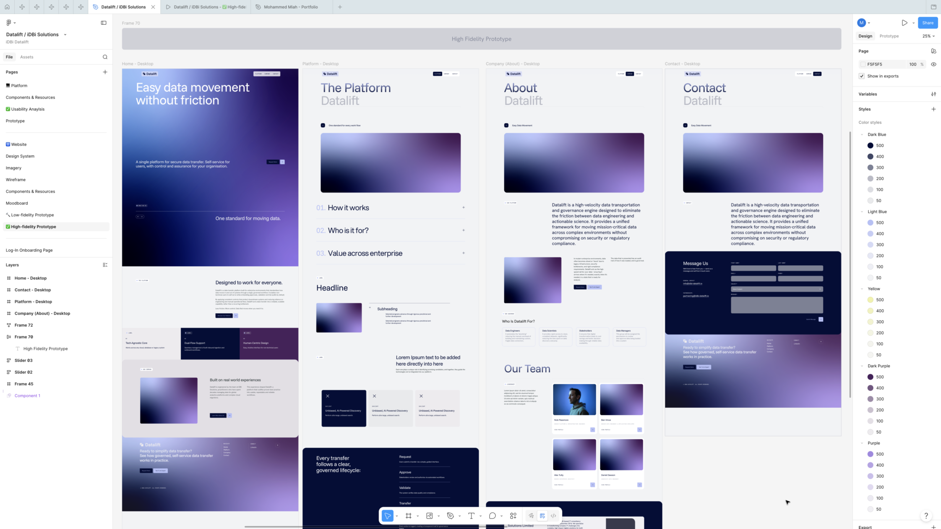
In parallel, I designed the four-page marketing site — Home, Platform, Company, Contact — designed in Figma at low- and high-fidelity, then handed off to a developer to build in WordPress.
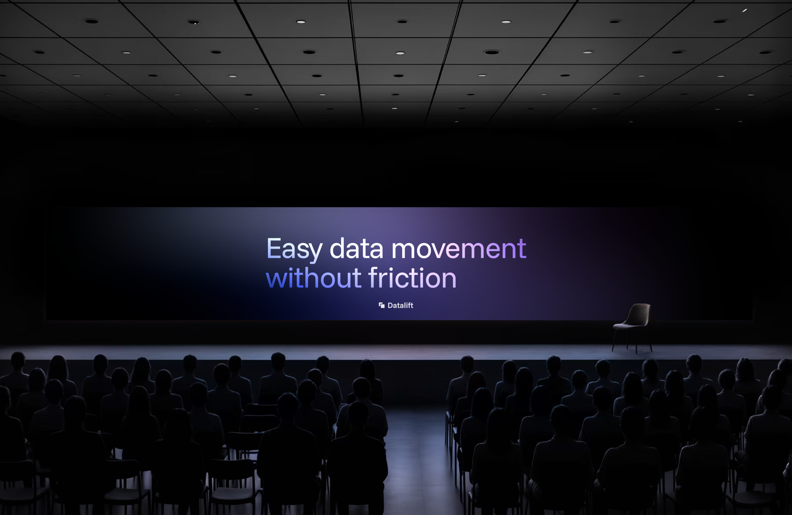
The site is structured around the value proposition itself — “Easy data movement without friction” — and walks the visitor through what the platform does, how it works (Request → Approve → Validate → Transfer → Audit), who it’s for (Data Engineers, Data Scientists, Stakeholders, Data Managers), and the iDBi story behind it. The same brand system runs from product into website without a seam — same typography, same components, same colour discipline.
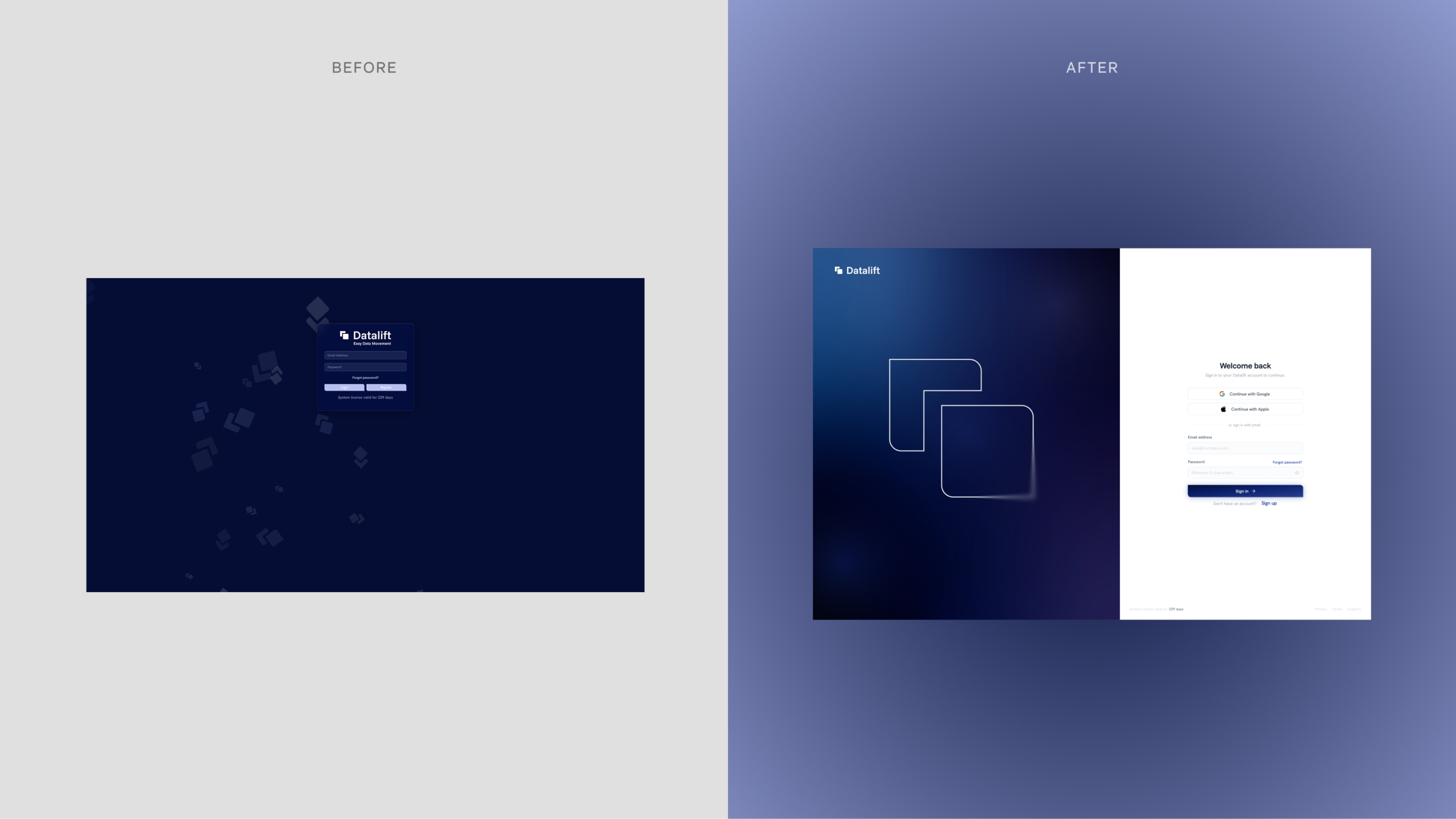
The onboarding redesign
The original sign-in screen wasn’t fit for an enterprise product. I designed a replacement built on industry-standard patterns: a split-screen layout with the brand expressed atmospherically on the left (a soft gradient with the Datalift mark rendered as a line illustration) and a clean, focused sign-in form on the right — Continue with Google, Continue with Apple, email/password, “Welcome back” framing, with adaptability for first-time users via a clear Sign Up entry point. Forgot-password and account-creation flows were specified alongside.
The login flow has been prototyped and iterated with client adaptations, currently sitting at a test environment ahead of going live with the public release.
Outcome
Across a focused, five-stage engagement, Datalift went from a working product without a design layer to a coherent brand with a complete system, a heuristic-grounded UX redesign in active development, a live marketing site, and an onboarding flow in client iteration.
For me, the engagement is the clearest evidence of how I work end-to-end: brand strategy through to product UX, grounded in a recognised UX framework, delivered tightly enough to hand off to engineers and a build team.
What I’d carry forward: the value of building the heuristic audit before the visual redesign. The audit didn’t just produce a list of fixes — it gave the engineering team a shared vocabulary for why each change was happening. Going forward I’d repeat that structure on any product redesign: audit against a named framework first, then design against the findings.
Project Info
iDBi Solutions: