• Datalift

    Datalift

    Brand identity, design system and product UX redesign for Datalift,
    an enterprise data-transfer platform
    Datalift is a high-velocity data transportation and governance engine built by iDBi Solutions — a single, governed platform that lets enterprise teams move data in and out of complex systems without bespoke pipelines or engineering bottlenecks. It is currently in private beta.

    / /

    Data Infrastructure

    UK

    Brand Identity
    Design System
    UX Audit
    Product UX/UI
    Website Design
    iDBi engaged me as a freelance lead designer to take Datalift from a working product without a brand into a coherent, market-ready offering. Across a five-stage engagement, I built the brand identity from scratch, ran a Nielsen 10-heuristic evaluation of the existing product, redesigned the core flows and design system, and delivered the live marketing website and a new onboarding experience.

    Freelance lead designer — brand identity, design system, heuristic UX audit, product redesign, marketing website, onboarding/login redesign

    Engagement: Five-stage scope of work from brief through brand, audit, product UX, website and dev handoff
    iDBi had built something real — a working data-transfer engine solving an expensive enterprise problem — but no design layer to carry it to market. The brief sat across three connected problems.

    A product designed by engineers, for engineers. Datalift’s stated audience is non-technical users — business teams who currently wait days for IT to load data on their behalf. But the existing UI was built without a UX practice behind it: useable by experts, opaque to the people it’s meant to serve. The interface needed to be audited and rebuilt around the user it actually targets.

    As the sole designer on the engagement, I owned:

    Brand identity — from competitive research through to delivered visual system

    Brand values — proposing five values that became the brand’s foundation

    Design system — colour, typography, hierarchy, iconography and a reusable component set in Figma

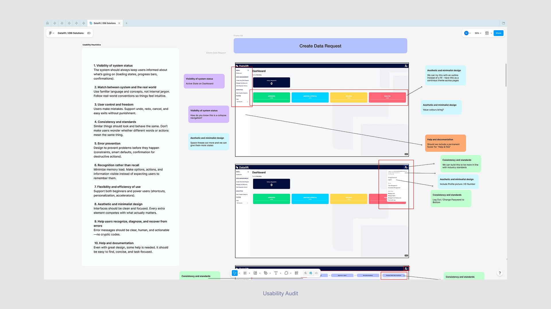
    UX audit — running a heuristic evaluation of the existing product against Nielsen’s 10 usability heuristics

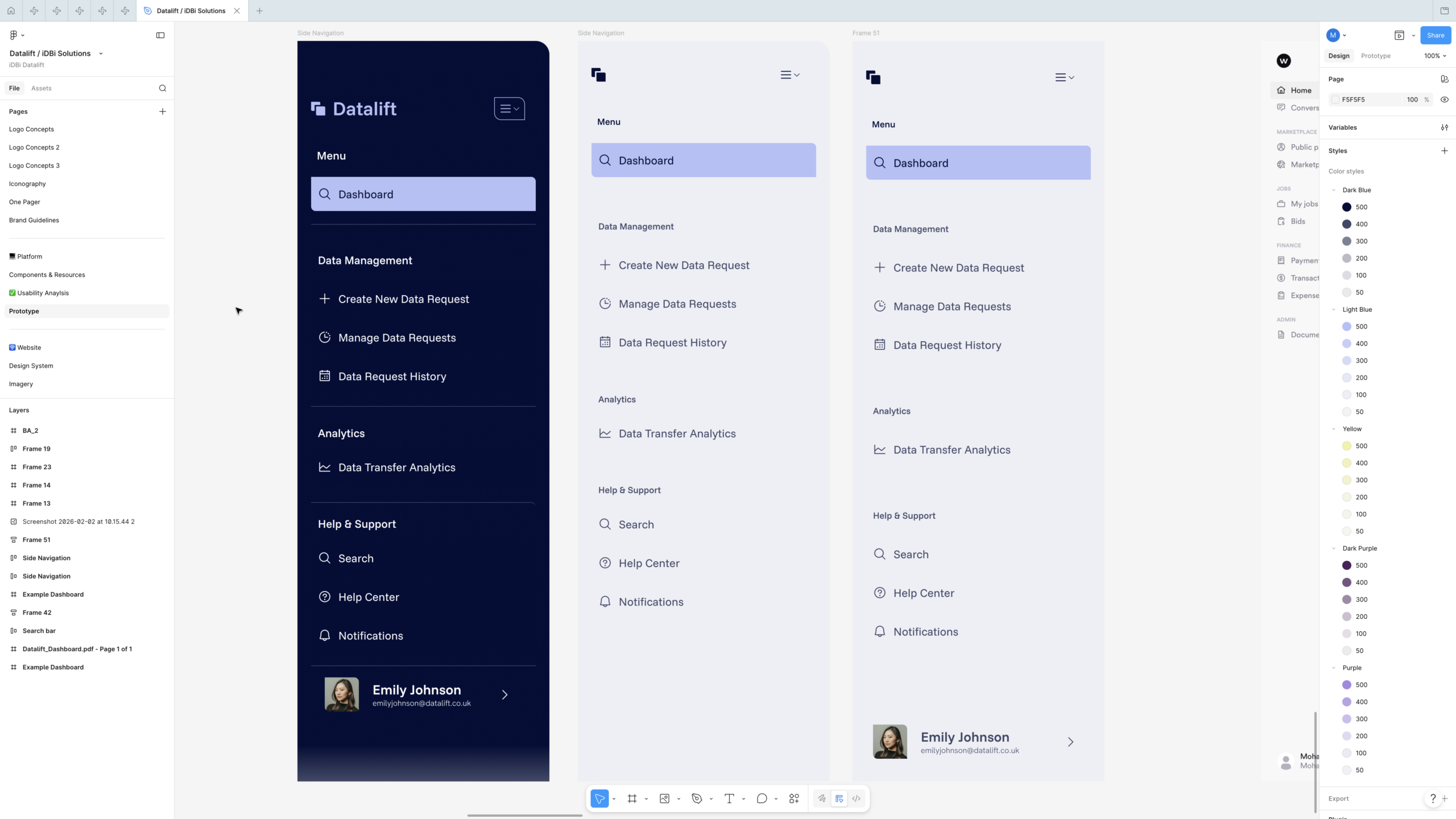
    Product redesign — wireframes, components and screen designs for the dashboard, side navigation, and Create Data Request flow

    Marketing website — full design of the four-page site, handed off to a developer for WordPress build

    Onboarding & login — designing and prototyping a new sign-in experience, iterated with client feedback
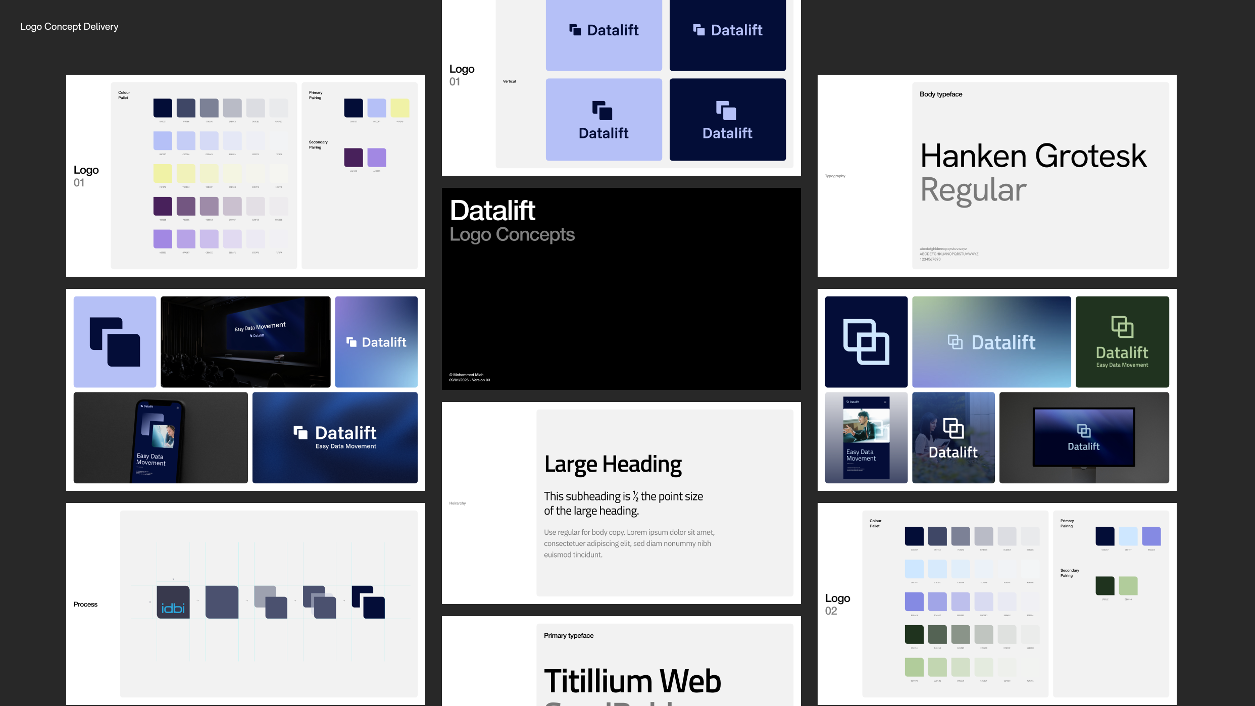
    The most consequential decision in the identity was that the Datalift mark shouldn’t be invented from nothing — it should be derived from the parent iDBi logo, signalling product-from-consultancy heritage without making Datalift feel like a sub-brand.

    I documented the derivation as a visible step-by-step process: starting from the iDBi mark, isolating its core shape language, then evolving it through a sequence of staged transformations into Datalift’s two-overlapping-rounded-squares wordmark. The result is a logo that has visible lineage — a quiet design rationale a client can defend in a board meeting, and a piece of brand storytelling that demonstrates informed decision-making rather than arbitrary choice.

    The system included horizontal and vertical lockups, dark- and light-tone variants, and a “+ Easy Data Movement” tagline lockup for marketing contexts — the full set a product brand needs to live across product UI, website and external touchpoints.
    The brand resolved into a system designed to do real work:

    Colour. A primary palette anchored on a deep navy (the product’s authority and “compliant” register), paired with a soft lavender/periwinkle as the on-brand action colour, and a warm cream/yellow accent. A secondary palette of deep purples extended the system for marketing surfaces. Primary and secondary pairings were specified explicitly so non-designers across iDBi could apply the brand without misuse.

    Typography. Funnel Sans as the primary display face, Hanken Grotesk as the body face — both Google Fonts, chosen deliberately for open licensing so the client could use them across product, web and documentation without commercial-font friction. Hierarchy rules were specified to a level developers could implement directly (e.g. subheadings at half the point size of large headings).

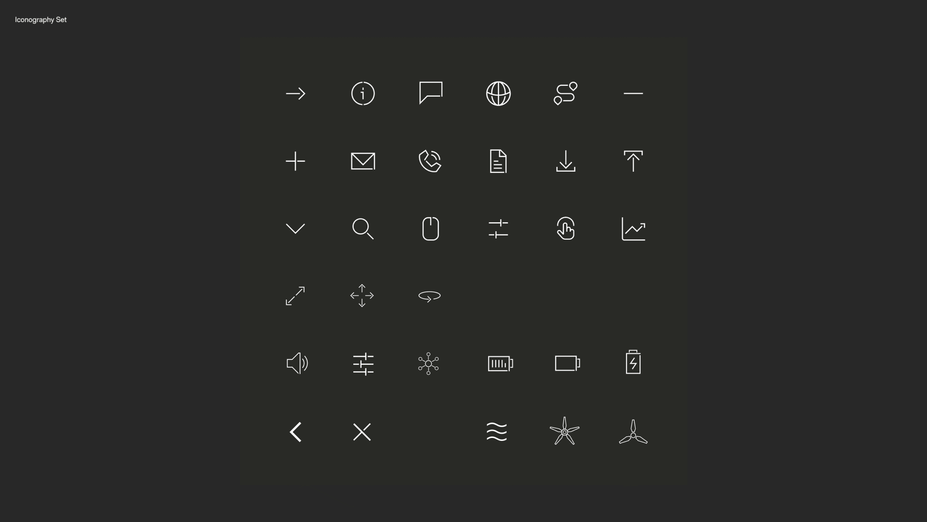
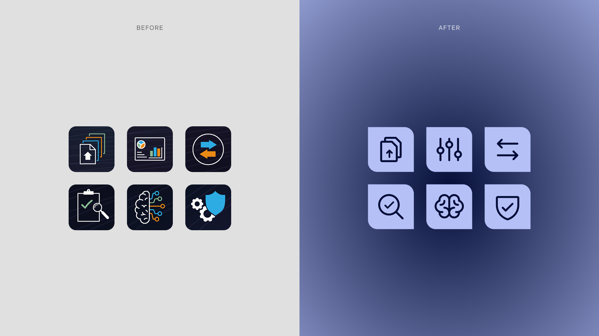
    Iconography. A dedicated icon set, scoped to be used identically across the marketing site and the product interface — closing the visual gap that often opens between a SaaS brand and its app.

    Components. A reusable component set in Figma — side navigation variants, search bar, tabs, status icons, dashboard cards — built so the engineering team had a single, consistent source of truth to work from.
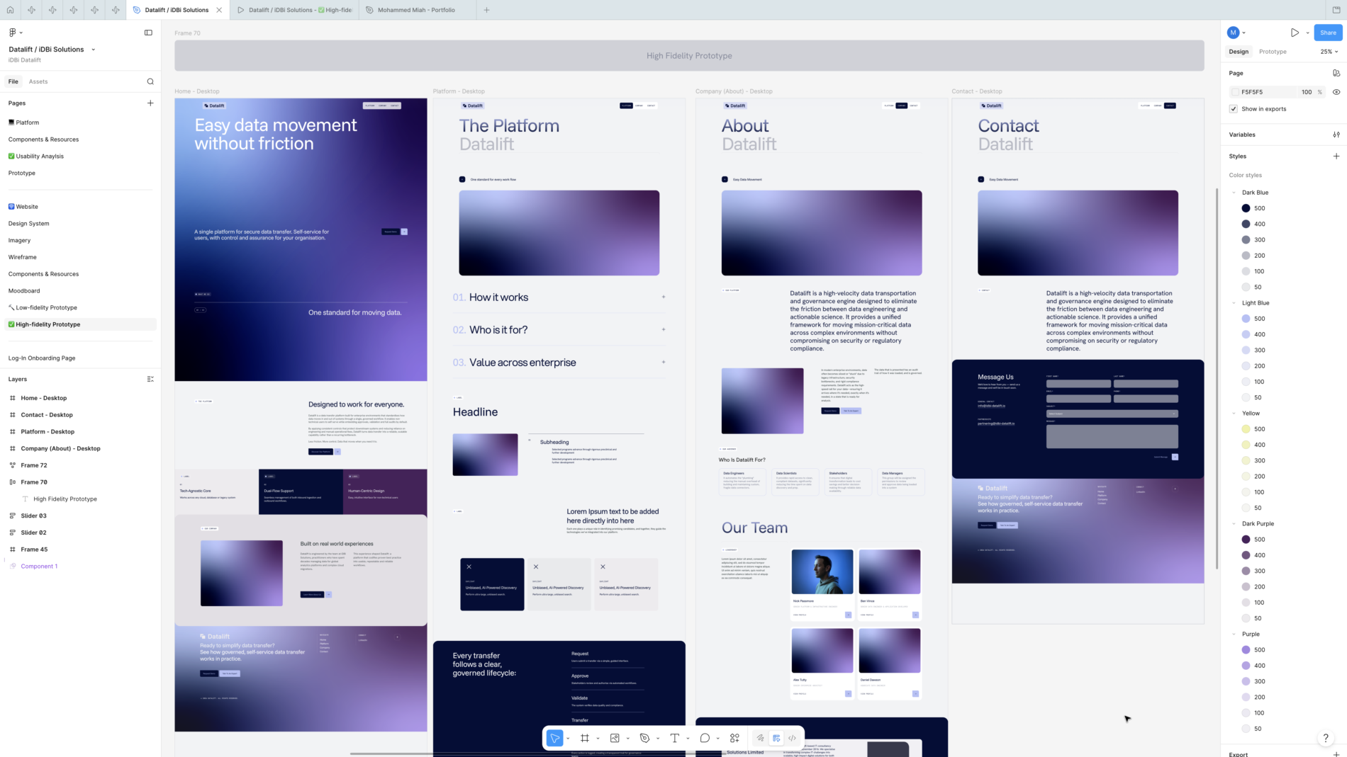
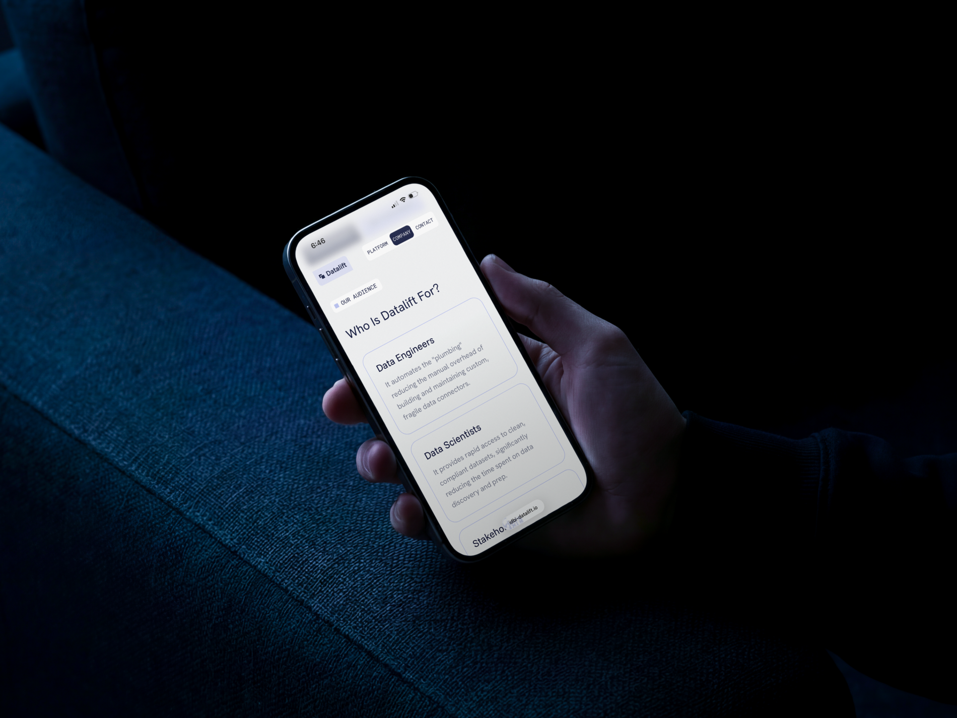
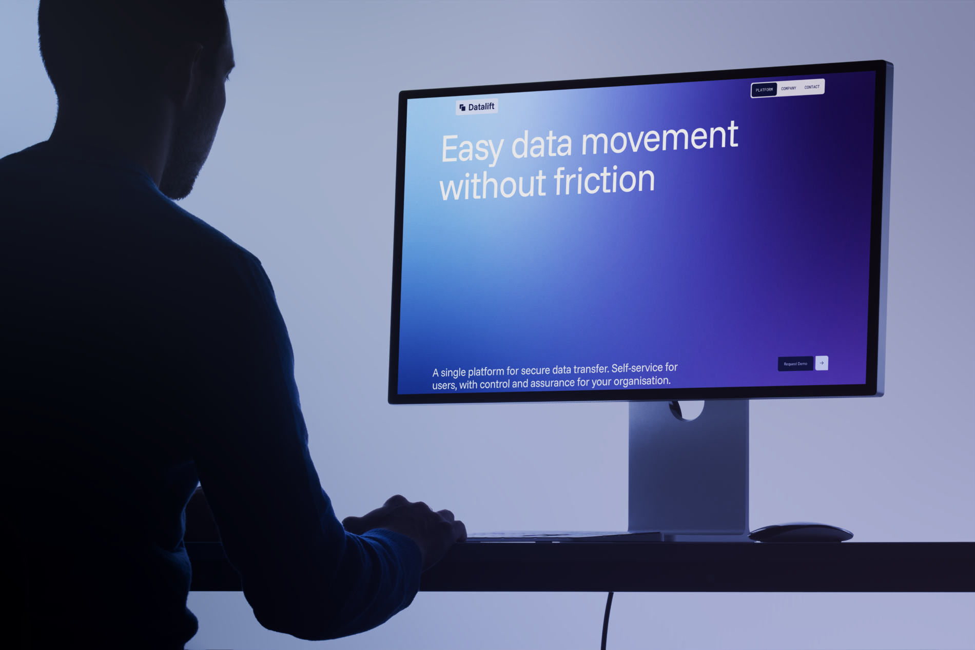
    In parallel, I designed the four-page marketing site — Home, Platform, Company, Contact — designed in Figma at low- and high-fidelity, then handed off to a developer to build in WordPress.

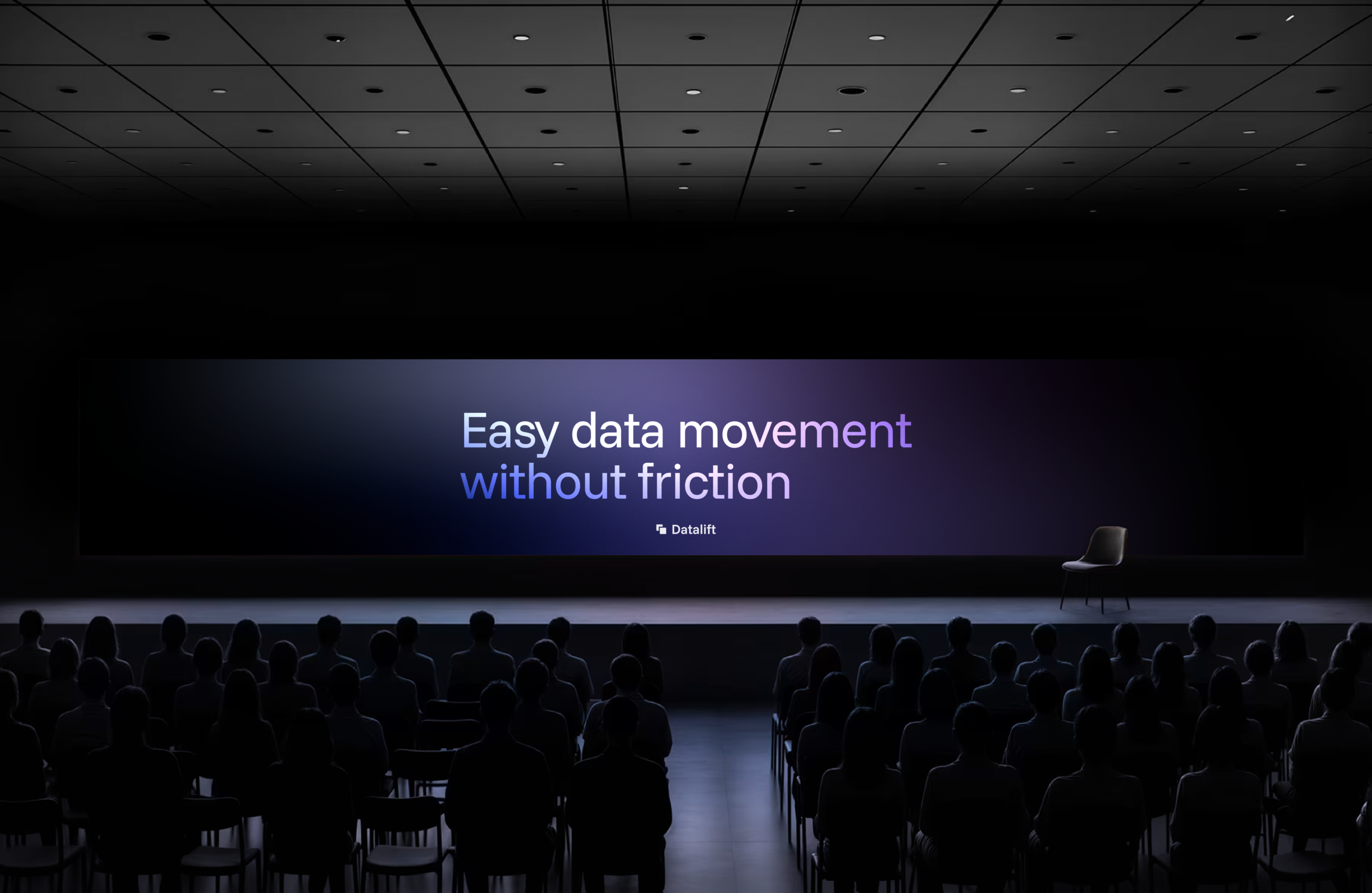
    The site is structured around the value proposition itself — “Easy data movement without friction” — and walks the visitor through what the platform does, how it works (Request → Approve → Validate → Transfer → Audit), who it’s for (Data Engineers, Data Scientists, Stakeholders, Data Managers), and the iDBi story behind it. The same brand system runs from product into website without a seam — same typography, same components, same colour discipline.
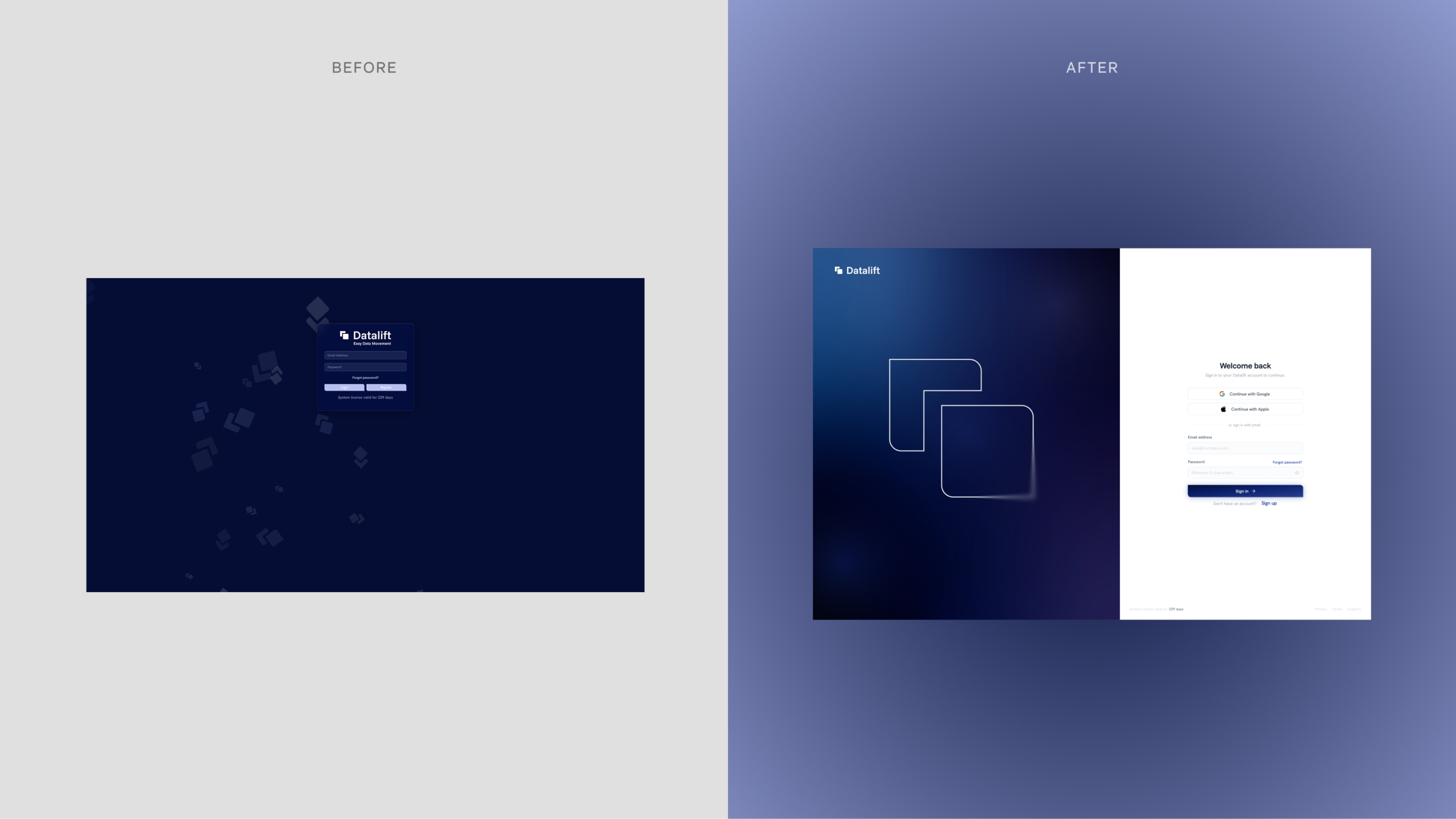
    The original sign-in screen wasn’t fit for an enterprise product. I designed a replacement built on industry-standard patterns: a split-screen layout with the brand expressed atmospherically on the left (a soft gradient with the Datalift mark rendered as a line illustration) and a clean, focused sign-in form on the right — Continue with Google, Continue with Apple, email/password, “Welcome back” framing, with adaptability for first-time users via a clear Sign Up entry point. Forgot-password and account-creation flows were specified alongside.
    The login flow has been prototyped and iterated with client adaptations, currently sitting at a test environment ahead of going live with the public release.

    Across a focused, five-stage engagement, Datalift went from a working product without a design layer to a coherent brand with a complete system, a heuristic-grounded UX redesign in active development, a live marketing site, and an onboarding flow in client iteration.

    For me, the engagement is the clearest evidence of how I work end-to-end: brand strategy through to product UX, grounded in a recognised UX framework, delivered tightly enough to hand off to engineers and a build team.

    What I’d carry forward: the value of building the heuristic audit before the visual redesign. The audit didn’t just produce a list of fixes — it gave the engineering team a shared vocabulary for why each change was happening. Going forward I’d repeat that structure on any product redesign: audit against a named framework first, then design against the findings.

  • Nestlé Innovation Centre

    Nestlé Innovation Centre

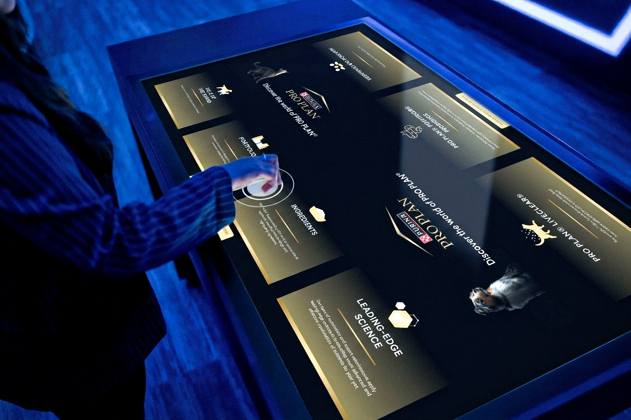
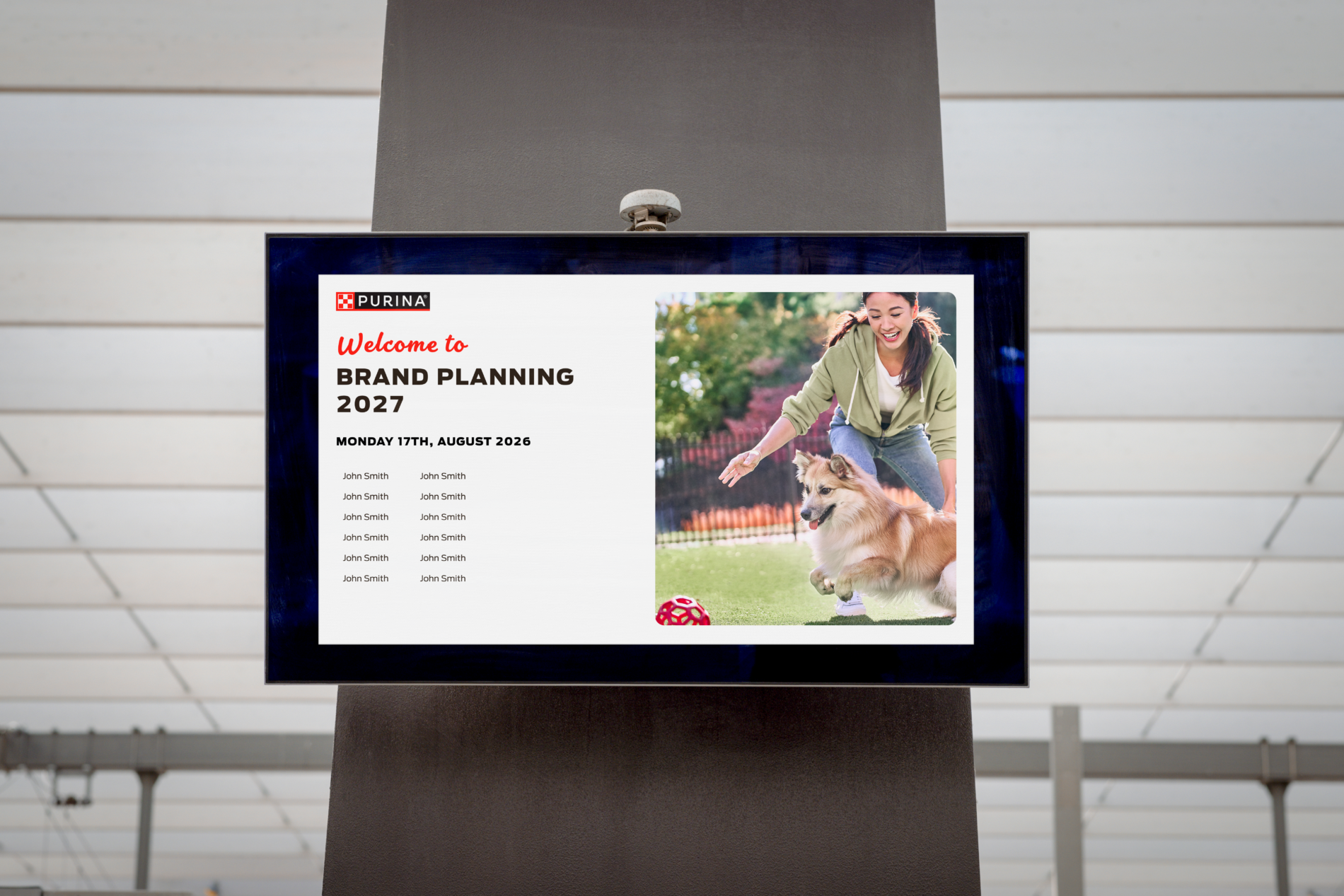
    The space featured a range of digital touchpoints including object-recognition tables, insight portals, live walls, and welcome screens, showcasing brands such as Purina, Gourmet, Felix, and Nescafé Coffee.

    /

    As lead UI/UX Designer, I was responsible for the design of the user interfaces across the entire experience ecosystem, creating scalable design systems that balanced each brand’s identity within a cohesive immersive environment. I also collaborated closely with developers using Engage Works’ proprietary interactive platform, Foundation, ensuring the experiences translated seamlessly from concept to fully functional interactive installations, with a strong focus on multi-user interaction and data visualisation.

    Credits

  • Cosmos Unseen Black Holes VR

    Cosmos Unseen Black Holes VR

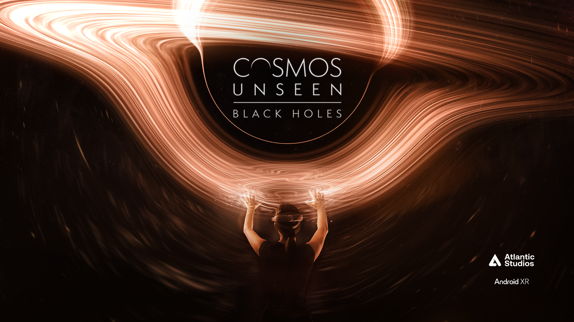
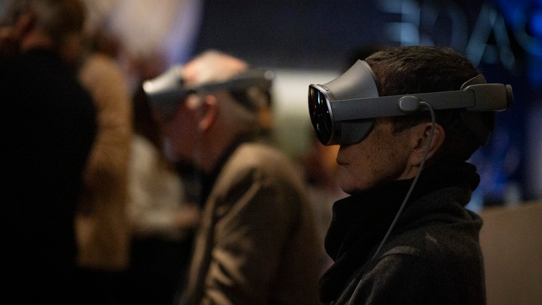
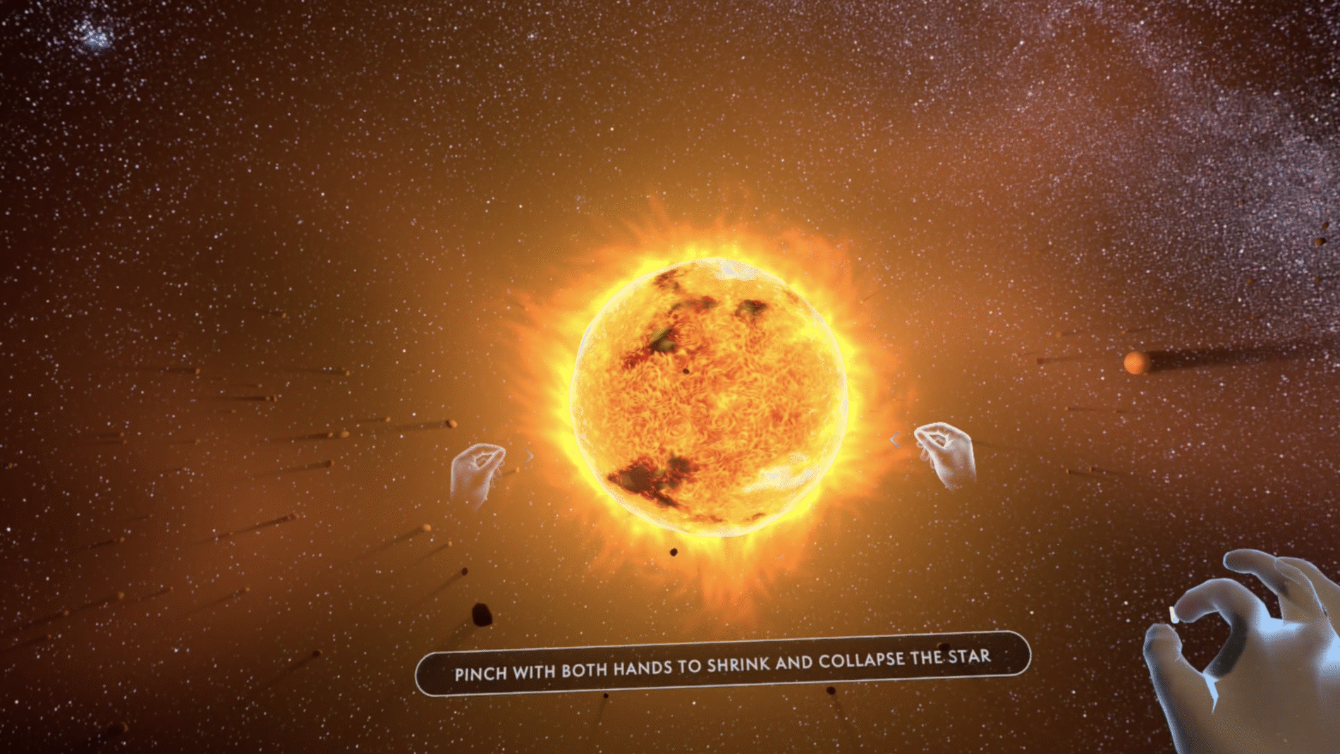
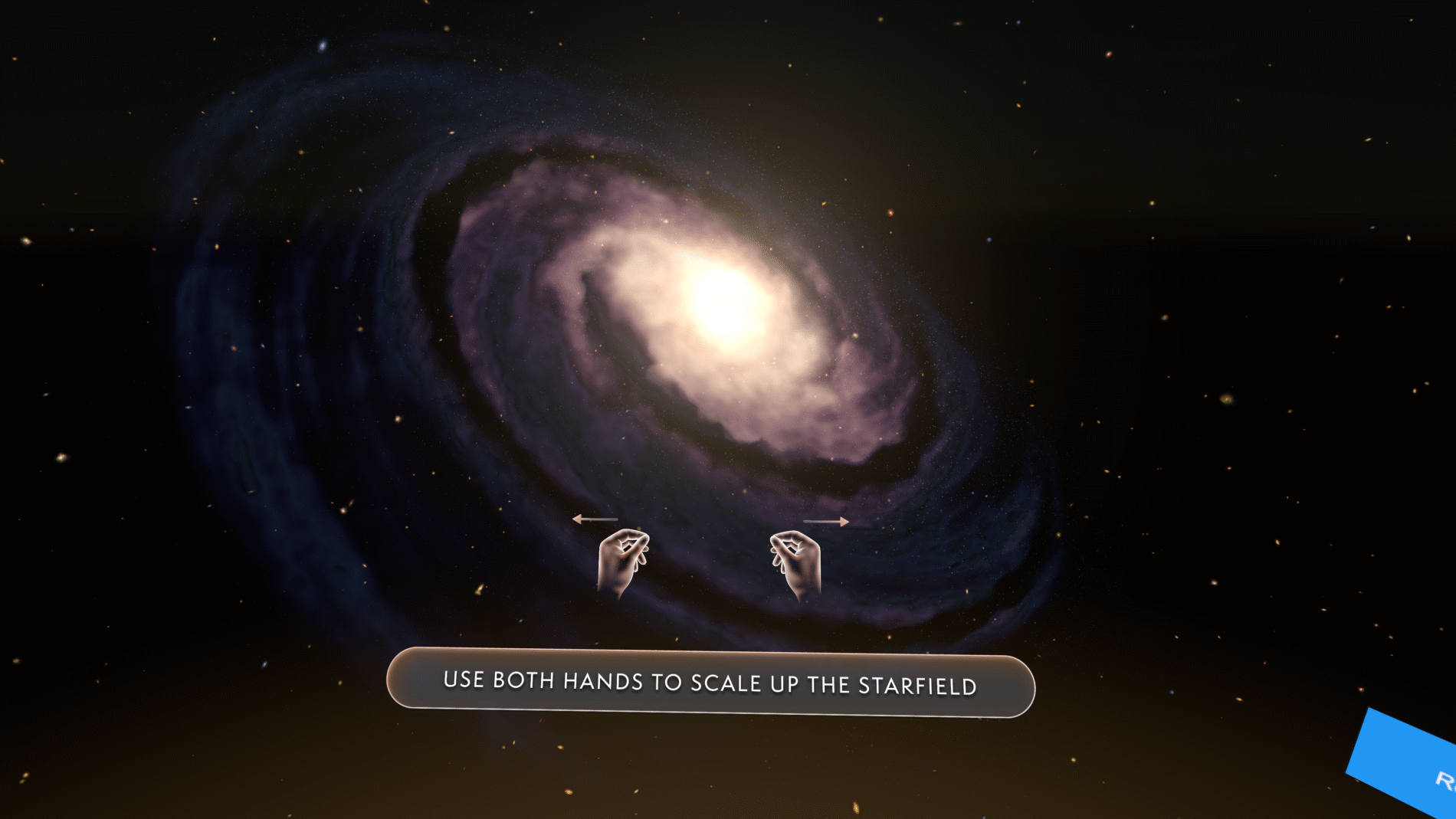
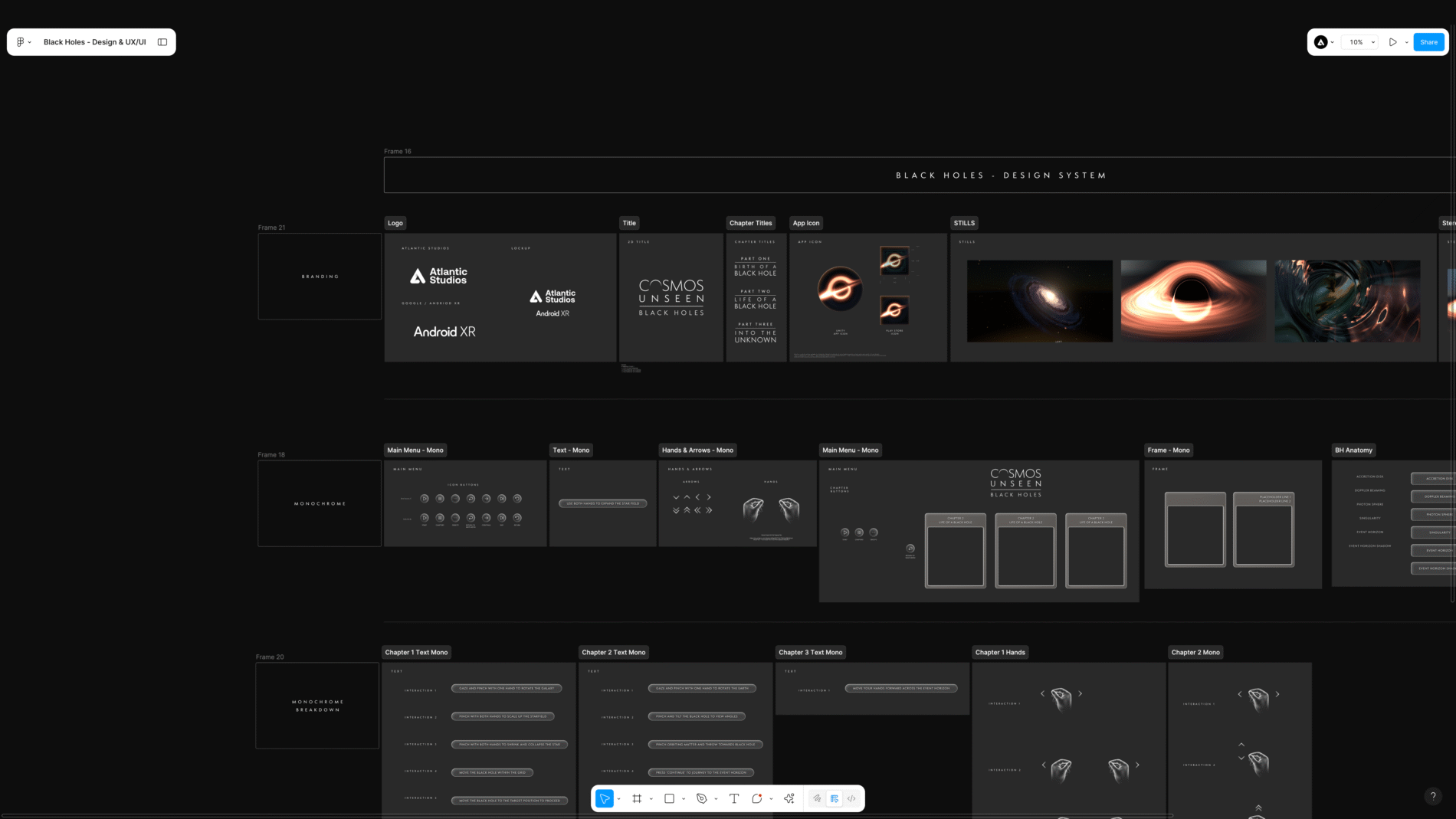
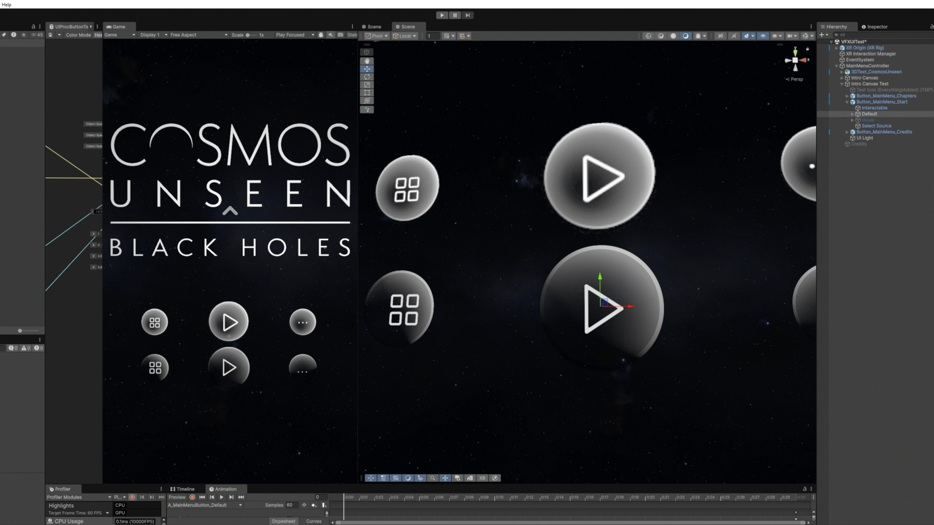
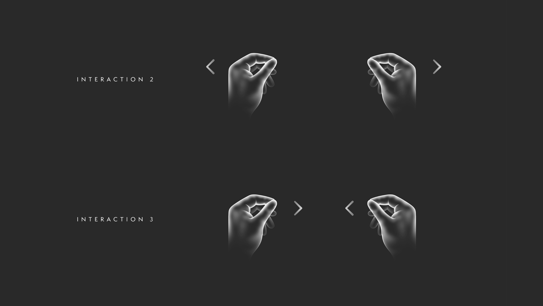
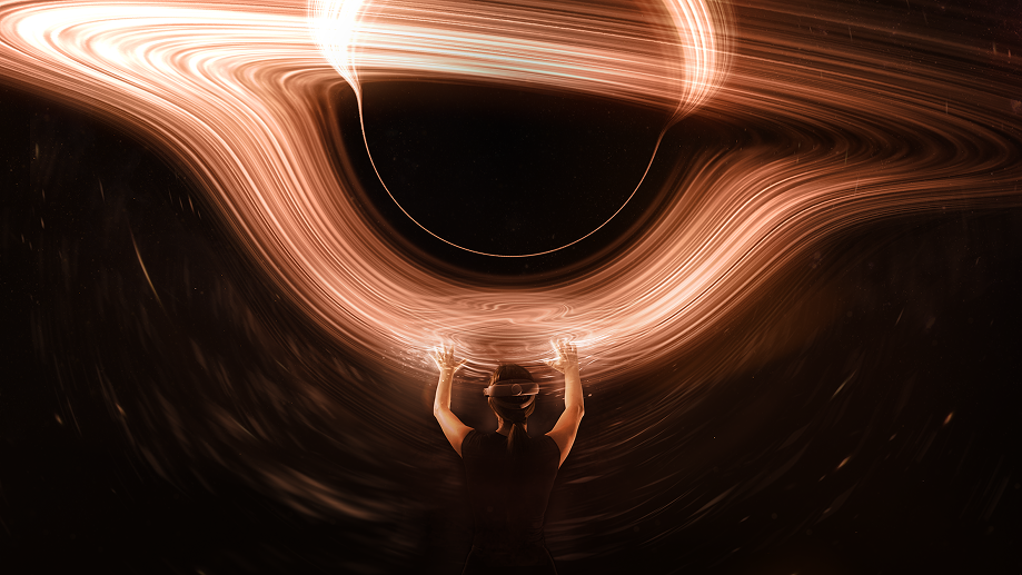
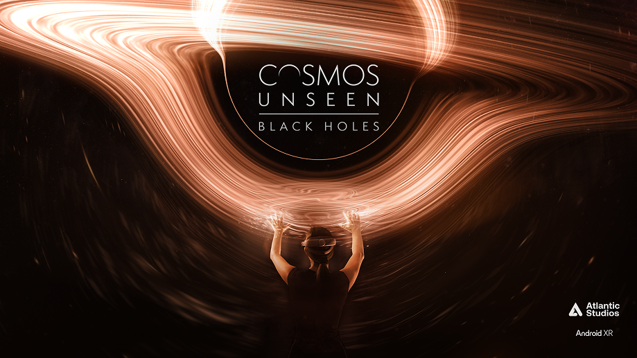
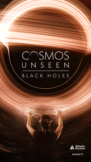
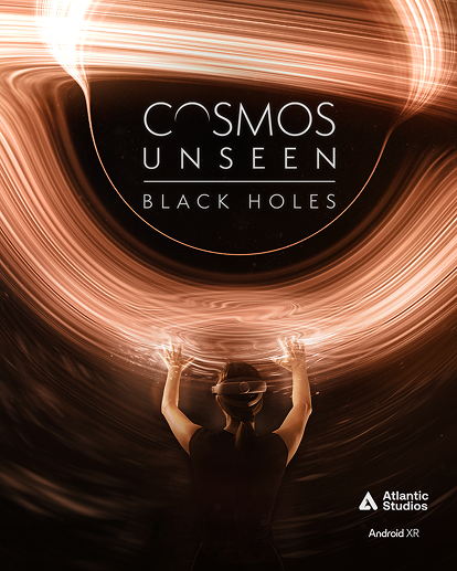
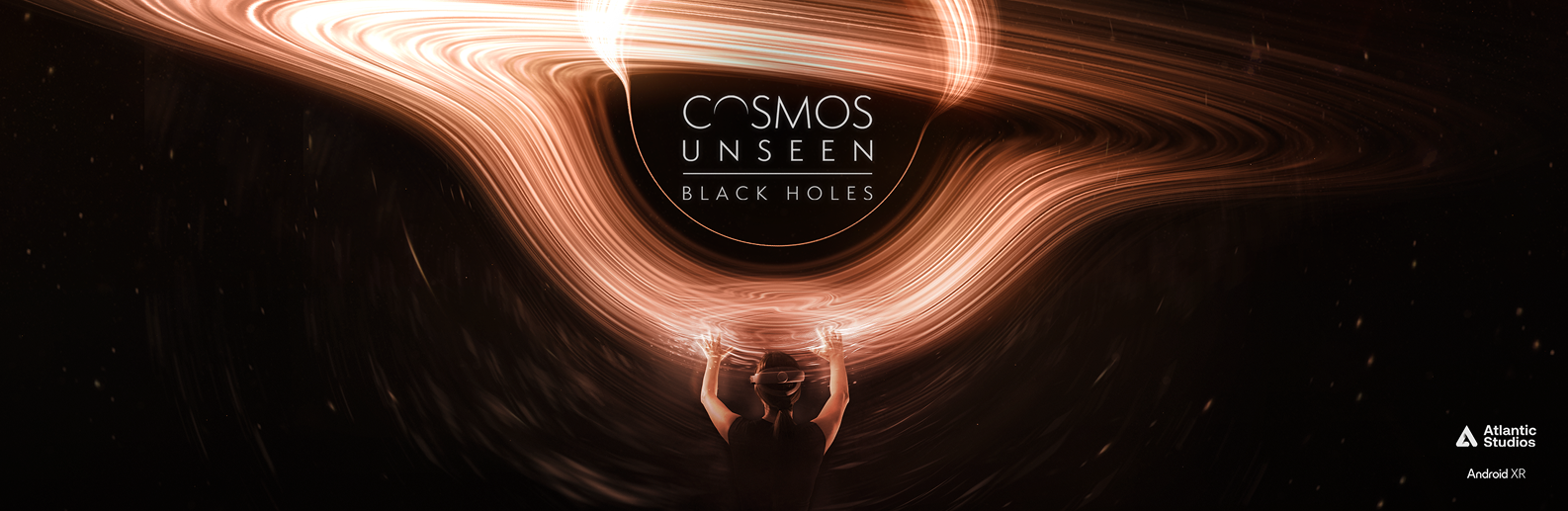
    Cosmos Unseen: Black Holes is a narrative-led VR experience that takes you on a cosmic voyage through the universe — getting hands-on with galaxies, black holes and the very fabric of space and time. I defined the visual identity, translated it into a scalable design system in Figma, and designed the UI, interaction language and gesture guidance for the experience, working alongside developers building it in Unity.

    / /

    The brief sat at the intersection of two hard problems.

    How do you guide someone through a story in 360° space without breaking immersion or losing them? In a flat app, the screen contains the user. In VR, the user can look anywhere — so the UI has to direct attention, signal what’s interactive, teach a gesture, and hand over control at the right moment, all without shattering the sense of being inside the cosmos. Every interface element is a potential intrusion into the experience.

    How do you design an interface for a platform nobody has designed for yet? This was built for the early Android XR release. The conventions a UI designer normally relies on weren’t settled — and that uncertainty ran through every decision below.

    On top of both: the UI had to feel like a natural extension of the identity of the cosmos itself — elevated, atmospheric, consistent — while staying intuitive, accessible, and resilient to a narrative that kept evolving through stakeholder feedback.

    The real question wasn’t “what should the buttons look like?” It was “how much UI can disappear, and how do we guide without intruding?”

    I want to be precise about ownership, because this was a cross-functional project:

    I personally owned:

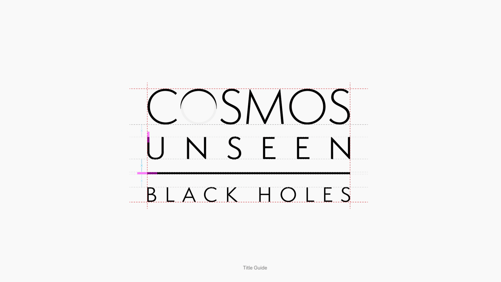
    • Visual identity — translating an abstract subject (black holes, the fabric of spacetime) into a coherent, ownable visual language, including the 2D title lockup and chapter title system
    • Design system — a scalable, component- and variable-driven system in Figma, built to be handed to developers
    • UX/UI & interaction language — the interface and the gesture-guidance copy: main-menu and chapter navigation, hand-gesture cues, information placement, and the flow through the experience
    • Marketing & social — poster asset delivery across multiple platforms and social content structures, all derived from the same identity

    I collaborated with: Unity developers implementing the experience in-headset, and stakeholders across end-of-sprint reviews.

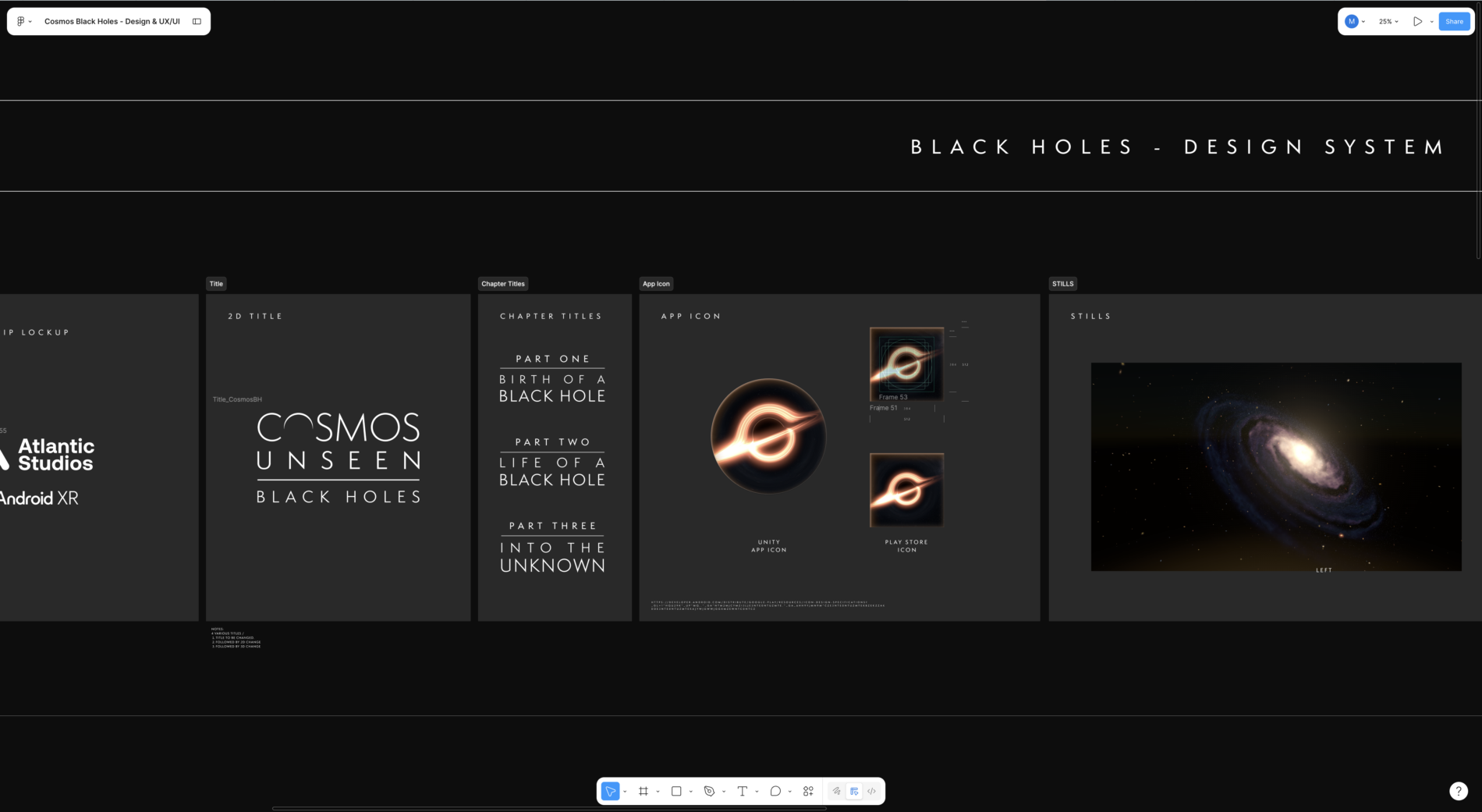
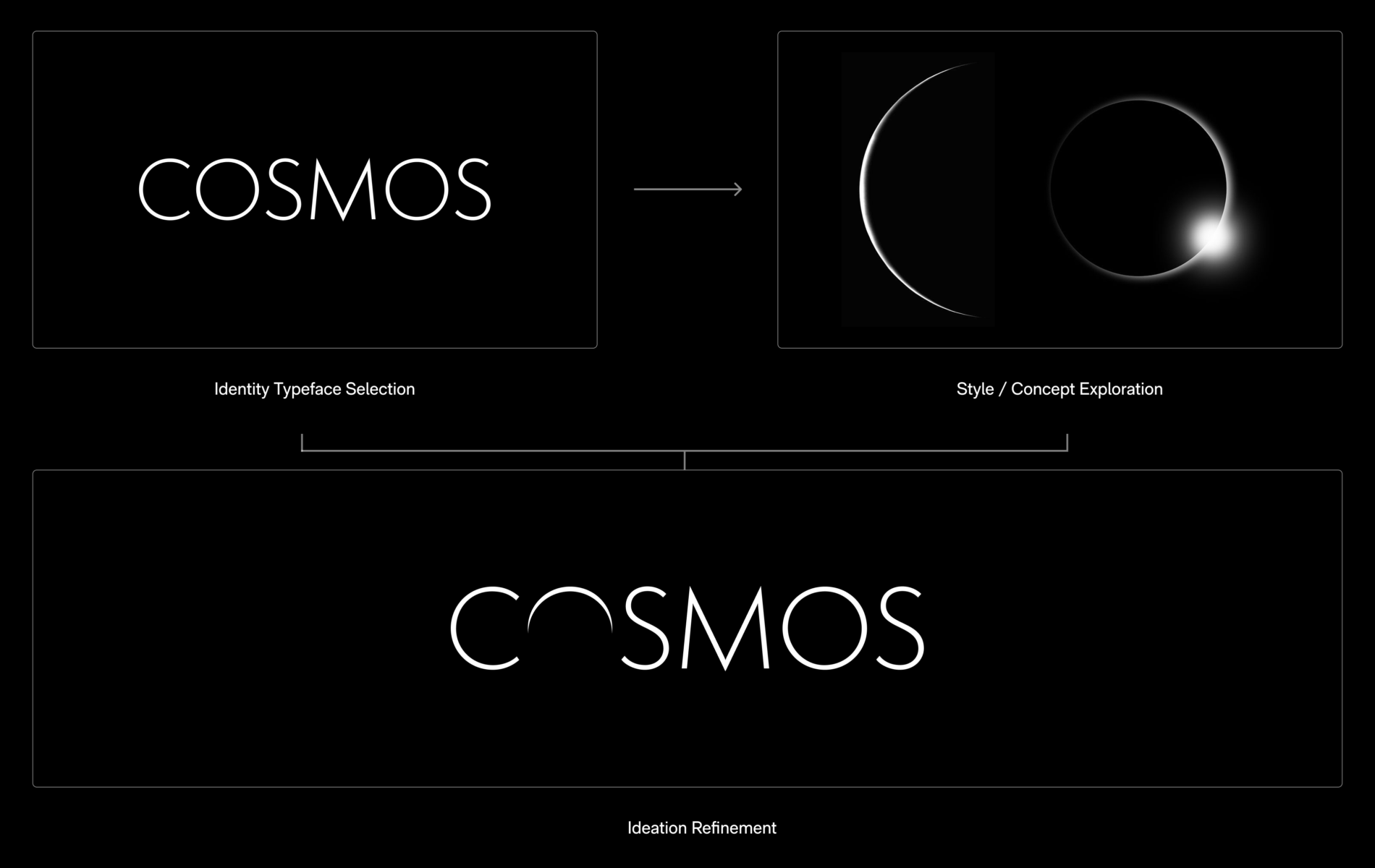
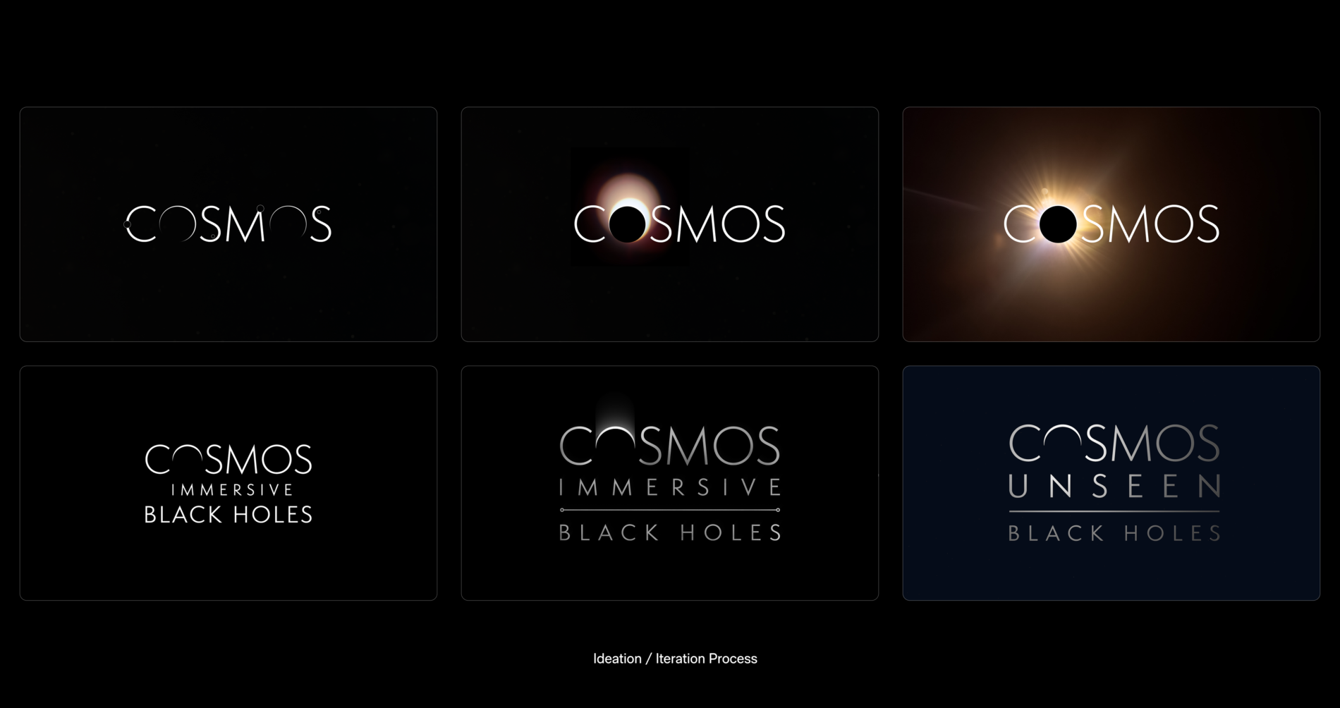
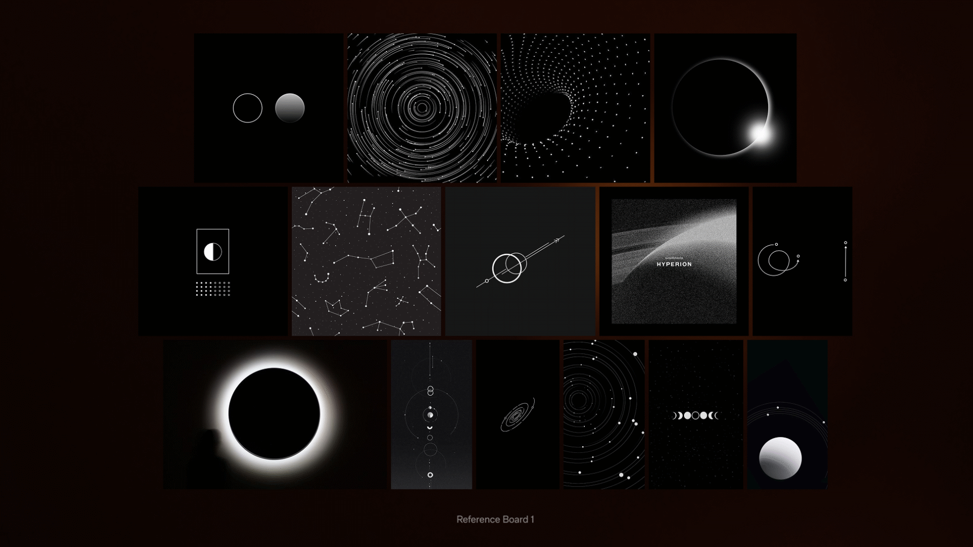
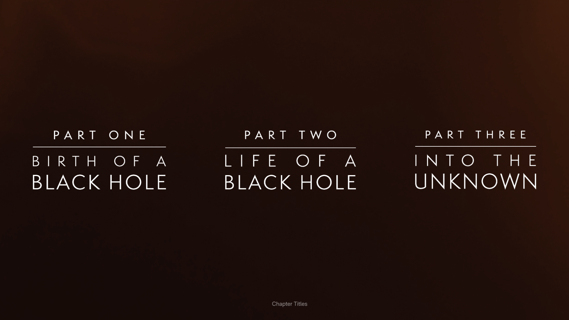
    A black hole is, almost by definition, hard to picture. I built reference and mood boards — split into General, Identity and Intro Reference — exploring how cosmic phenomena form, and how light, gradient and motion could carry meaning. The way light bends around an eclipse, the way a starfield resolves into structure: these became the visual DNA tying the brand, the interface and the marketing together. From this, the identity resolved into a refined title lockup — Cosmos Unseen: Black Holes — and a three-part chapter structure: Birth of a Black Hole, Life of a Black Hole, and Into the Unknown.

    A real constraint shaped the marketing work: the Moohan headset was still under NDA, so the campaign couldn’t show the device. I ran dedicated exploration boards to solve this — Hand POV, Silhouette, Scale, Light Silhouette — working out how to convey an immersive headset experience through hands, light leaks, silhouette and a sense of cosmic scale, rather than the product itself. The discipline of selling the experience on atmosphere alone kept the identity focused on the cosmos, not the kit.

    The experience was informed by serious astrophysics. Its scientific direction drew on work associated with institutions including the UCLA Galactic Center Group, the University of Sussex, and the Event Horizon Telescope collaboration, and the broader field shaped by researchers such as Sir Roger Penrose, Dr Priyamvada Natarajan and Dr Ziri Younsi. Working to an end-of-sprint cadence, the team confirmed and clarified tasks, secured sign-offs, and set responsibilities for the next sprint — keeping the creative work accountable to the underlying science.

    A real, semantic system — not a sticker sheet.
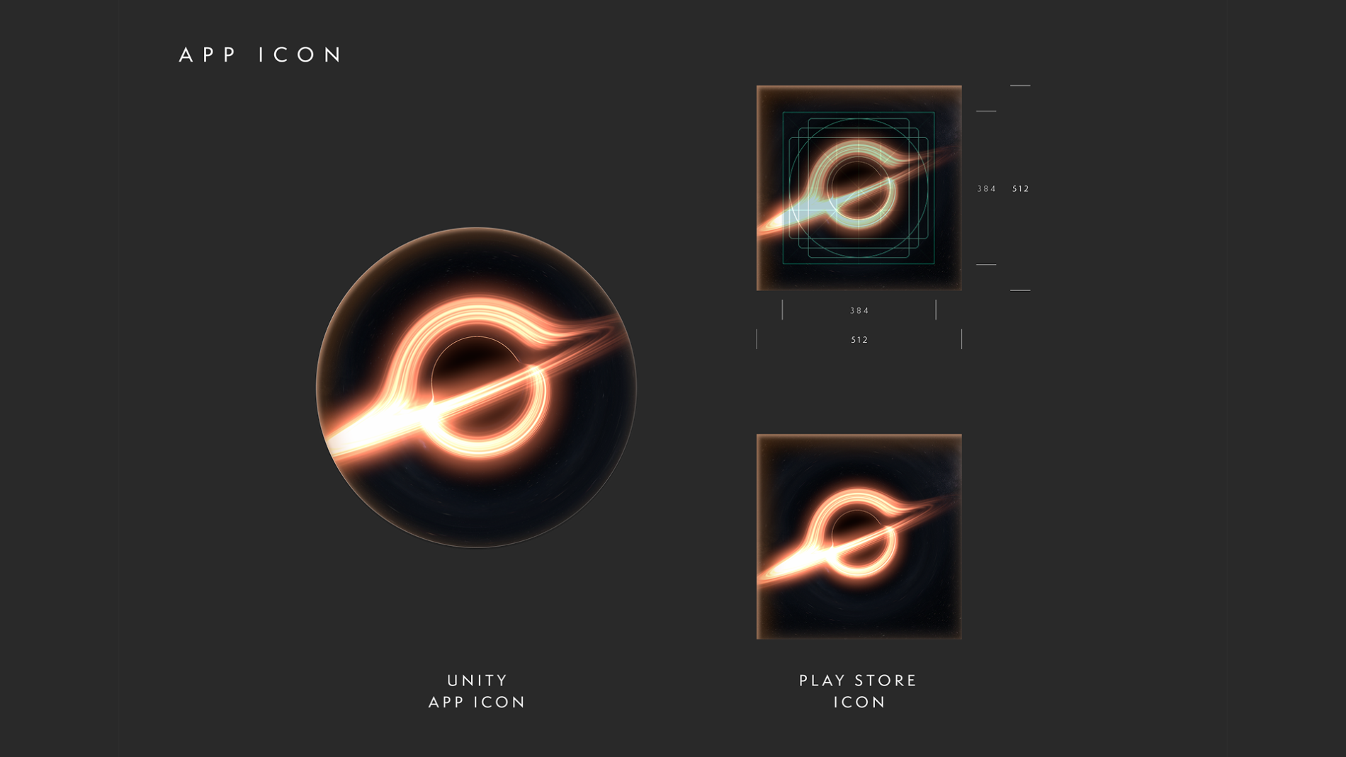
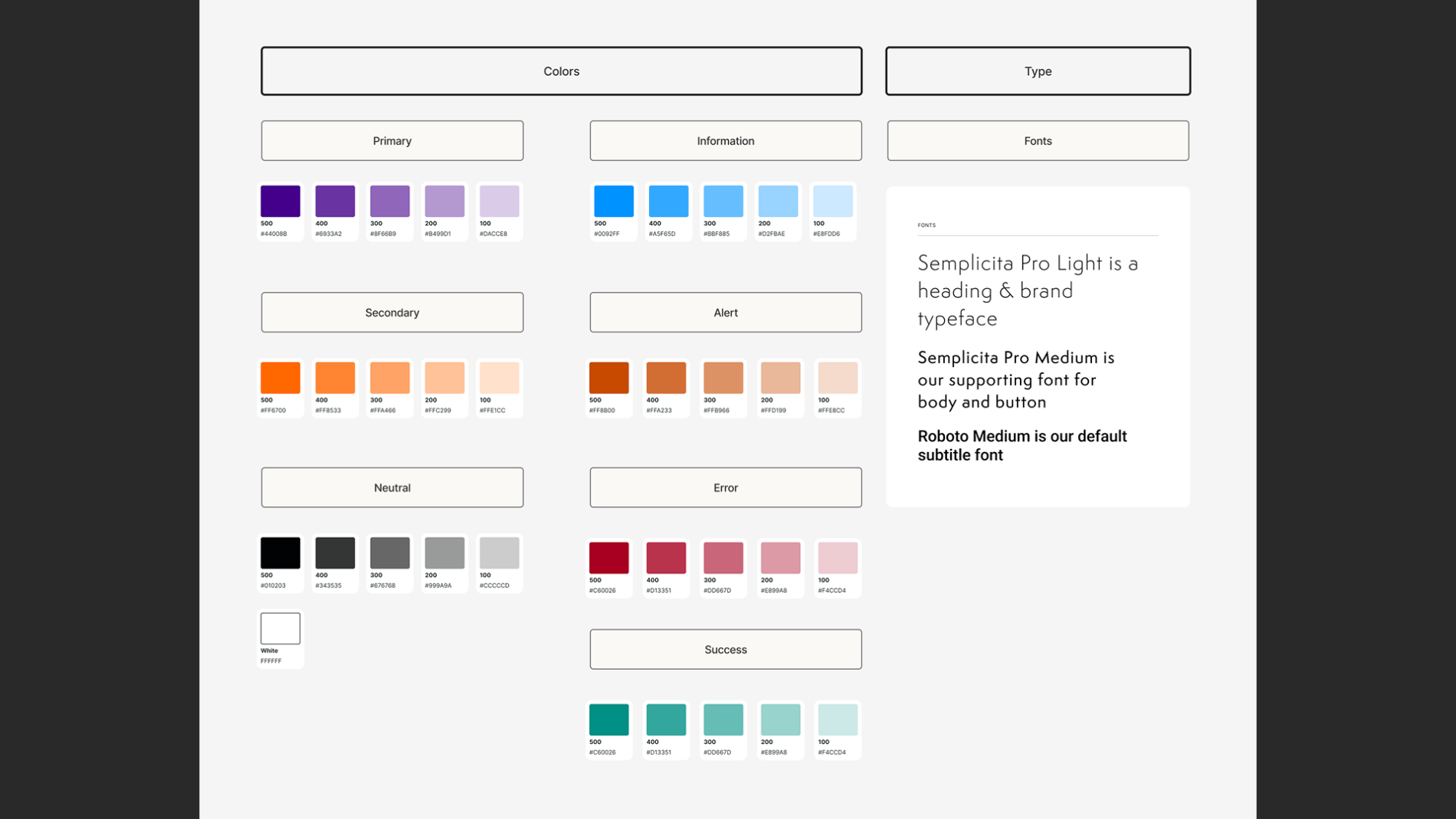
    I built the system in Figma around named colour styles (Primary, Secondary, Neutral, plus a full status set — Information, Alert, Error, Success — and a dedicated Arrows style) and a reusable Glow effect that gave the interface its atmospheric depth consistently. The file was organised into clear pages — Design System, UI Styles, Ideation, User Instructions HUD, App Icon, Credits and a dedicated Export page — so the work was navigable for everyone touching it.

    Components and states.
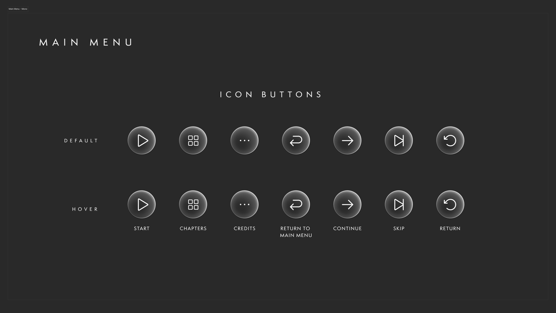
    The icon system was built with Default and Hover states across the full set of controls — Start, Chapters, Credits, Continue, Skip, Return, and Return to Main Menu — using Figma components and variables so a single change to a main component cascaded to every instance. With a narrative that kept shifting and feedback arriving each sprint, this wasn’t a nicety; it was what made iteration survivable without the design fragmenting.

    Built for handoff.
    Developers were given direct access to the Figma file, with open communication on updates and file/folder locations in shared team channels, and a dedicated Export page so assets could be pulled at 1x, 2x and 4x in PNG or SVG and adapted to whatever the Unity build required. The system wasn’t a designer’s private reference — it was a working handoff tool.

    Diagnosing problems with no ground truth.
    When something looked wrong in-headset, the hard question was whose fault is it? — the design, the export/implementation, or the headset itself. Without established conventions, isolating the cause took disciplined collaboration with the dev team rather than assumption.

    Matching UI to voice-over narrative.
    The interface didn’t stand alone — UI cues had to sync with the voice-over narrative, appearing and guiding at the exact right moment so story and interface moved as one.

    Staying ready for a moving target.
    To keep all of this shippable, I maintained clear “ready for dev” states, kept communication tight in team channels, and prototyped wherever possible to demonstrate how an effect or a stretch of the journey would actually feel — turning the unknown into something the team could see and sign off.

    For me, the lasting value is the proof that a design system can be built to thrive under uncertainty: when the platform, the specs and even the narrative are all moving, a semantic, component-driven system and a disciplined dev handoff are what keep the work coherent and shippable.

    What I’d carry forward: the experience reinforced how much spatial UI depends on timing and restraint — guiding attention in 360° is as much about what you choose not to show as what you do. With more platform maturity, I’d push further on formalising accessibility standards for gesture-based interaction, an area the whole category is still defining.

    Credits

  • Titanic The Digital Resurrection

    Titanic The Digital Resurrection

    Designing the visual identity and broadcaster-grade brand system streaming worldwide

    2026 Emmy Nominated in Outstanding Graphic Design: Documentary

    2026 Emmy Awards in Outstanding Graphic Design: Documentary

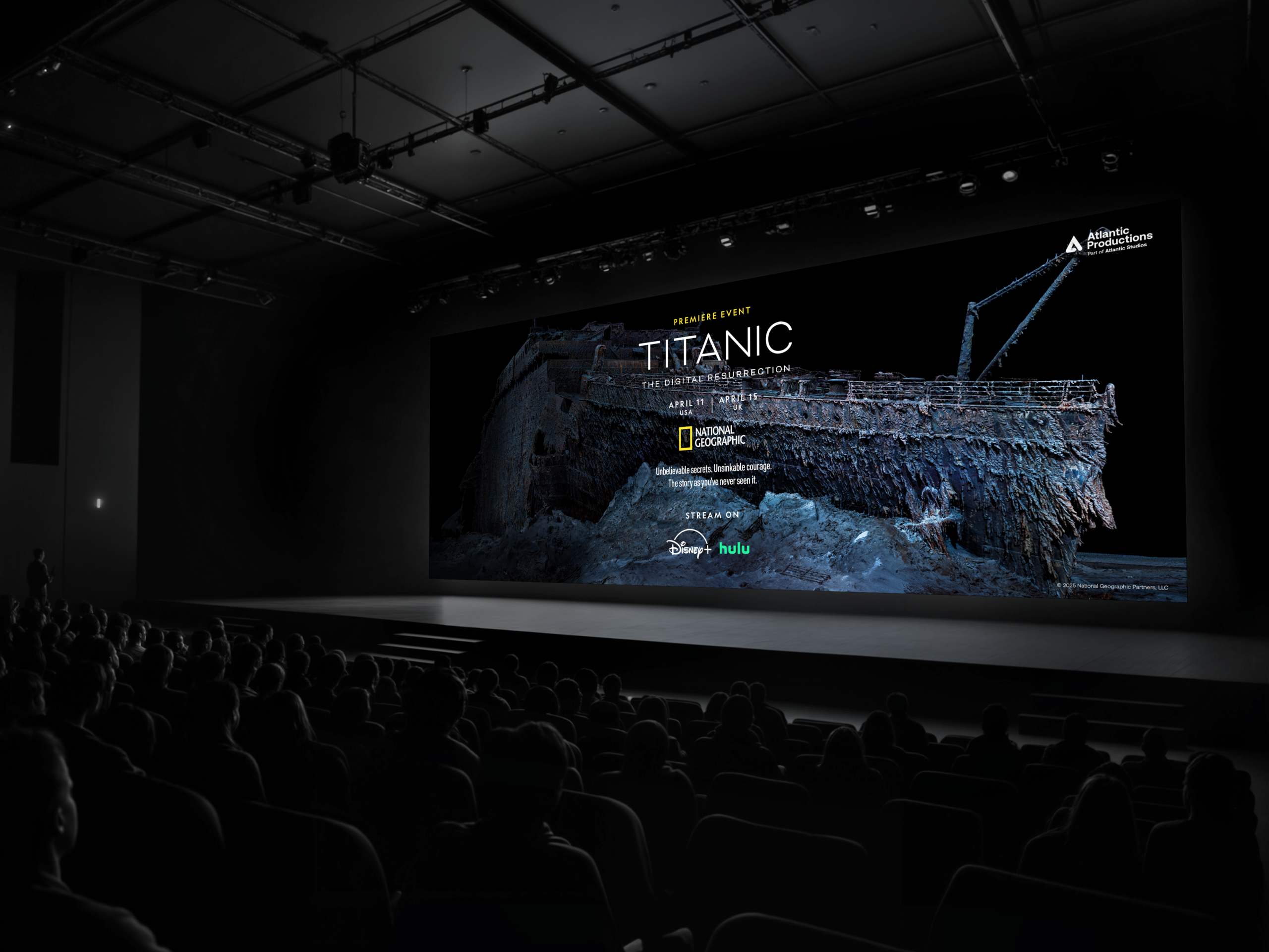
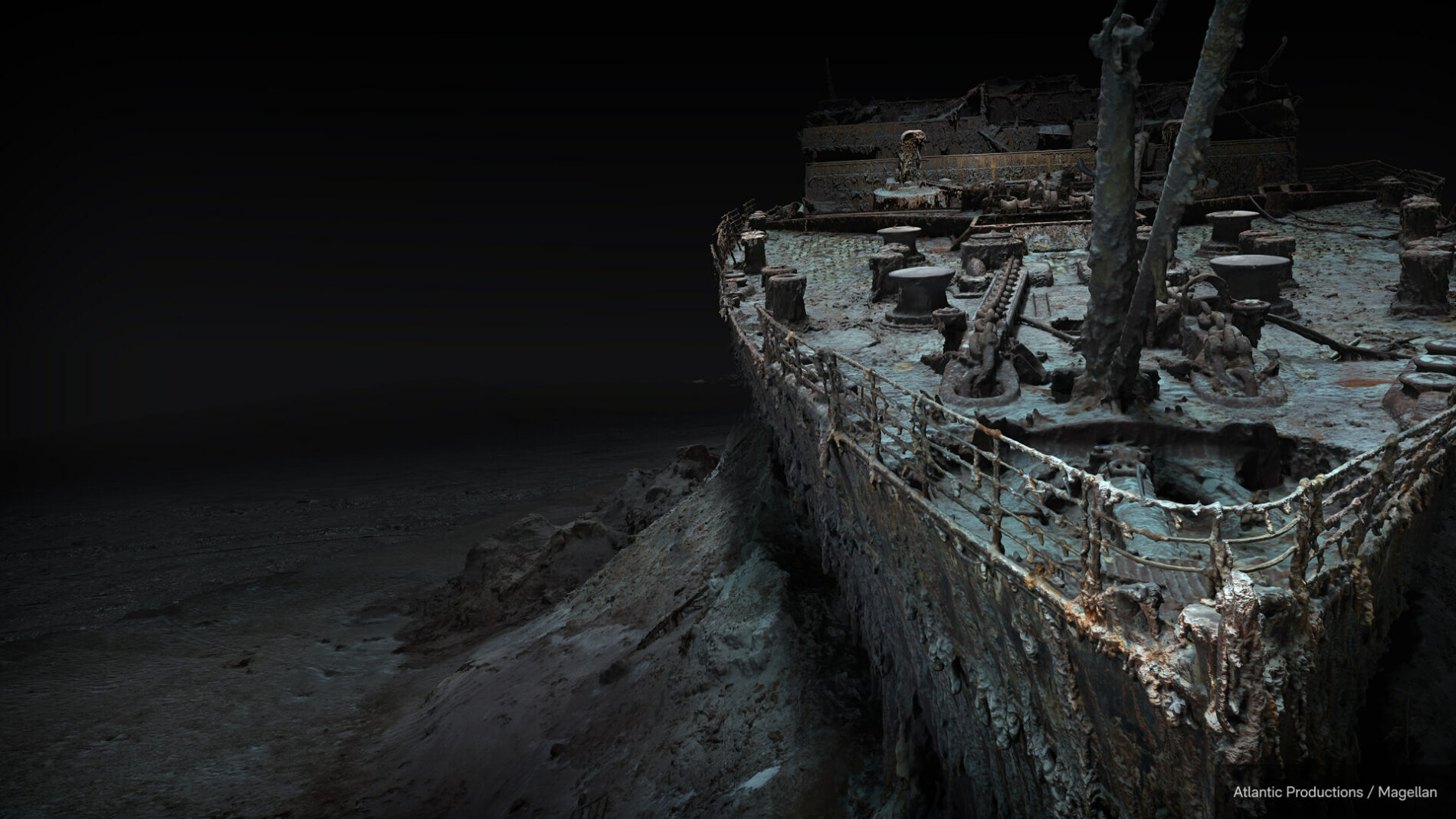
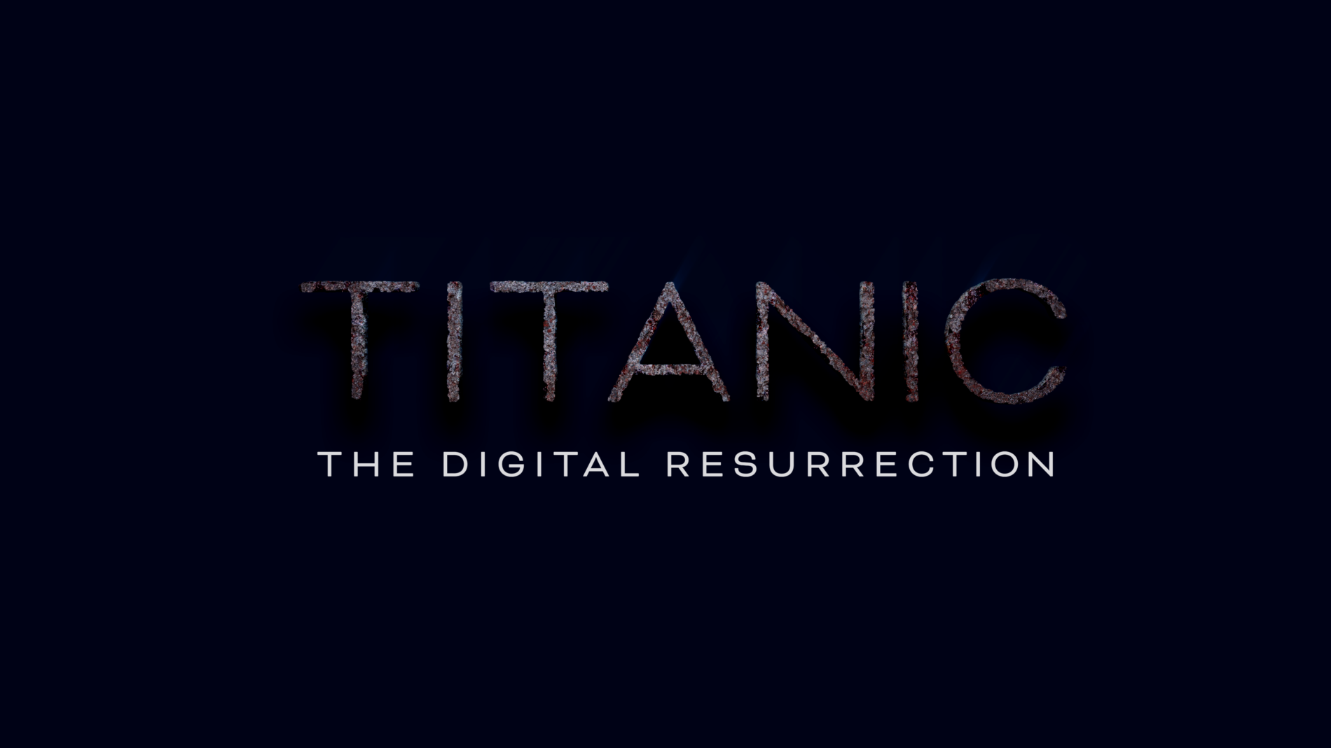
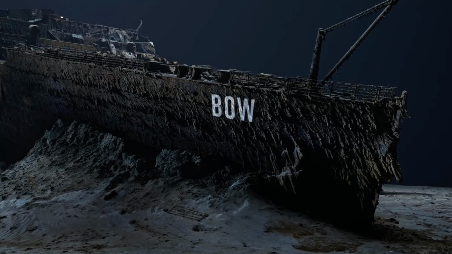
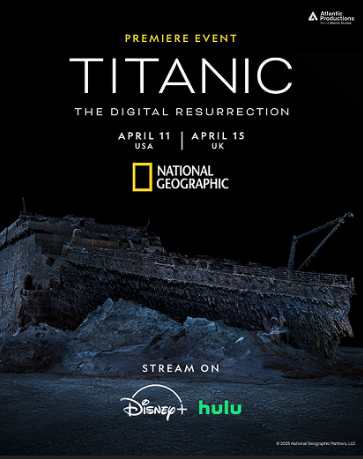
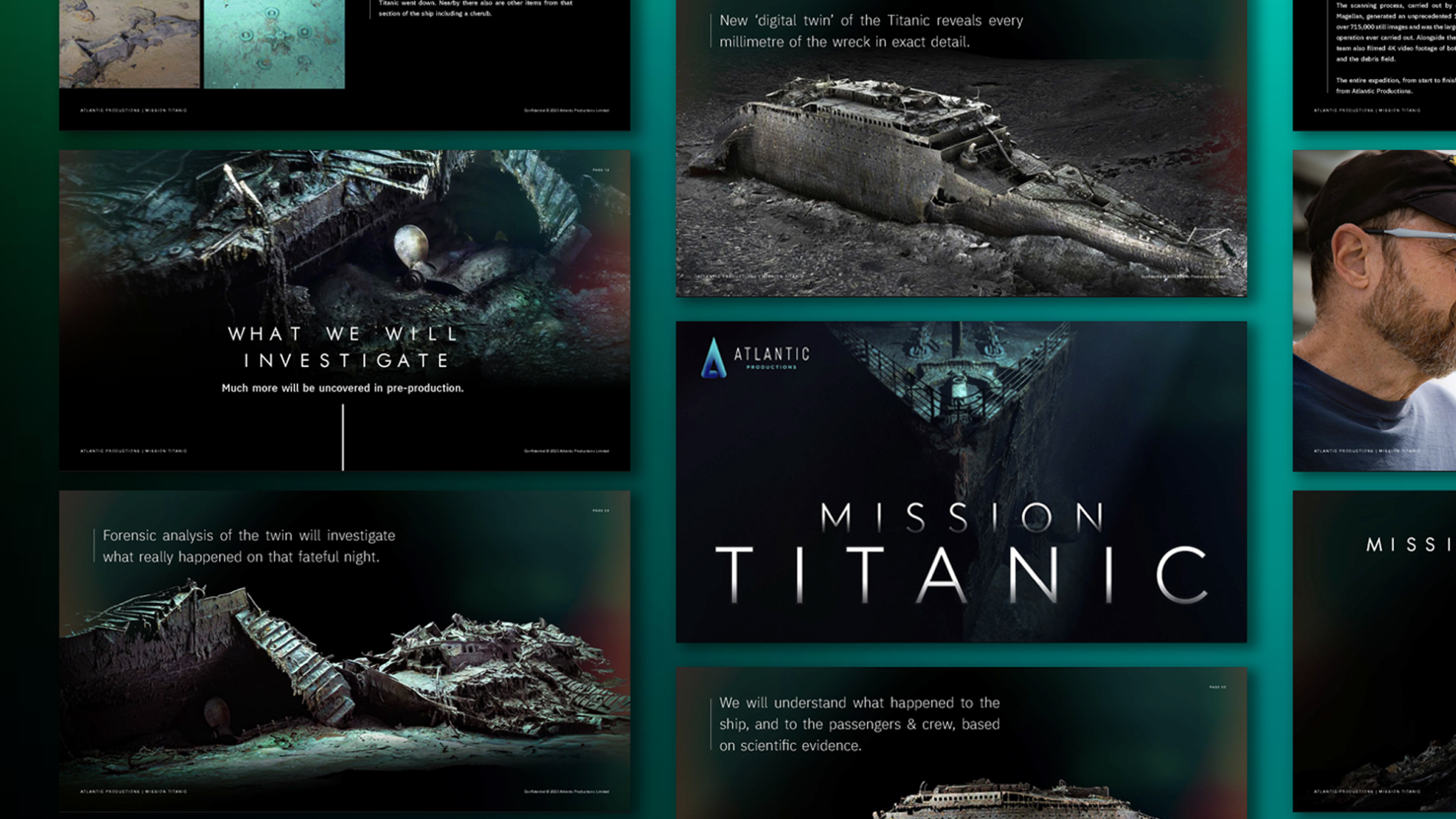
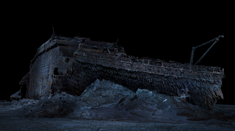
    Titanic: The Digital Resurrection is a 90-minute National Geographic documentary from Atlantic Productions, premiered by National Geographic and streaming on Disney+. It reveals the most precise model of the wreck ever made — a full-scale 1:1 digital twin built from 715,000 underwater images, captured 12,500 feet down with deep-sea mapping partner Magellan.

    /

    Feature Documentary

    UK

    Pitch deck proposal
    Brand Identity
    Title Design
    Broadcast Graphics
    Marketing & Social · Documentary Film

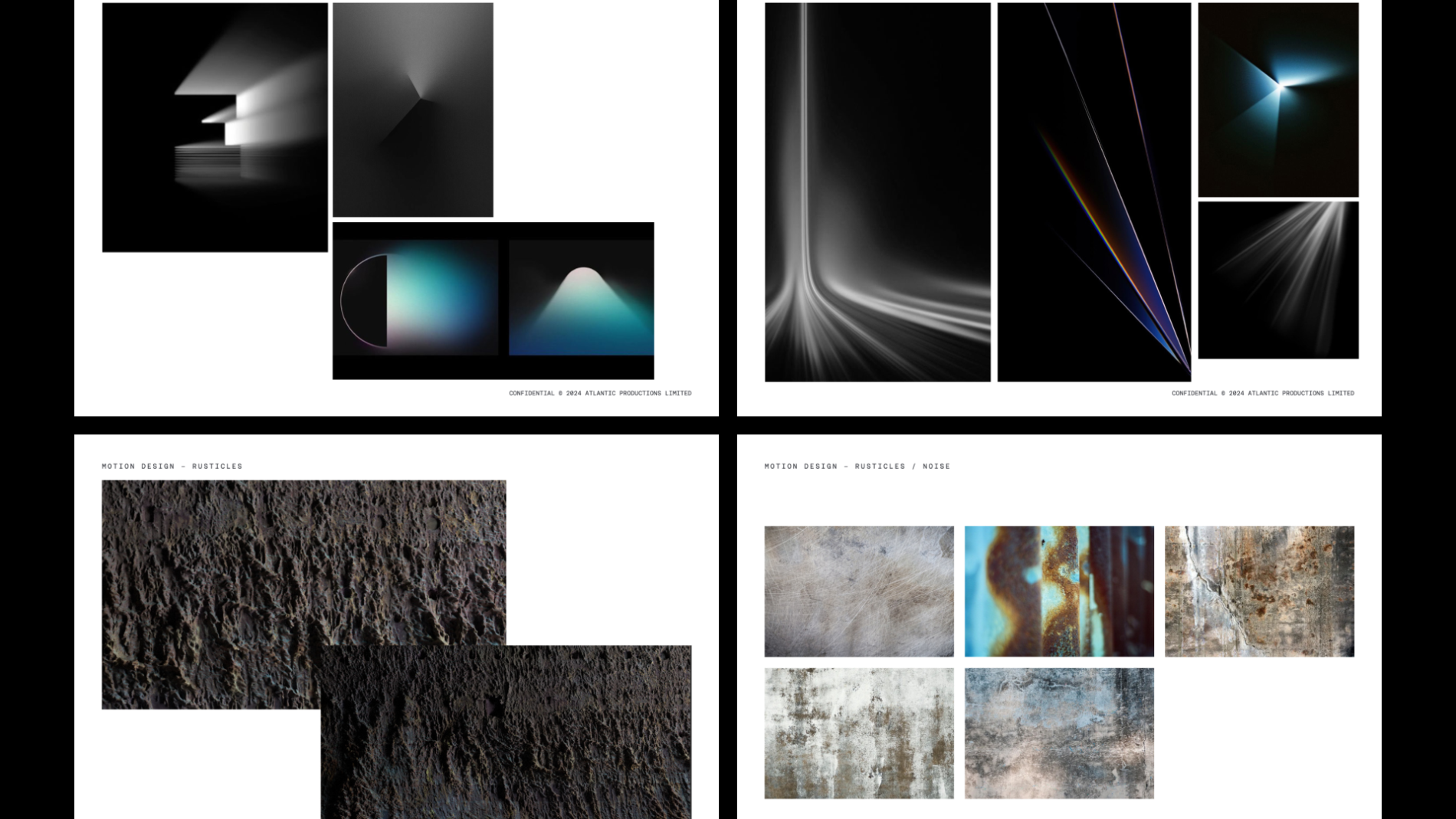
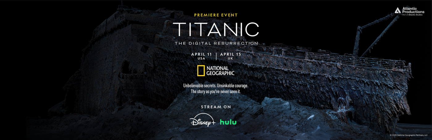
    I led the visual identity from a blank page: the title-logo system, the broadcaster brand pack handed to National Geographic, the in-show graphics, and the marketing and social design that carried the film into a worldwide release.

    Lead designer — visual identity, title-logo system, NatGeo brand pack, in-show graphics (lower thirds & supporting text), pitch-deck design, hero poster and marketing/social campaign, BTS photo selection

    The brief sat at the intersection of three real constraints:
    This was the first documentary to reveal a 1:1 digital twin of the wreck — that scientific breakthrough deserved an identity that didn’t blend in with the wider Titanic visual canon.

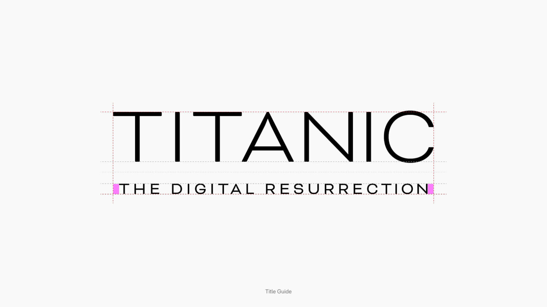
    As a NatGeo title, every typographic and graphic decision had to be specified precisely enough to be reproduced consistently across the channel’s international and platform output, by teams I’d never meet.

    From the broadcast cut to the Disney+ tile, from a 4K hero poster to a phone-sized Instagram thumbnail, in every territory — the system had to hold.

    To be precise about scope on a production of this size:
    I led:

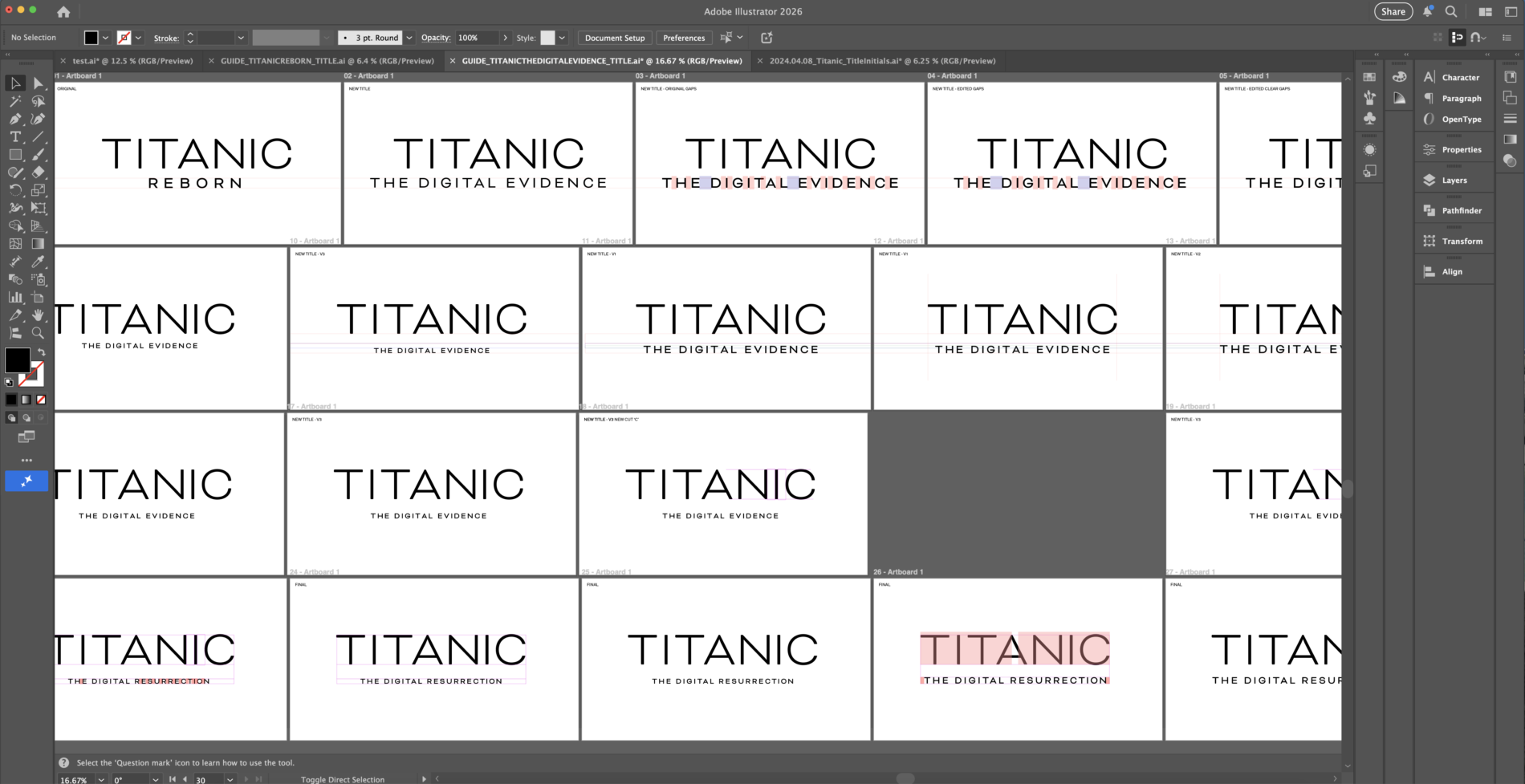
    Visual identity — originating the title-logo concept and visual system from a blank page, then iterating through director, producer and broadcaster sign-off

    Title sequence design — the 2D title-card system that opens the documentary

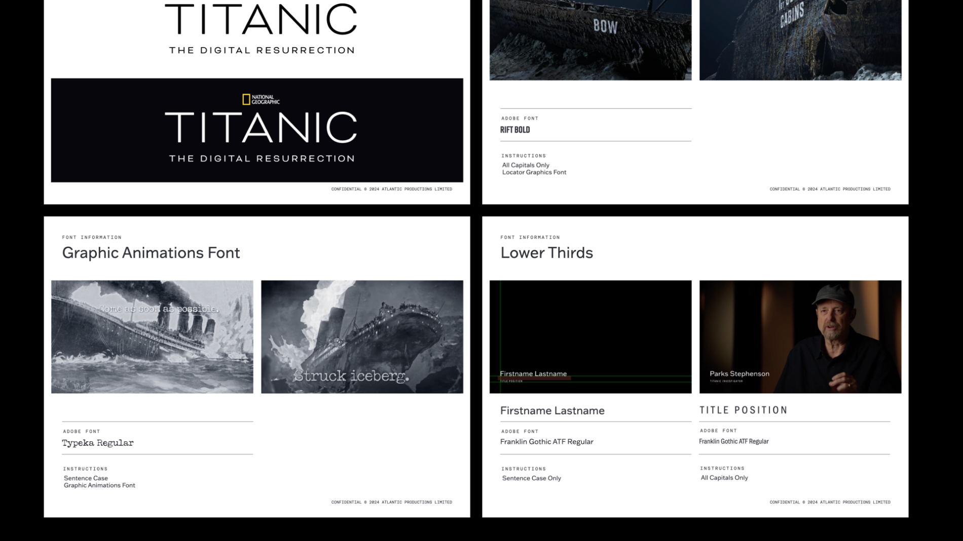
    Broadcaster brand pack — the NatGeo-facing brand and font information document specifying lock-ups, lower thirds and typographic rules

    In-show graphics — lower thirds and supporting on-screen text

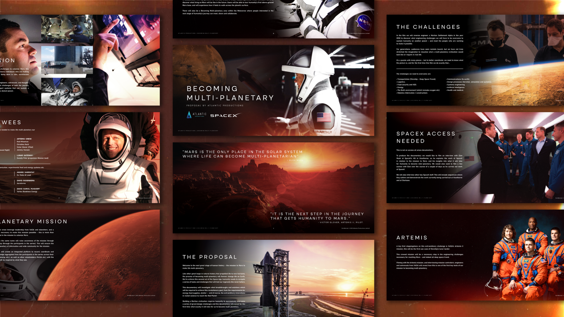
    Pitch deck — solo design of the original deck Atlantic submitted to National Geographic that supported the successful commission

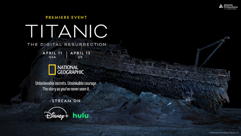
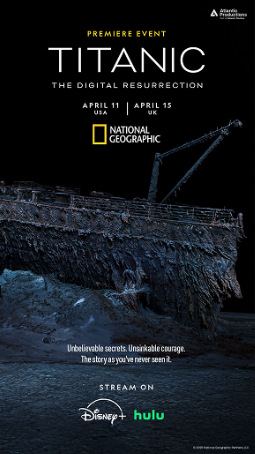
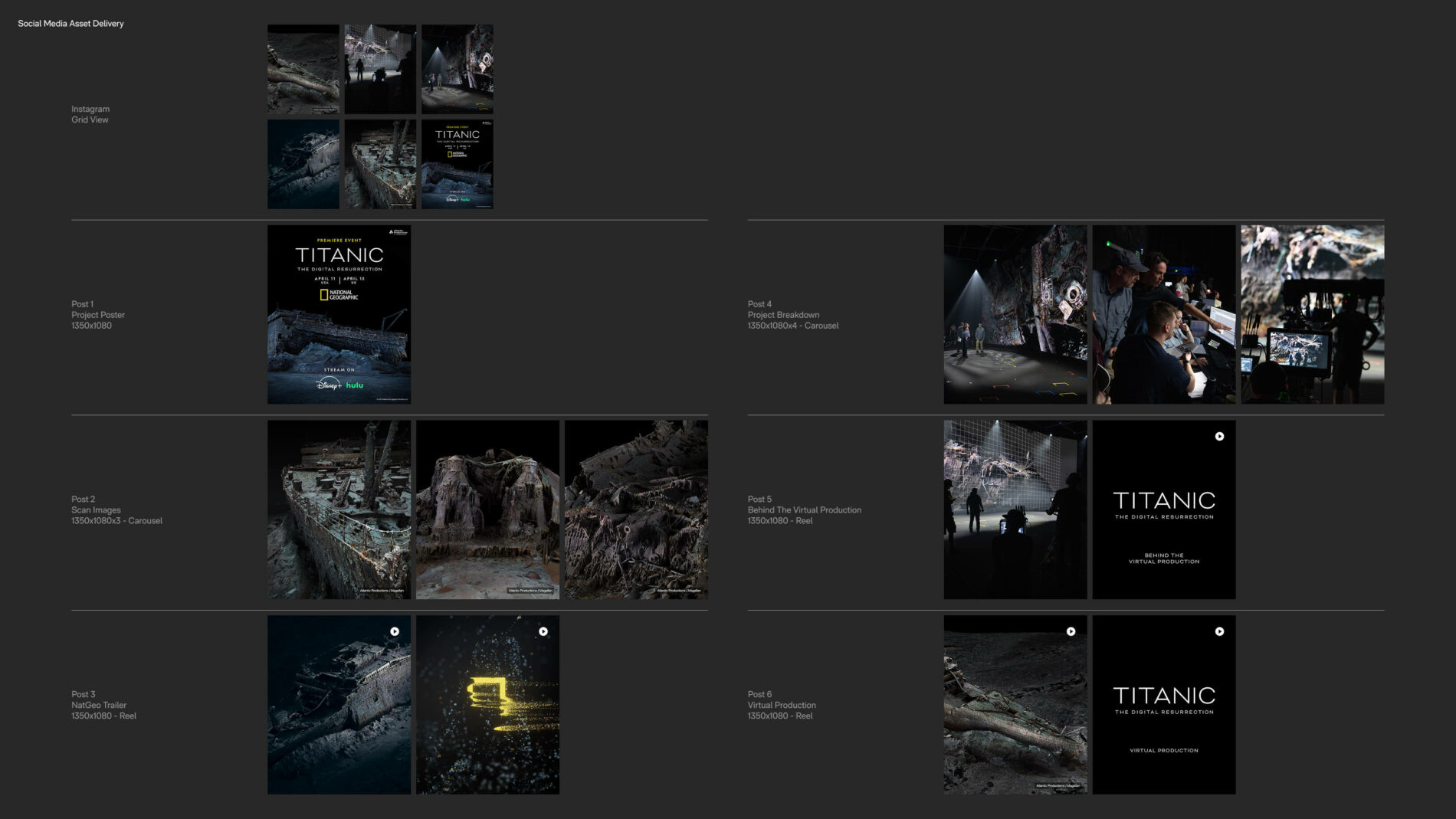
    Marketing & social — solo design of the hero poster, its adaptations across formats and territories, the rollout campaign across Instagram and LinkedIn, and the BTS photo curation

    Creative direction for motion — supplying direction to the motion designer who translated the 2D title-card system into the 3D opening sequence, informally as the brand owner

    The identity didn’t begin at delivery — it began at pitch. I designed the original pitch deck Atlantic Productions submitted to National Geographic, the deck that supported the successful commissioning of the documentary.

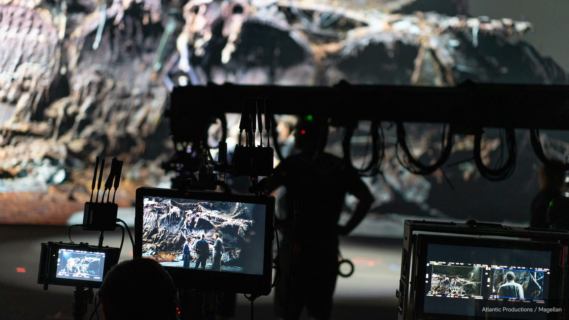
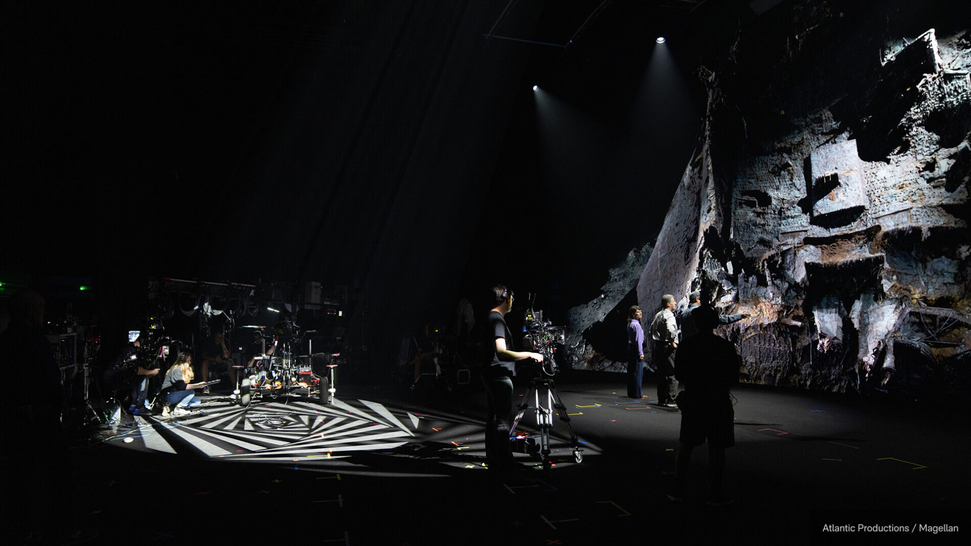
    Curating BTS without spoiling the film. A real, often-overlooked craft challenge: the marketing team had hundreds of BTS images from the virtual production shoot (a 23m-wide LED volume at Garden Studios, the wreck rendered at 8096×2816 across the wall) — material strong enough to give the campaign visual life, but laced with moments that would spoil the film if released in the wrong order. I curated and sequenced the imagery so the campaign teased without revealing, and timed releases against the staggered international broadcast and streaming windows so nothing landed early in a market still waiting to watch.

    The documentary went on to be nominated for the 2026 News & Documentary Emmy for Outstanding Graphic Design: Documentary — recognition for the design discipline itself, applied to this film.

    The work shipped on the world’s largest factual-content platforms, in an identity that holds across every format National Geographic puts it into. For me, the lasting lesson is how much of brand work for broadcast is what you write down for other people to use: the title looks the way it does because of the design decisions, but the title looks that way everywhere because of the document specifying how it must be applied.

    What I’d carry forward: the discipline of designing a system tight enough to be handed over and still hold. Documentary identity is unusual in that the designer rarely controls every surface it lands on — so the system itself, including its written rules, becomes a critical part of the deliverable.

    Atlantic Studios

  • Presentation Design

    Presentation Design

    Designing the decks that turn complex briefs into clear, persuasive narratives
    — for broadcasters, productions, brands and in-house teams.

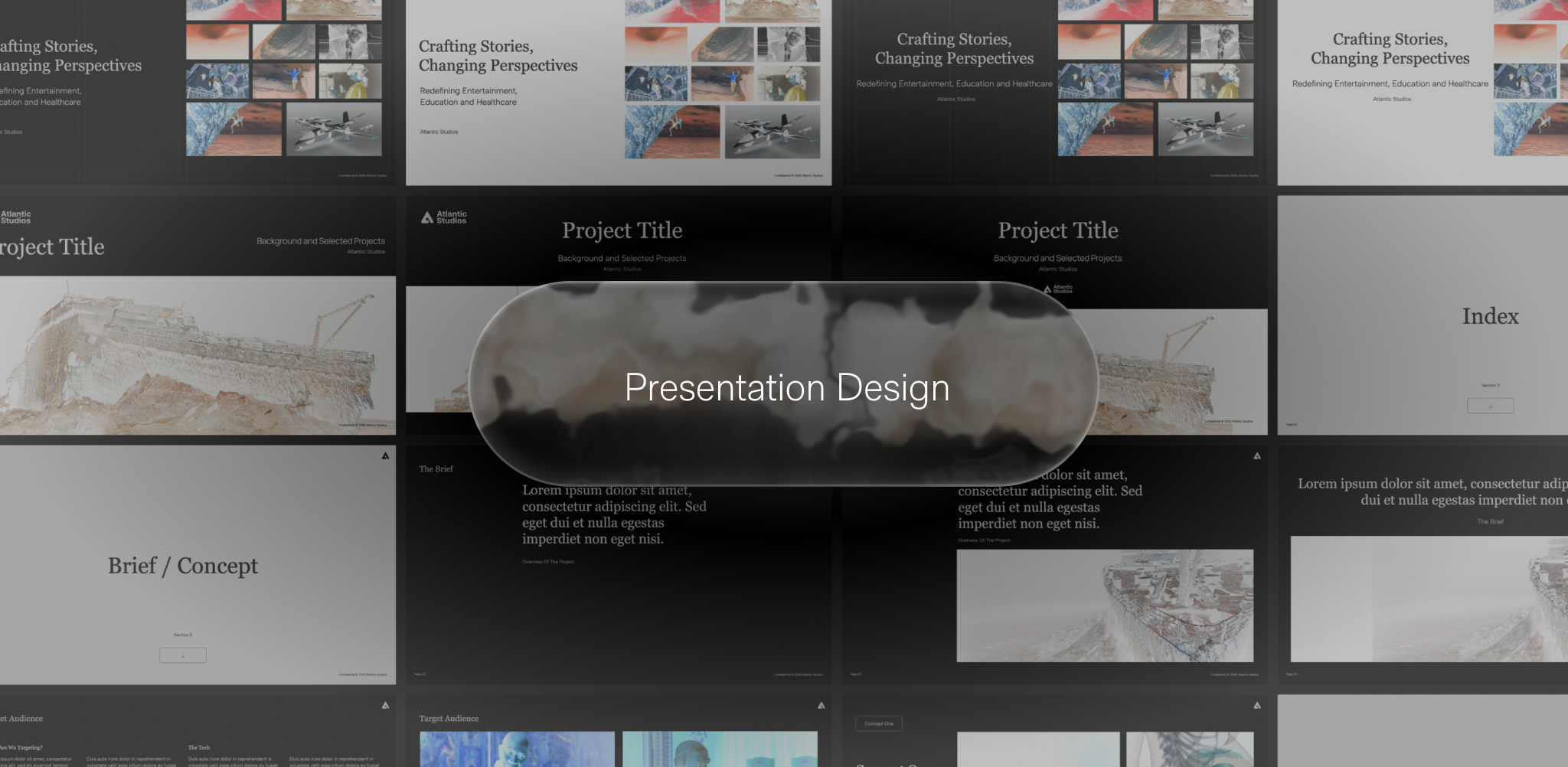
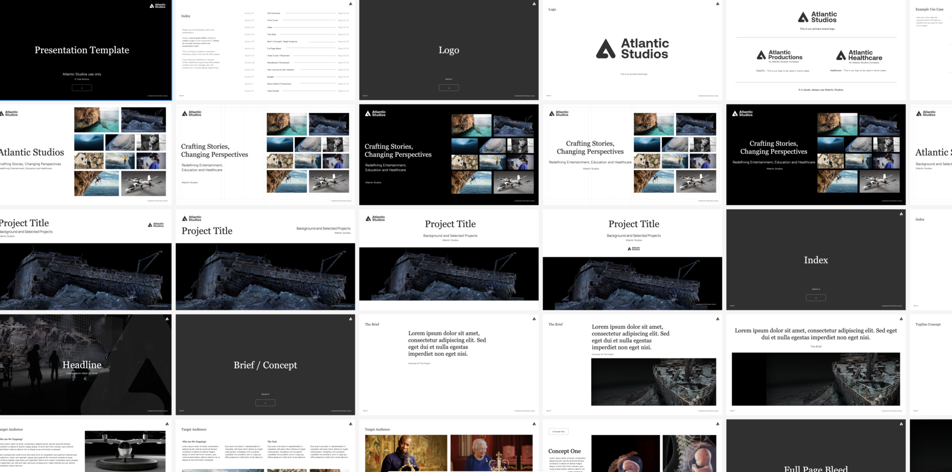
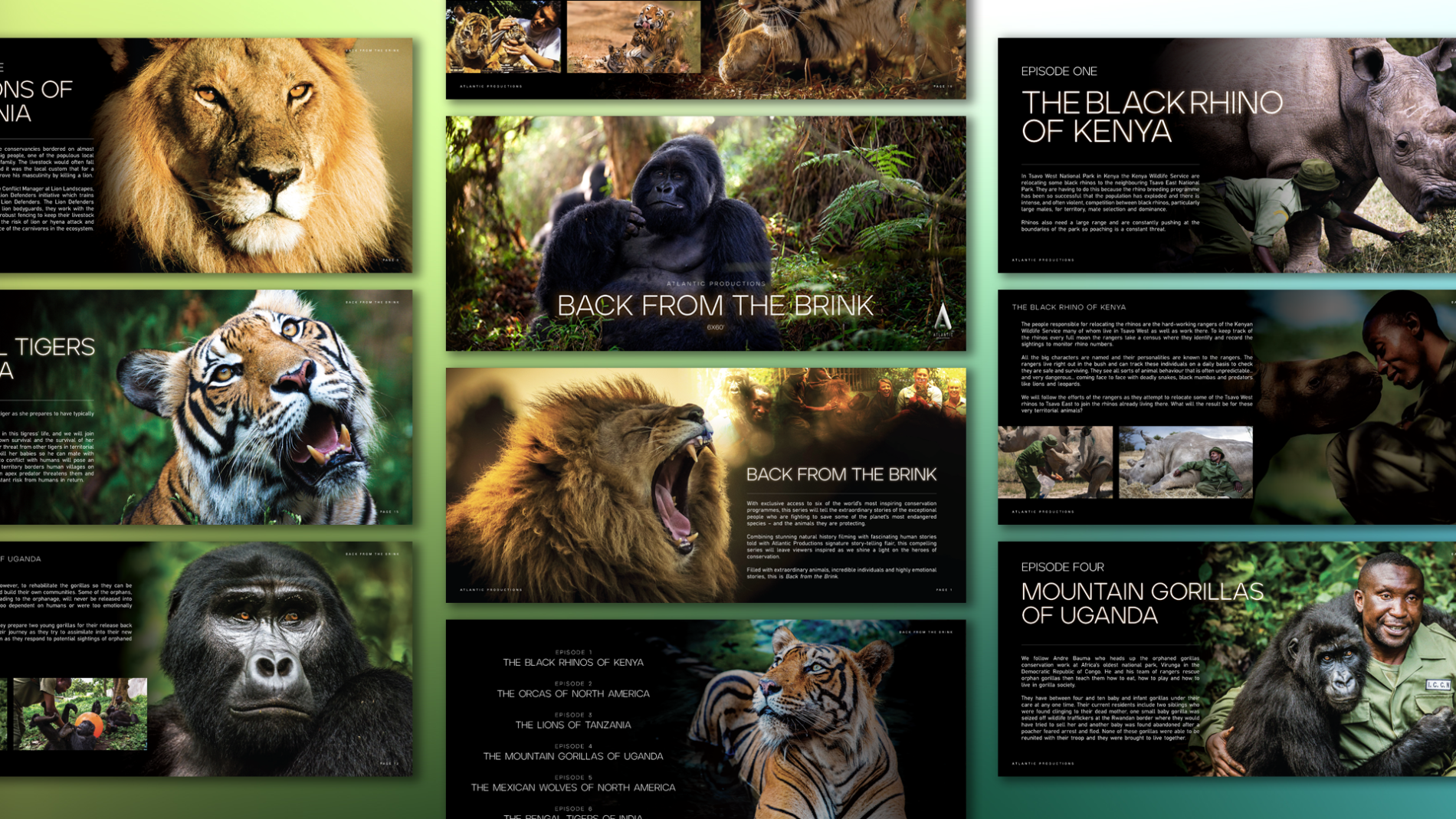
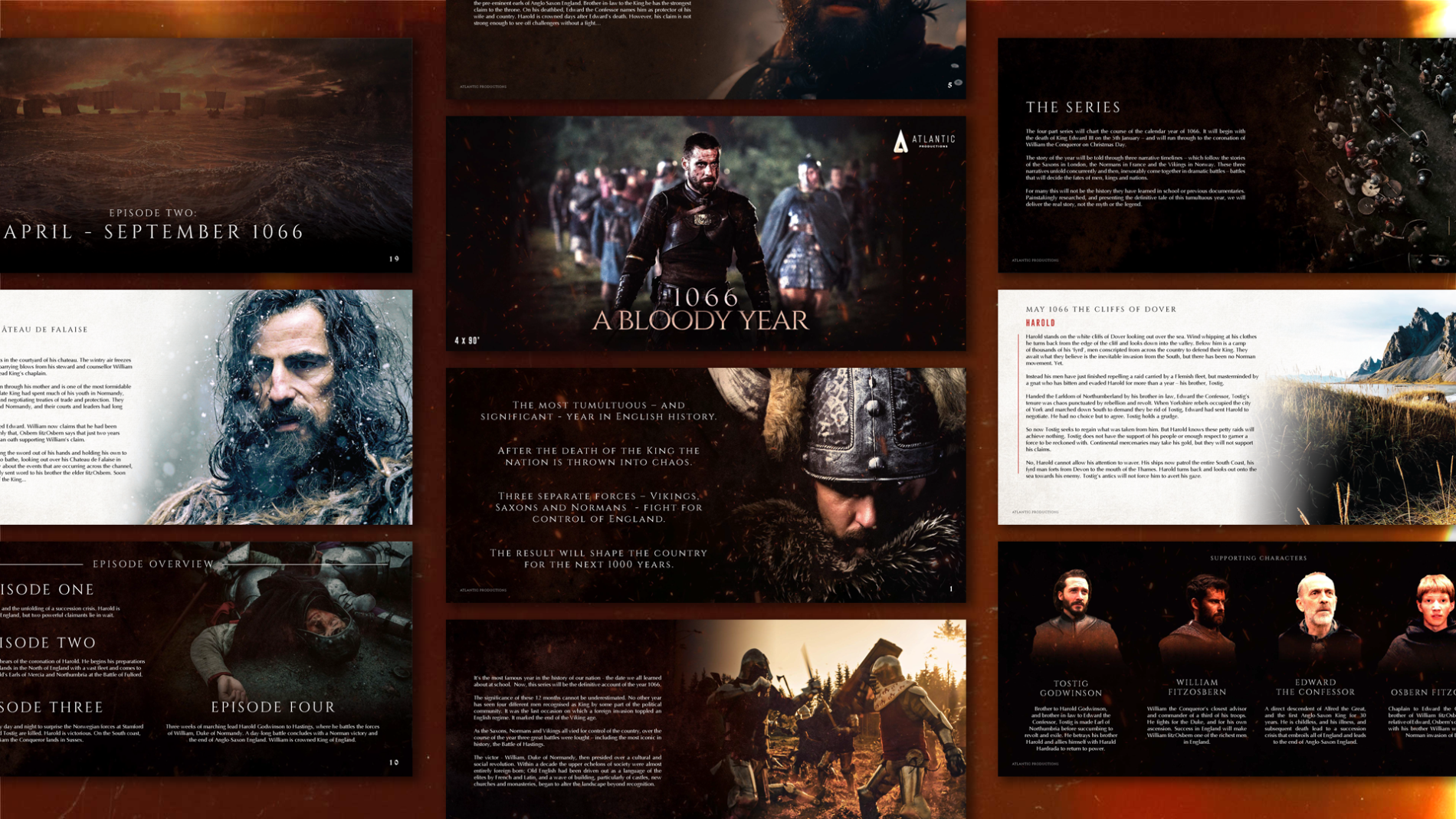
    Presentation design is one of the most consistent threads across the work — the deliverable that turns a strategy, a brief, a body of research or a brand into a story someone can decide on. I treat decks the way I treat any other design artefact: as a system of typography, hierarchy and image that earns the audience’s attention before it asks for their decision.

    / /

    UK

    Pitch decks — development, product, film/TV development, immersive
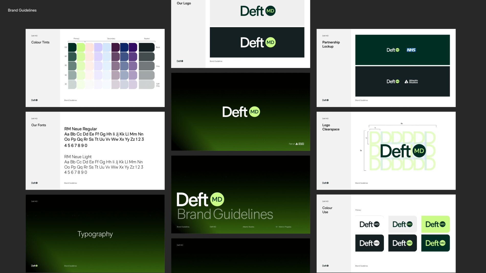
    Presentation Templates & In-house team resources
    Investor proposals
    Brand Guidelines & Brand books
    Brand Credentials documents
    RFP & Tender Proposals
    Commercial & Corporate presentation design

    Adobe InDesign,
    Apple Keynote
    Google Slides
    Microsoft PowerPoint
    Figma Slides

    Brand Assets

    Story before slides.

    Hierarchy is the first design decision.

    Brand carries through.

    Data earns its place.

    Designed for the screen it’s read on.

    Pitch decks

    Brand Consistency

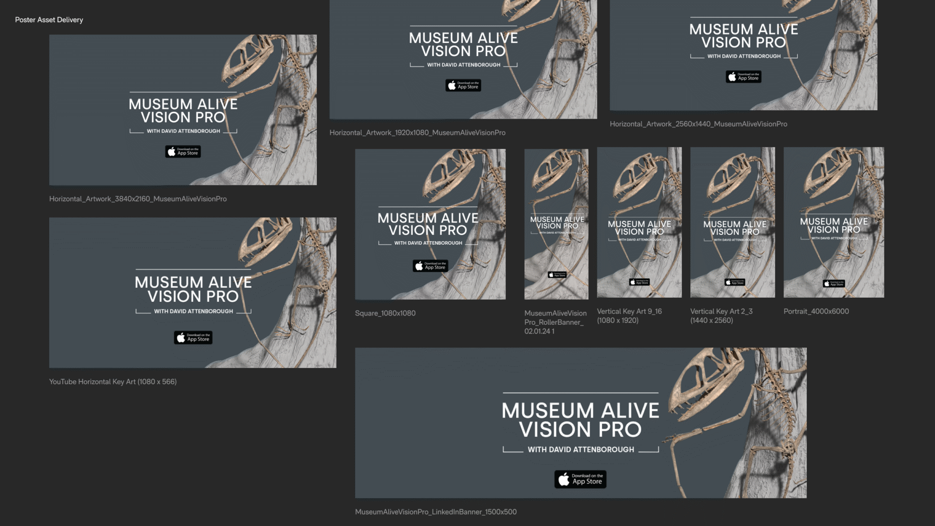
  • Museum Alive Vision Pro with David Attenborough

    Museum Alive Vision Pro with David Attenborough

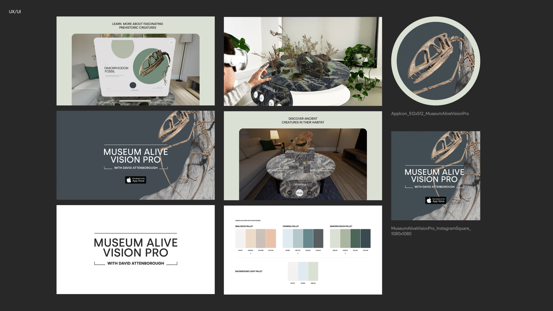
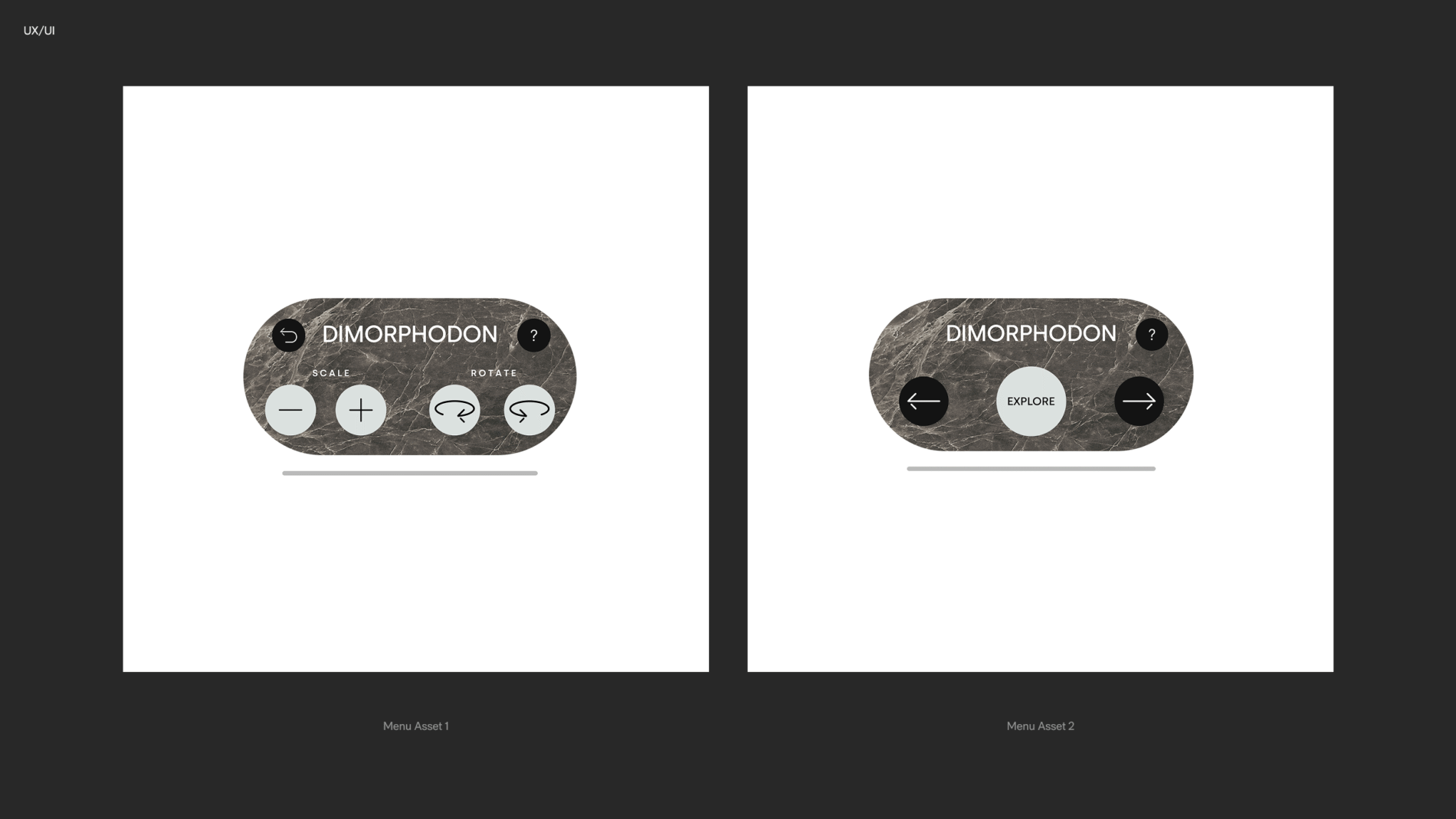
    Designing a UI system for a Spatial Reality experience for the early release of the Apple Vision Pro

    David Attenborough takes the user on a journey to select a scientifically accurate fossil from the museum and watch it come back to life in mixed reality on Apple Vision Pro.

    / /
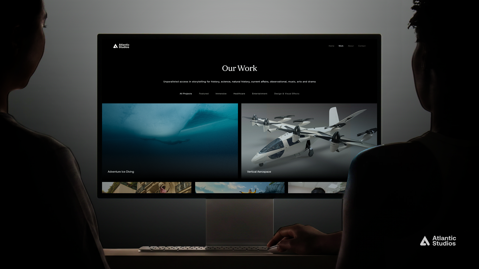
  • Atlantic Studios Rebrand

    Atlantic Studios Rebrand

    Brand Refresh whilst retaining thirty-years of heritage

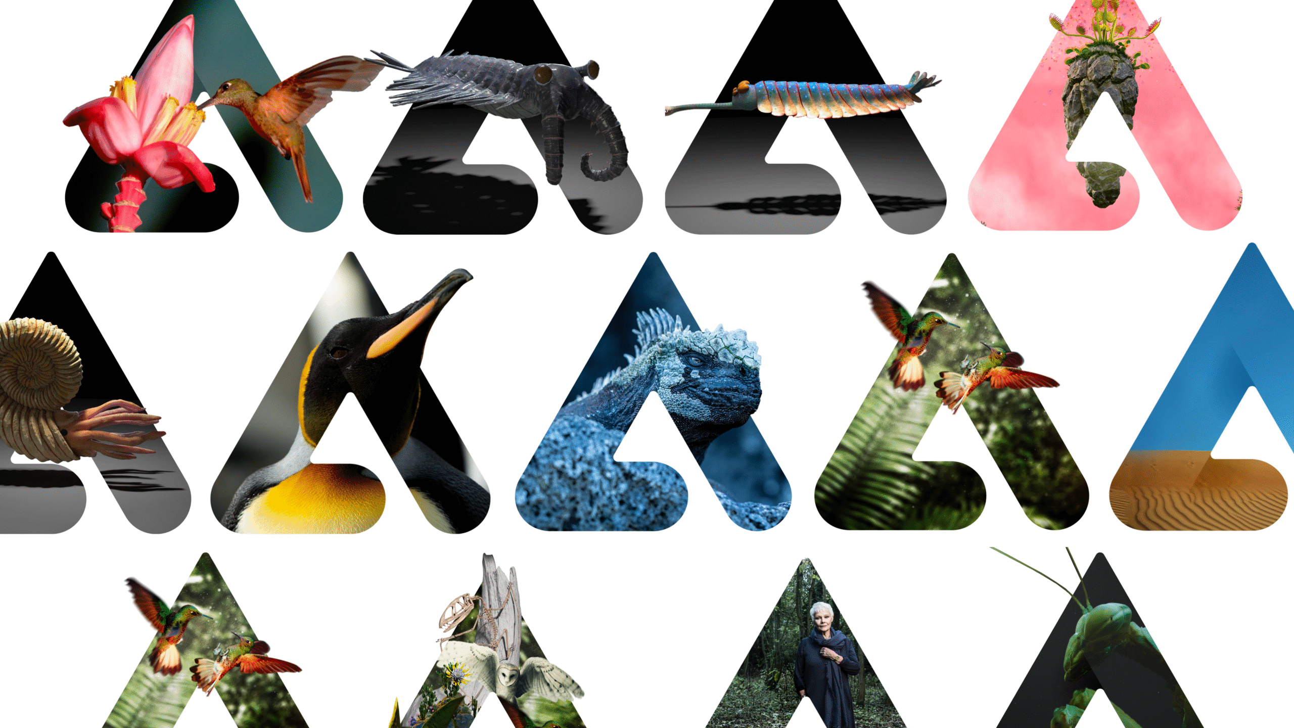
    Atlantic Productions transitioned into Atlantic Studios, aiming to further establish their presence in immersive technology and healthcare while reinforcing their reputation as leaders in innovation and storytelling.

    / /

    Immersive Studio

    UK

    Brand Identity
    Brand Refinement
    Brand Strategy
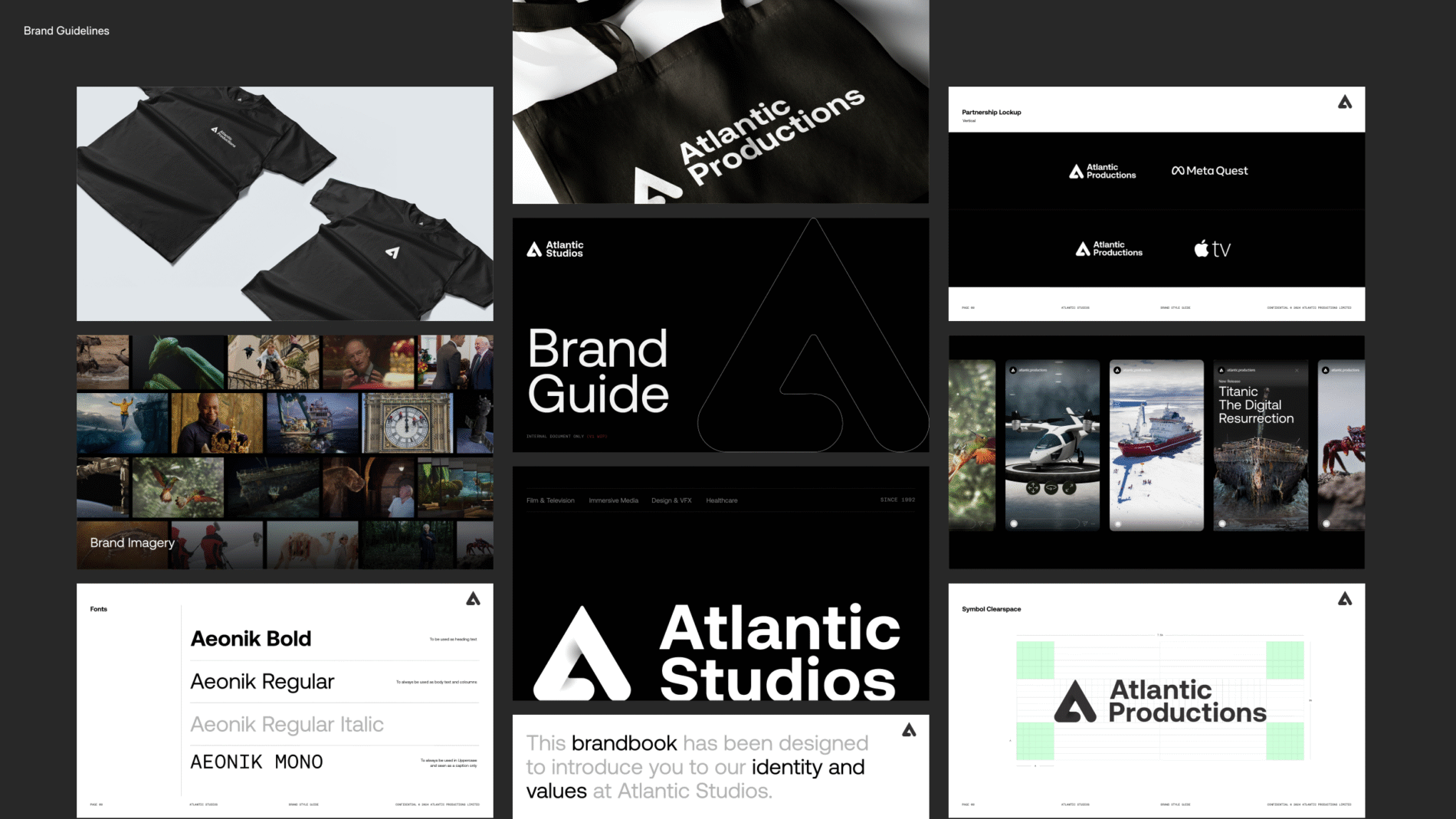
    Brand Guidelines
    Website Design
    Website Development

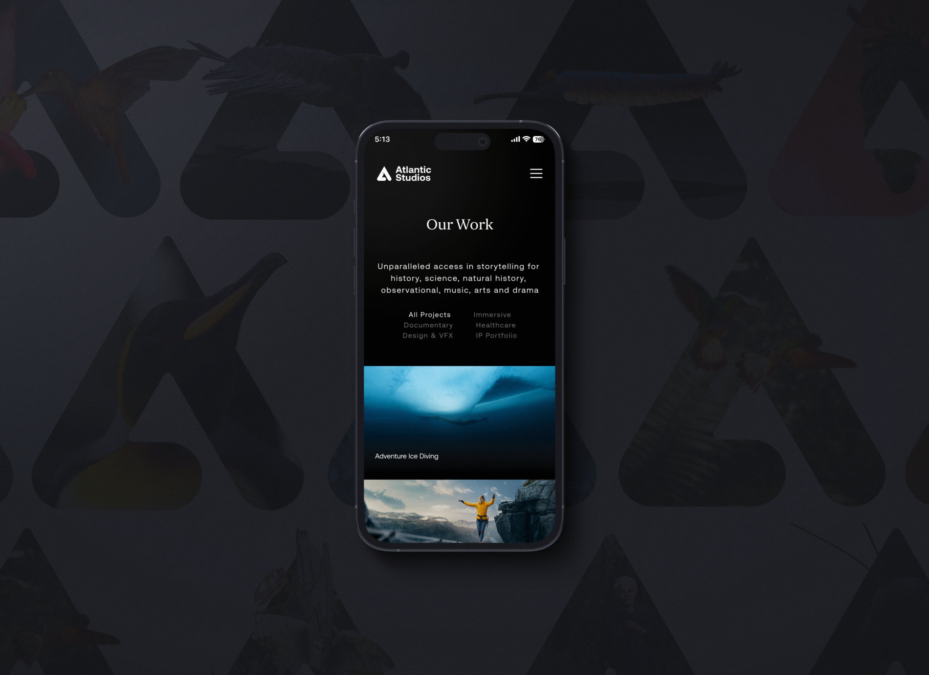
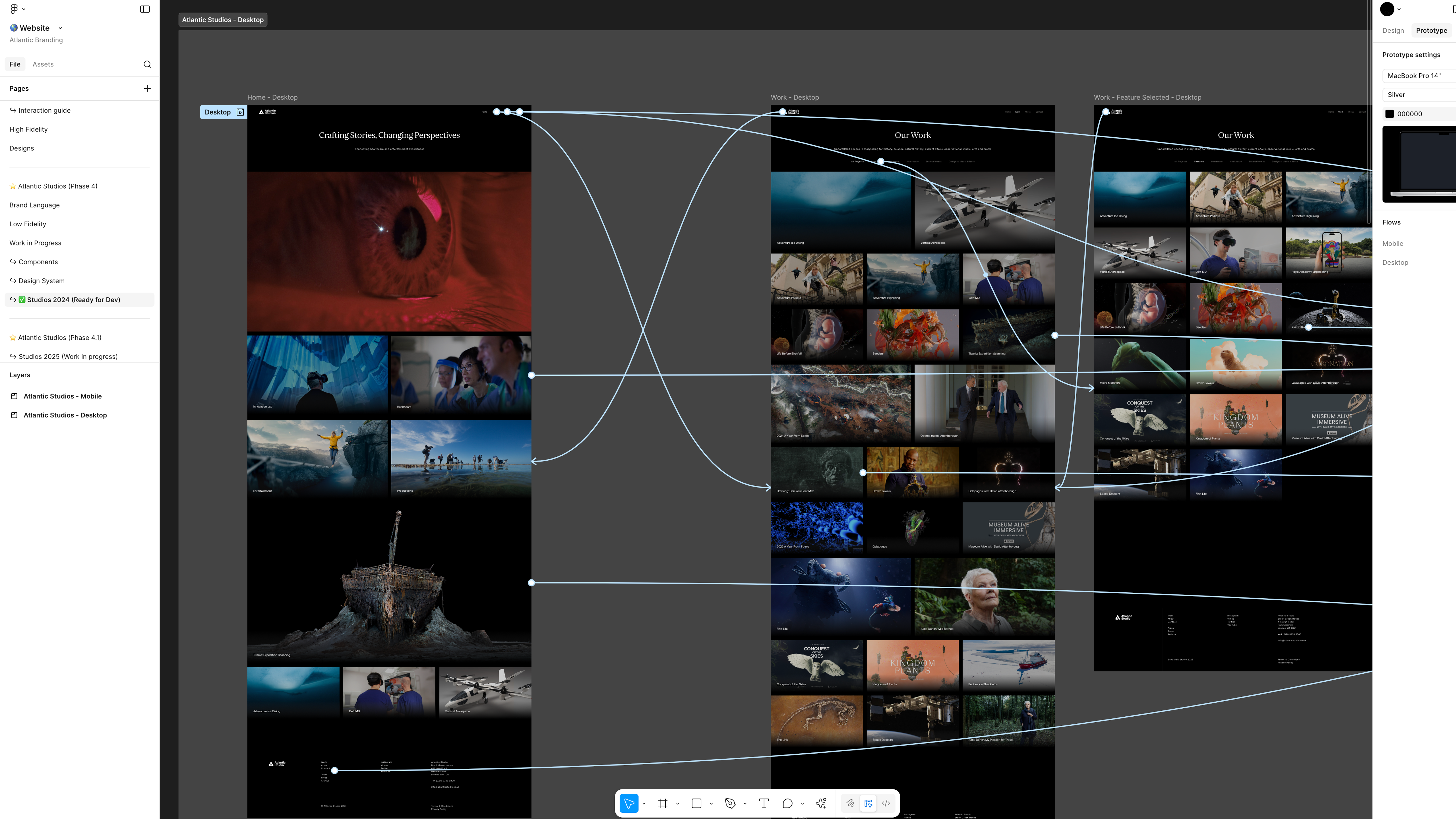
    I developed a design system applying atomic design principles to create reusable components and enabled both light and dark modes. Interaction testing ensured the experience was intuitive and mobile-friendly, aligning with modern usability standards. With the inclusion of updated brand guidelines, the refreshed brand identity not only improved usability, but also positioned the company as a future-facing leaders in technology.

    I personally owned:

    • Brand Website — logo, colour system, type styles, and the overall visual language
    • Design system — translating that identity into reusable UI: buttons and their states, navigation patterns, spacing/padding/gap systems
    • Interaction & flows — user flows for moving forward and back through the website
    • Stakeholder communication — building and presenting concepts to stakeholders strategic phase reviews

    I collaborated on the website build via a structured handover to a developer who embedded the system into the live WordPress site.

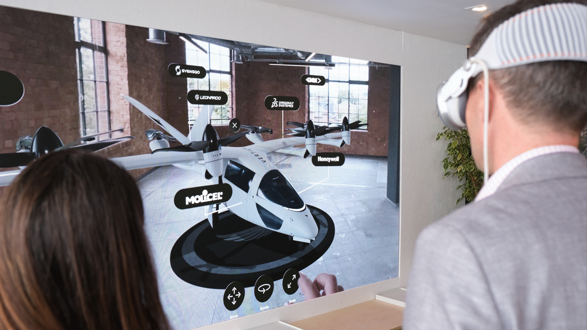
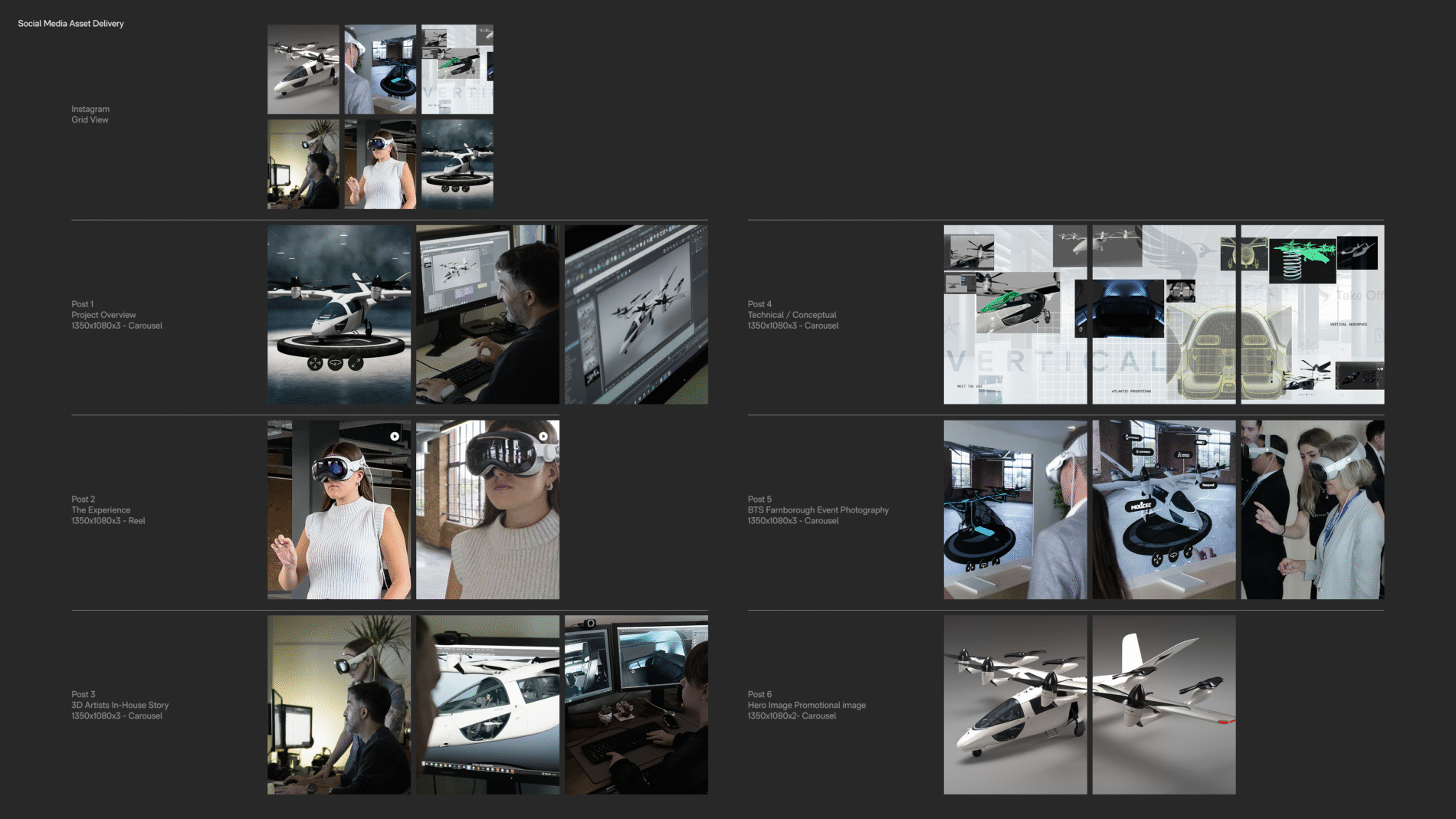
  • Vertical Aerospace MR

    Vertical Aerospace MR

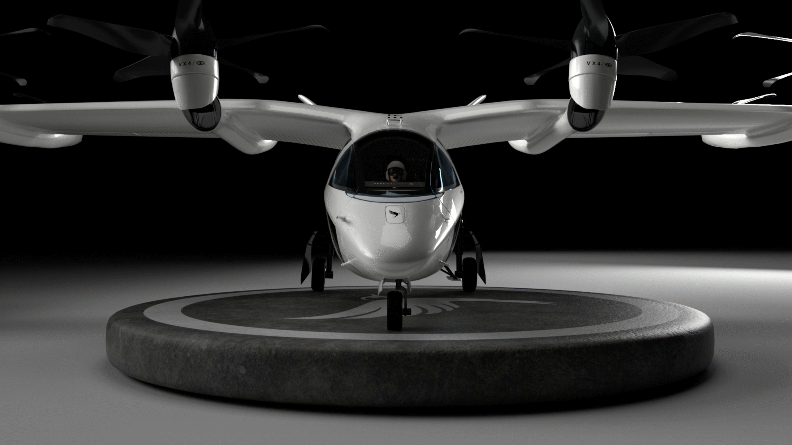
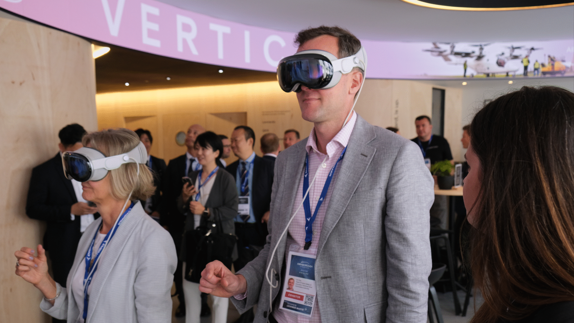
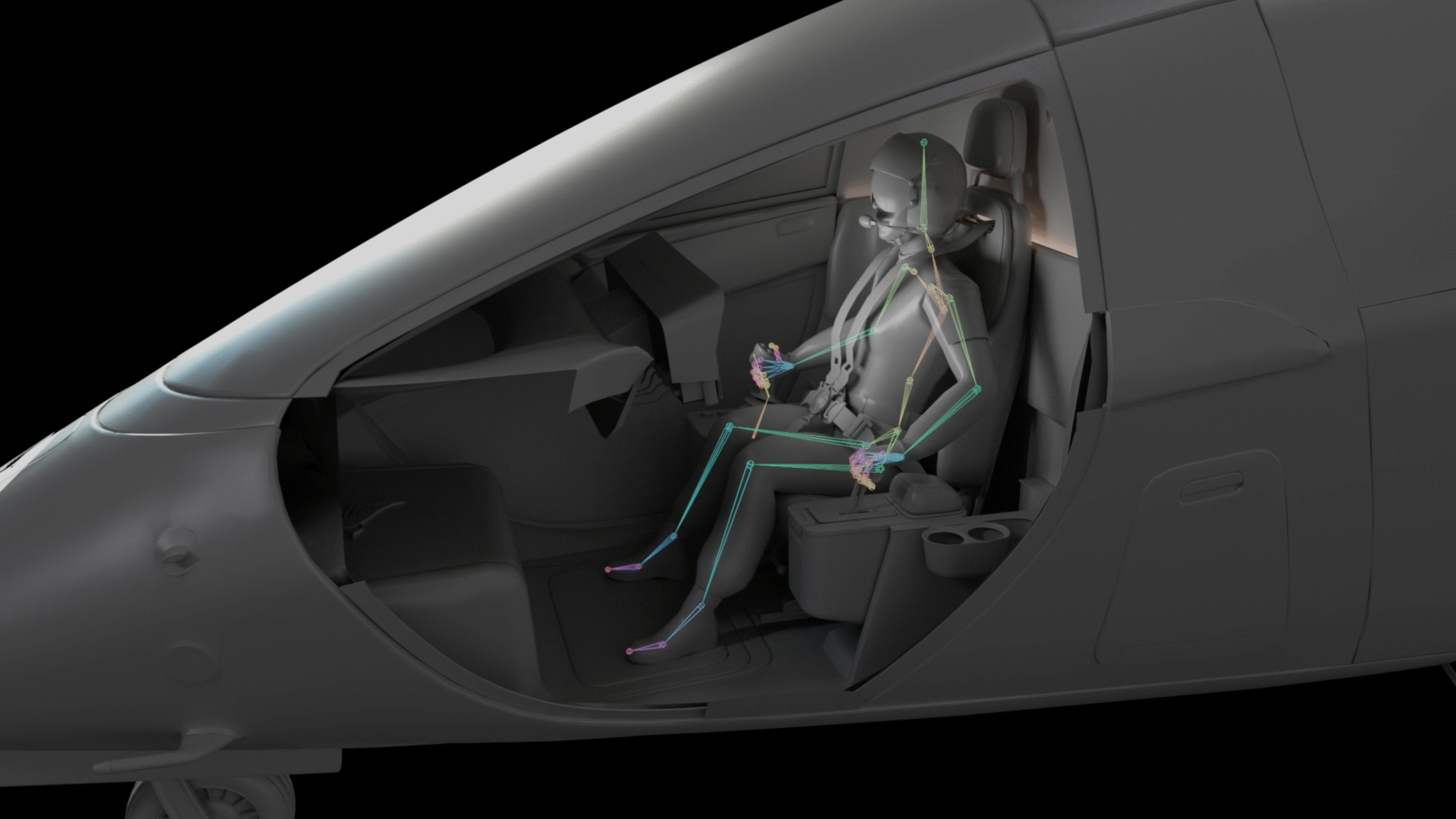
    Design UX/UI for a world-first immersive spatial experience designed for the Apple Vision Pro  – 
    showcased at Farnborough International Airshow 2024

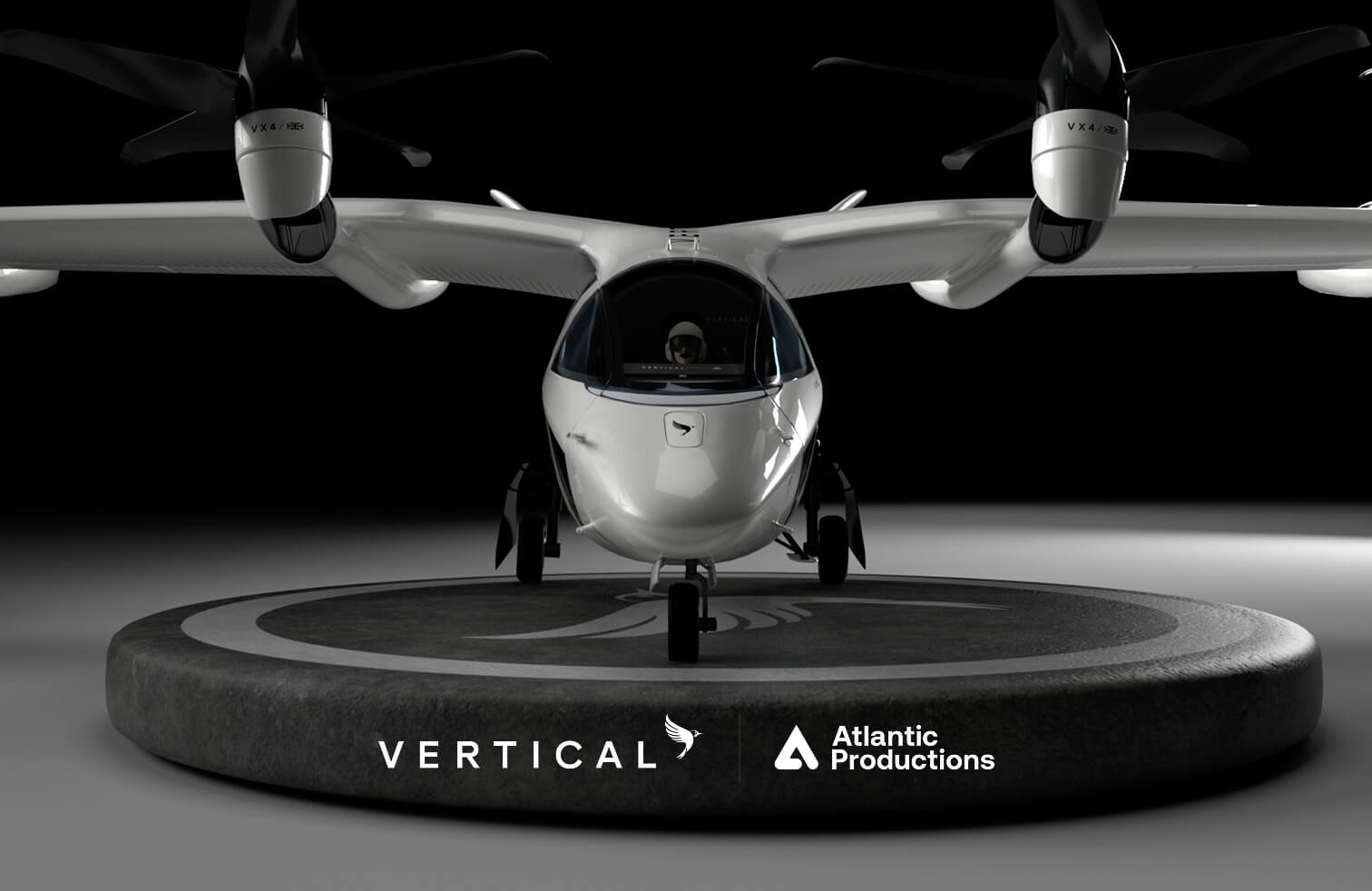
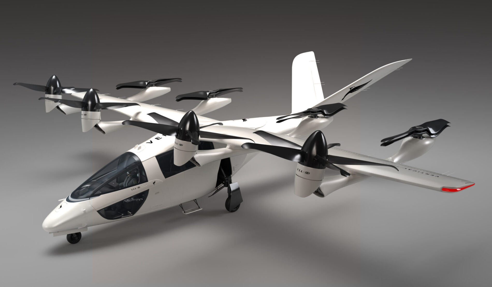
    Atlantic Productions partnered with Vertical Aerospace to bring their pioneering fully electric vertical take-off and landing aircraft to life on Apple Vision Pro.

    / /

    Aviation and Aerospace

    UK

    User Interface Design
    User Experience Design
    Social Media Strategy
    Social Media Assets

    With deep research into the brand guidelines, my role was to create the user experience and interface to take you on the journey showcasing the aircraft working with the features and parameters of a spatial design.

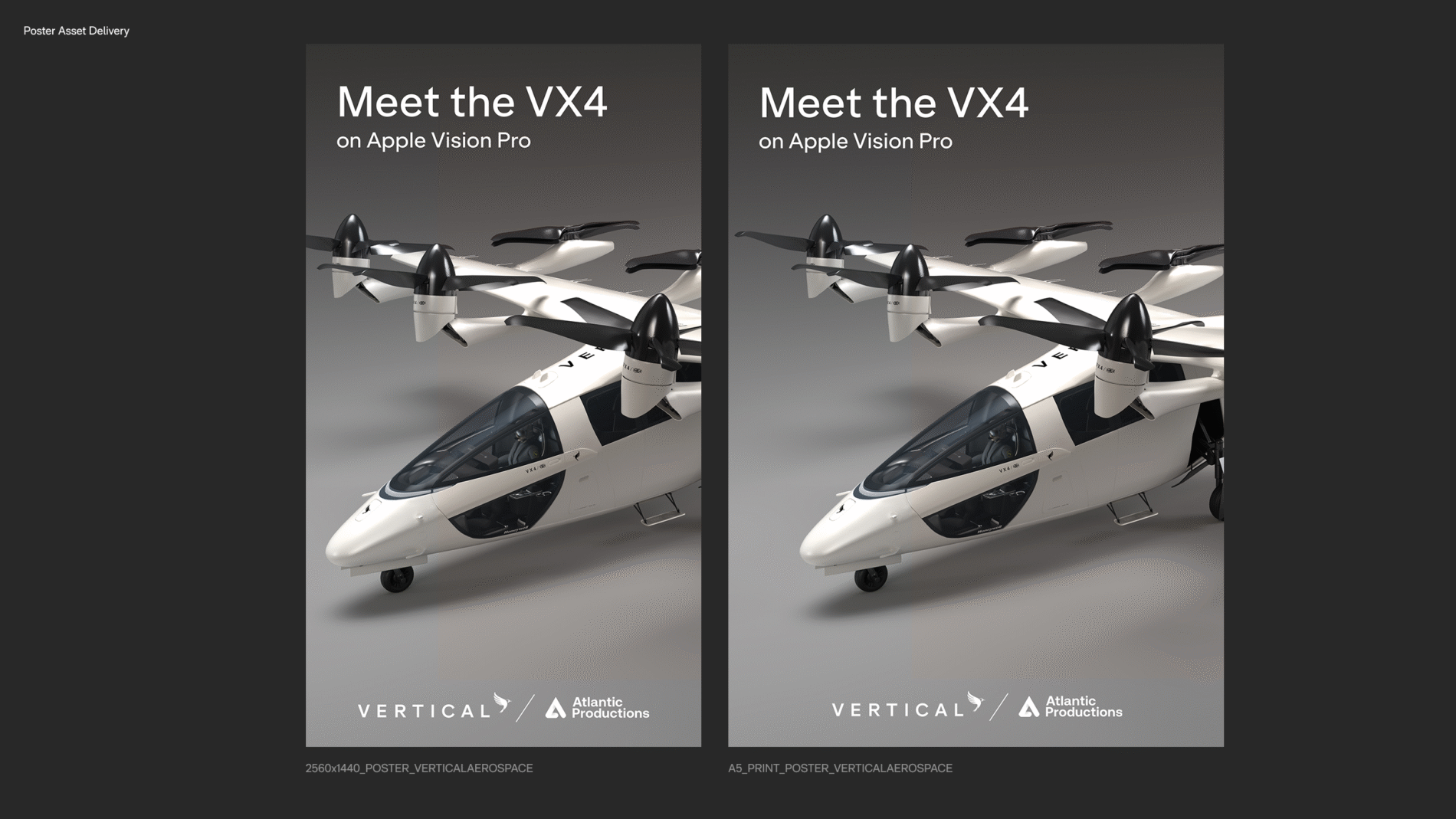
    My role was also present the production process across social media platforms for both Atlantic Studio and Vertical Aerospace.