• Protected: Nestlé Innovation Centre

    Protected: Nestlé Innovation Centre

    This content is password-protected. To view it, please enter the password below.

  • Cosmos Unseen Black Holes VR

    Cosmos Unseen Black Holes VR

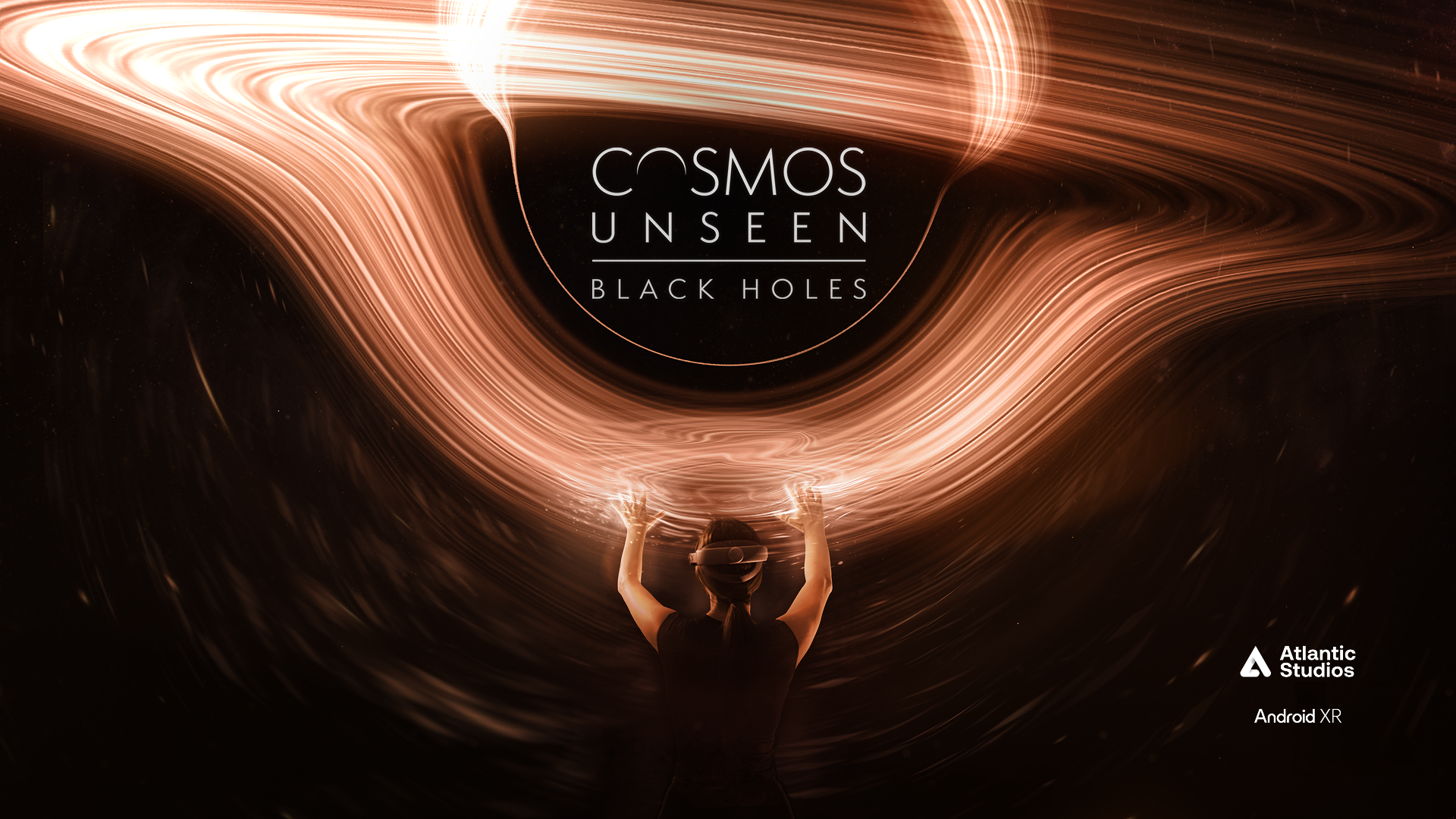
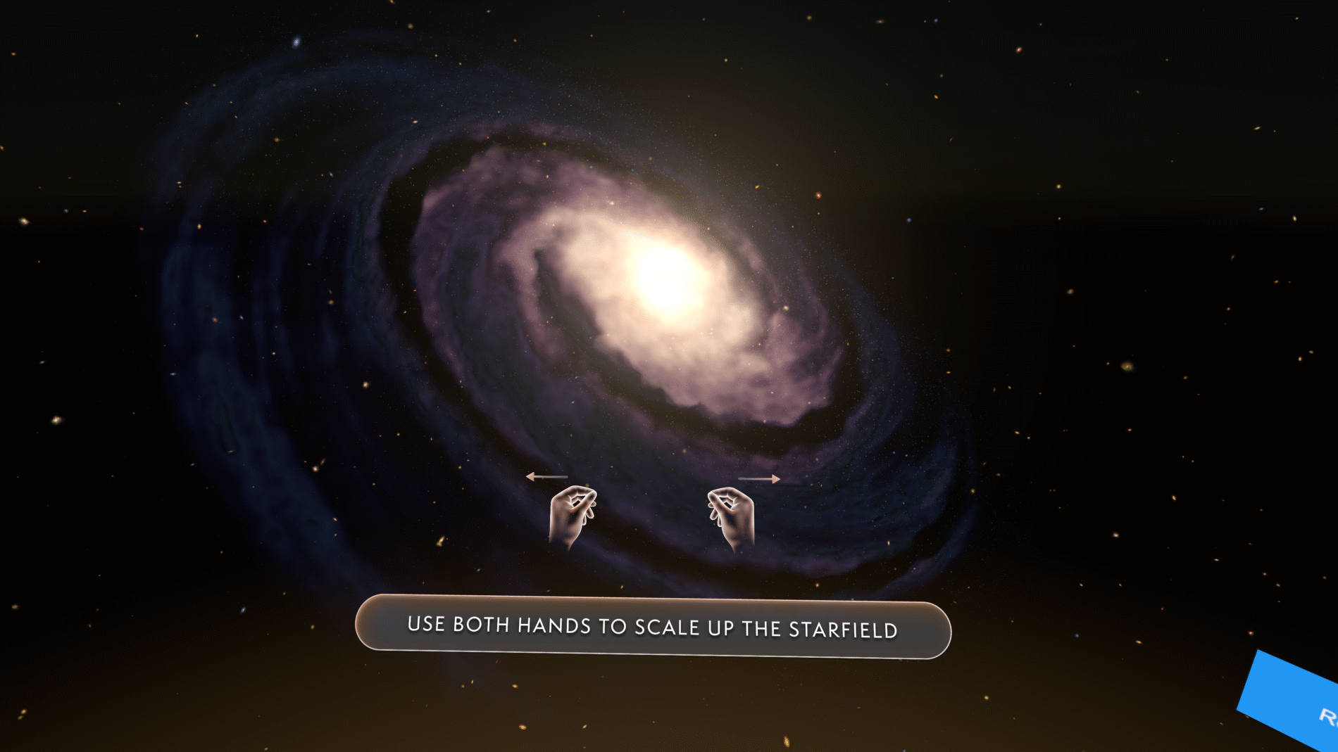
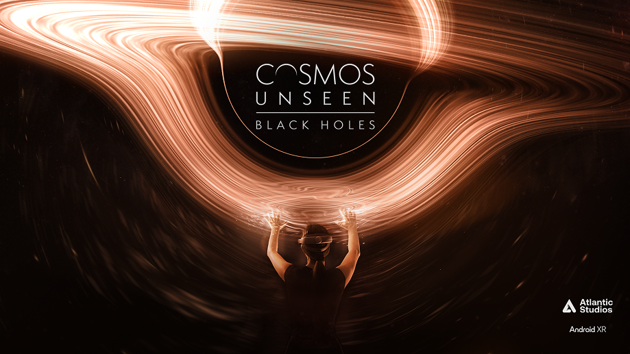
    Cosmos Unseen: Black Holes is a narrative-led VR experience that takes you on a cosmic voyage through the universe — getting hands-on with galaxies, black holes and the very fabric of space and time. I defined the visual identity, translated it into a scalable design system in Figma, and designed the UI, interaction language and gesture guidance for the experience, working alongside developers building it in Unity.

    / /

    The brief sat at the intersection of two hard problems.

    How do you guide someone through a story in 360° space without breaking immersion or losing them? In a flat app, the screen contains the user. In VR, the user can look anywhere — so the UI has to direct attention, signal what’s interactive, teach a gesture, and hand over control at the right moment, all without shattering the sense of being inside the cosmos. Every interface element is a potential intrusion into the experience.

    How do you design an interface for a platform nobody has designed for yet? This was built for the early Android XR release. The conventions a UI designer normally relies on weren’t settled — and that uncertainty ran through every decision below.

    On top of both: the UI had to feel like a natural extension of the identity of the cosmos itself — elevated, atmospheric, consistent — while staying intuitive, accessible, and resilient to a narrative that kept evolving through stakeholder feedback.

    The real question wasn’t “what should the buttons look like?” It was “how much UI can disappear, and how do we guide without intruding?”

    I want to be precise about ownership, because this was a cross-functional project:

    I personally owned:

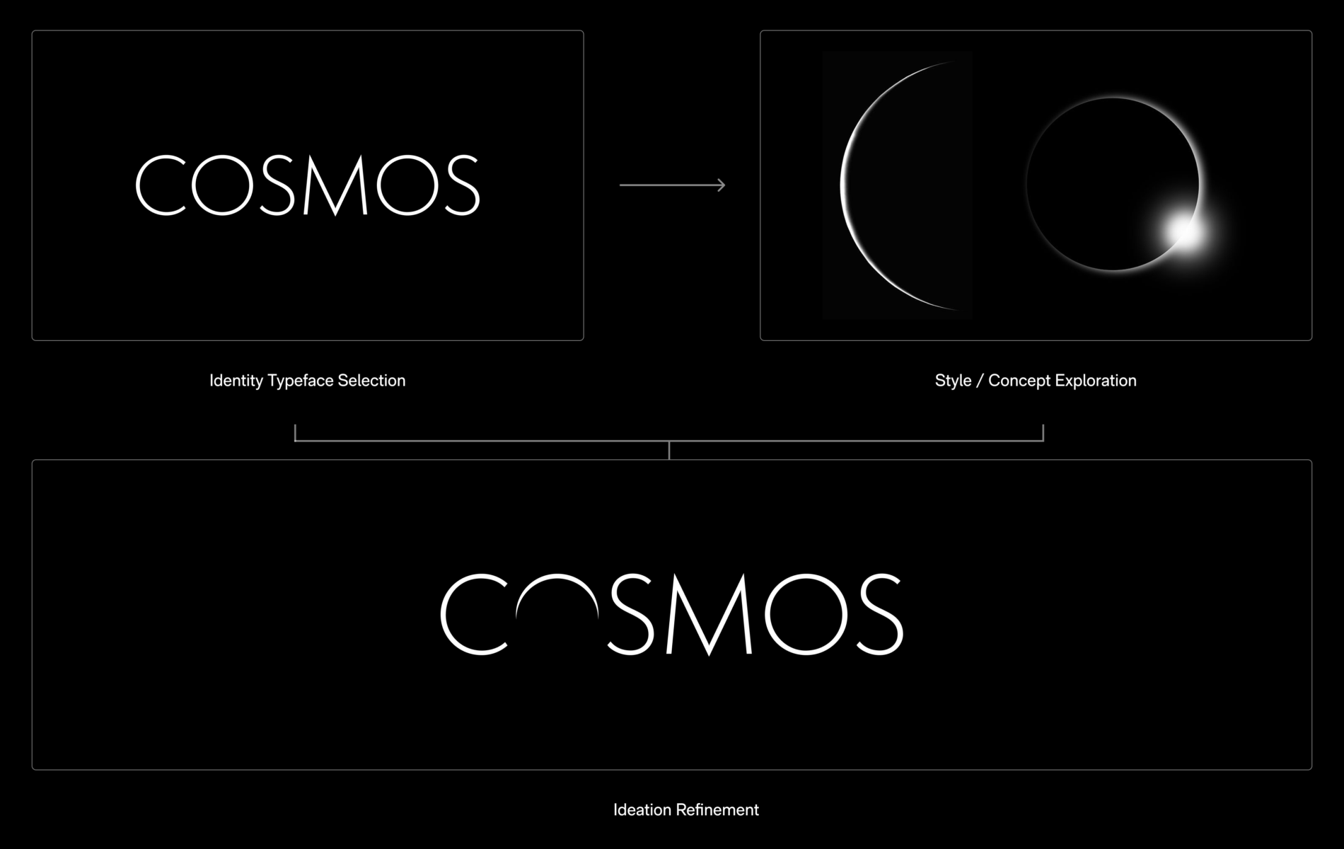
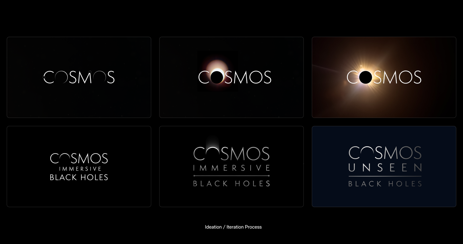
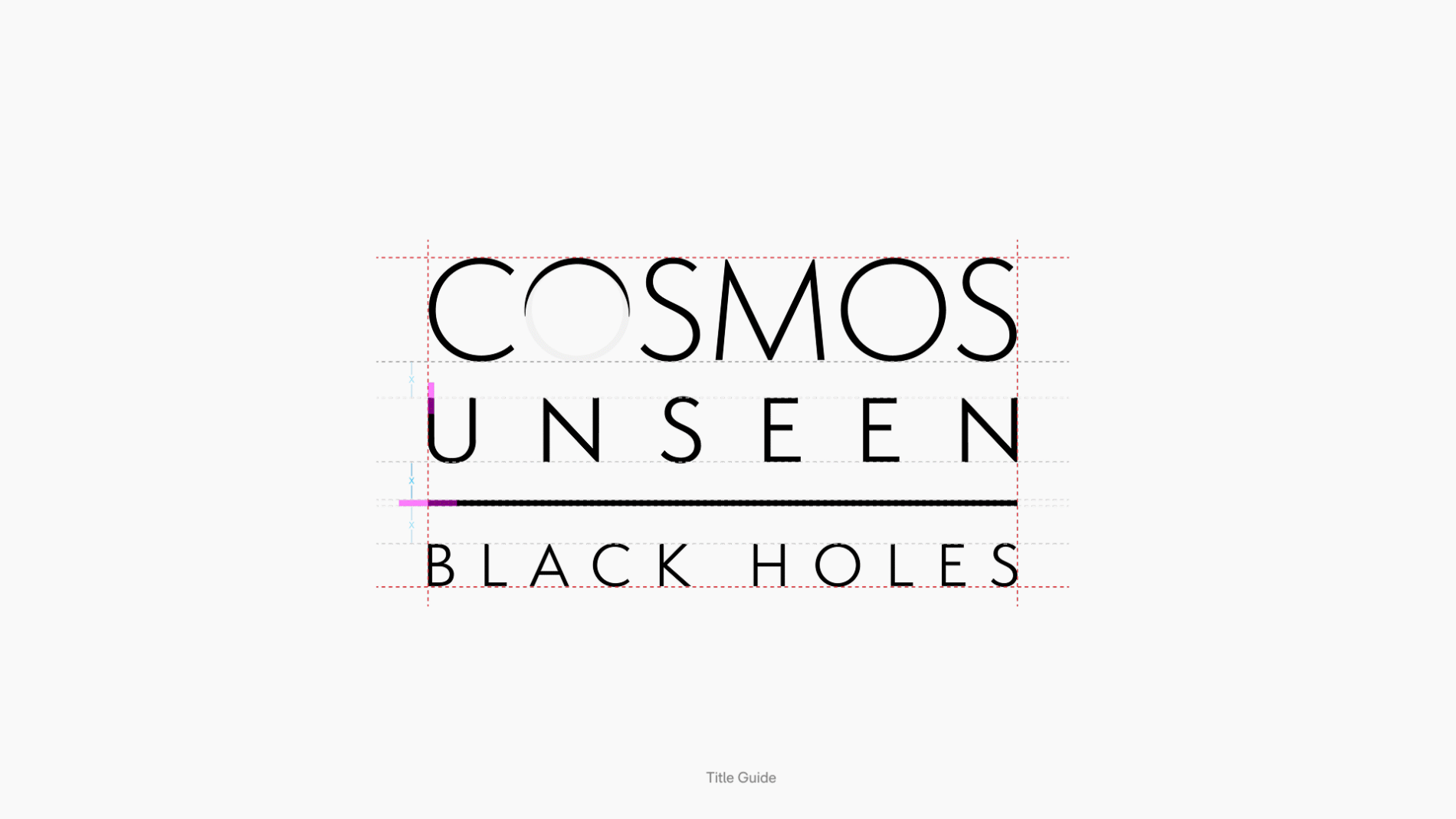
    • Visual identity — translating an abstract subject (black holes, the fabric of spacetime) into a coherent, ownable visual language, including the 2D title lockup and chapter title system
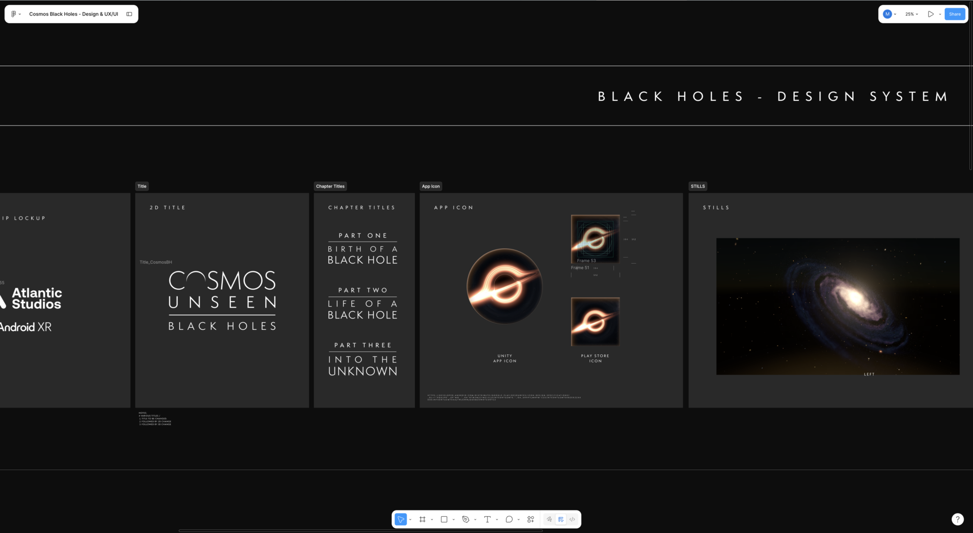
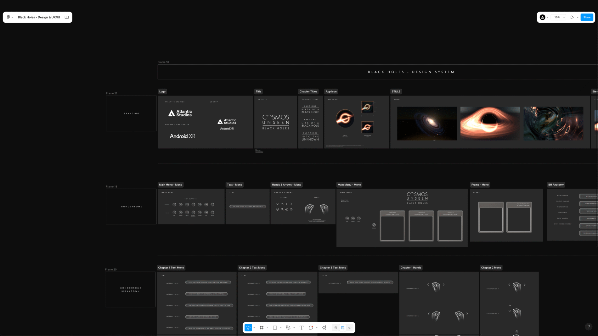
    • Design system — a scalable, component- and variable-driven system in Figma, built to be handed to developers
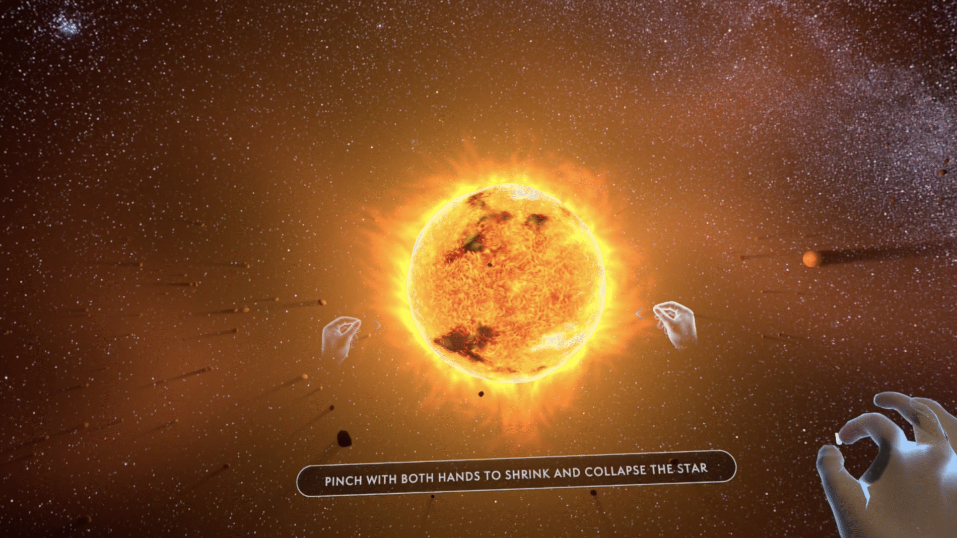
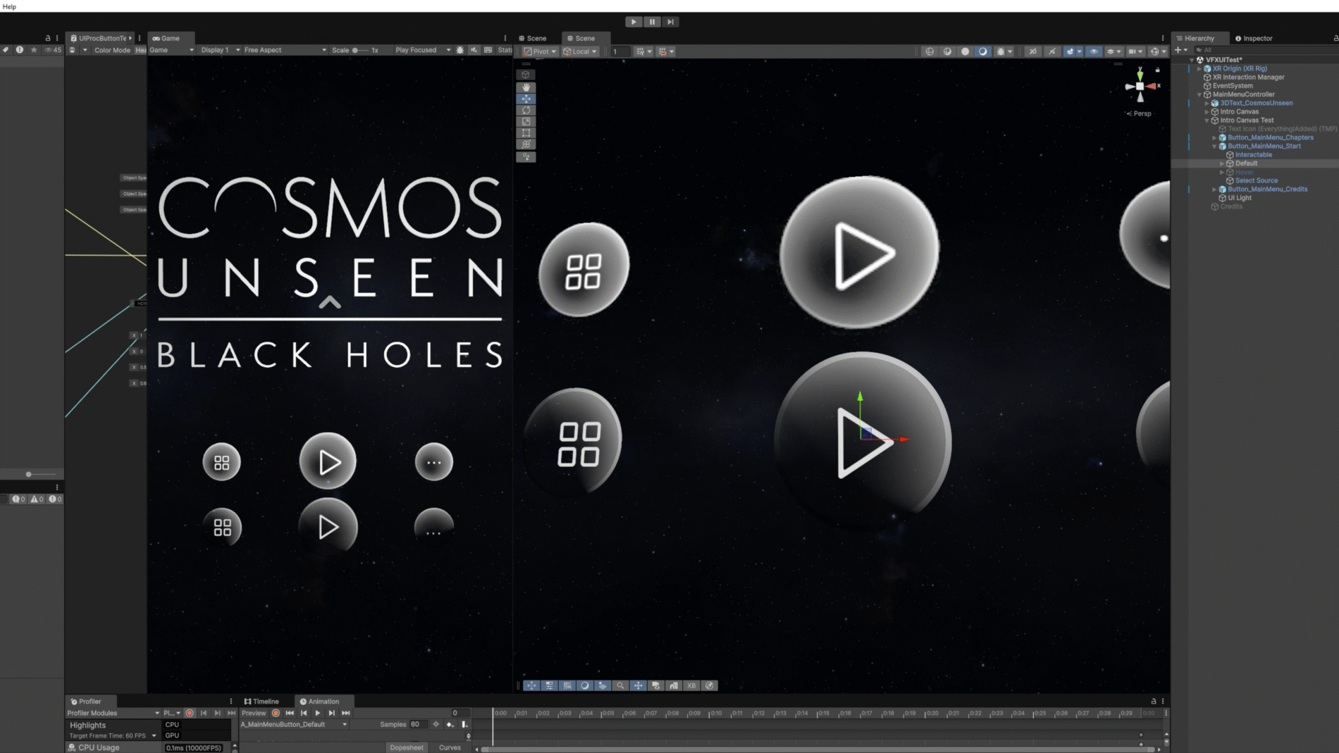
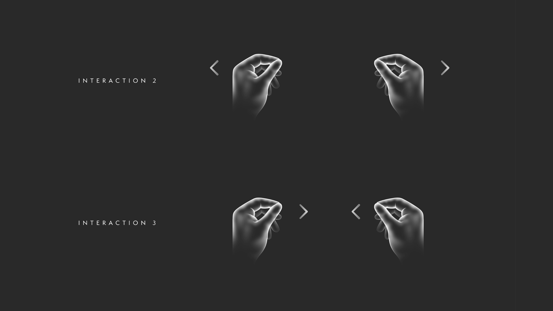
    • UX/UI & interaction language — the interface and the gesture-guidance copy: main-menu and chapter navigation, hand-gesture cues, information placement, and the flow through the experience
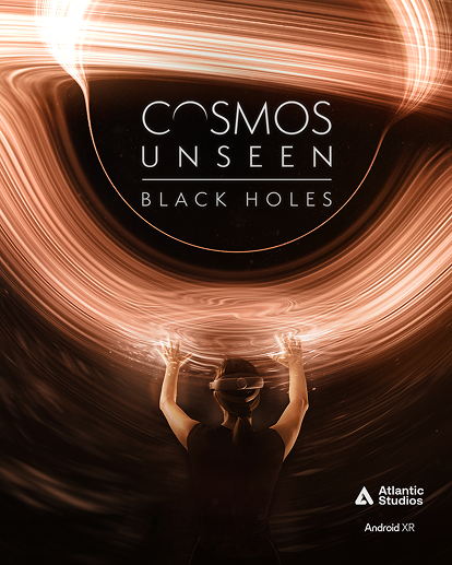
    • Marketing & social — poster asset delivery across multiple platforms and social content structures, all derived from the same identity

    I collaborated with: Unity developers implementing the experience in-headset, and stakeholders across end-of-sprint reviews.

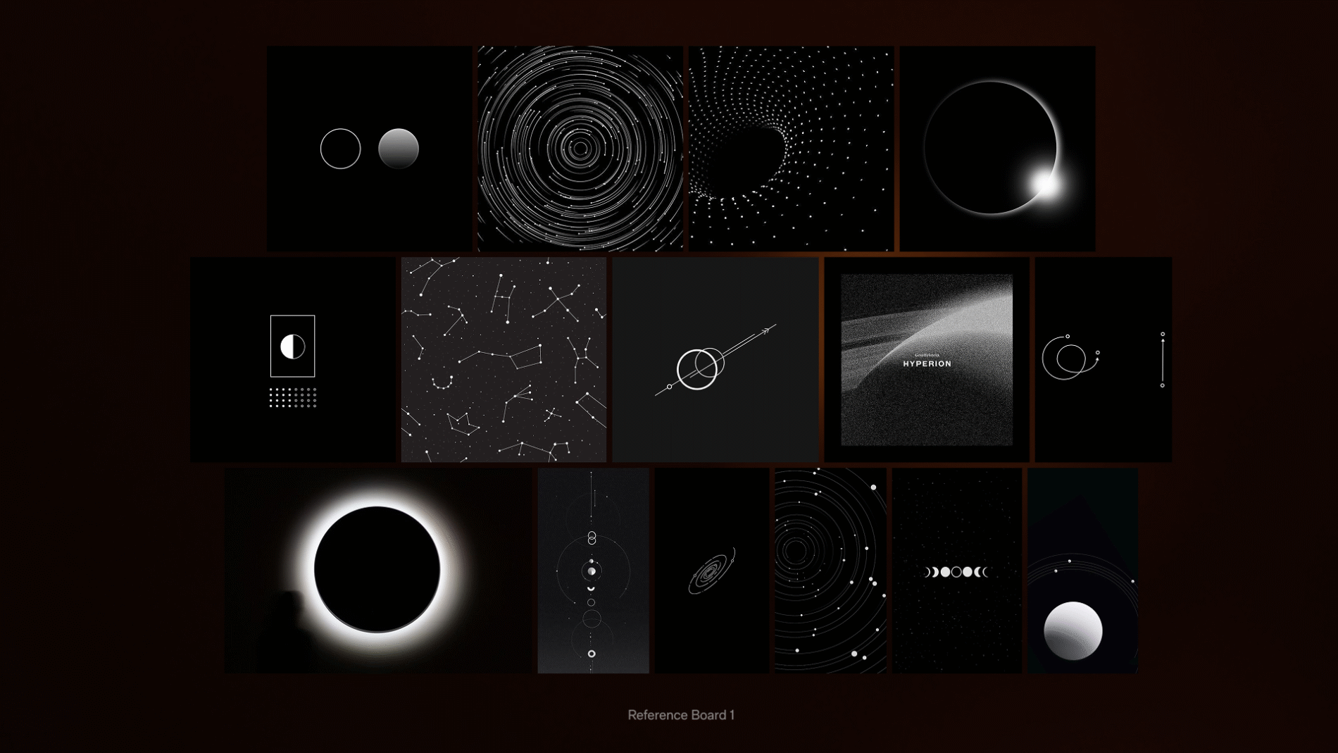
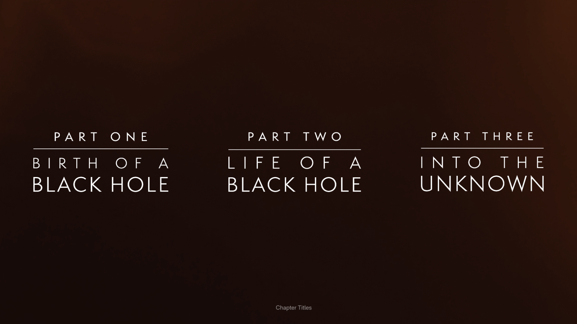
    A black hole is, almost by definition, hard to picture. I built reference and mood boards — split into General, Identity and Intro Reference — exploring how cosmic phenomena form, and how light, gradient and motion could carry meaning. The way light bends around an eclipse, the way a starfield resolves into structure: these became the visual DNA tying the brand, the interface and the marketing together. From this, the identity resolved into a refined title lockup — Cosmos Unseen: Black Holes — and a three-part chapter structure: Birth of a Black Hole, Life of a Black Hole, and Into the Unknown.

    A real constraint shaped the marketing work: the Moohan headset was still under NDA, so the campaign couldn’t show the device. I ran dedicated exploration boards to solve this — Hand POV, Silhouette, Scale, Light Silhouette — working out how to convey an immersive headset experience through hands, light leaks, silhouette and a sense of cosmic scale, rather than the product itself. The discipline of selling the experience on atmosphere alone kept the identity focused on the cosmos, not the kit.

    The experience was informed by serious astrophysics. Its scientific direction drew on work associated with institutions including the UCLA Galactic Center Group, the University of Sussex, and the Event Horizon Telescope collaboration, and the broader field shaped by researchers such as Sir Roger Penrose, Dr Priyamvada Natarajan and Dr Ziri Younsi. Working to an end-of-sprint cadence, the team confirmed and clarified tasks, secured sign-offs, and set responsibilities for the next sprint — keeping the creative work accountable to the underlying science.

    A real, semantic system — not a sticker sheet.
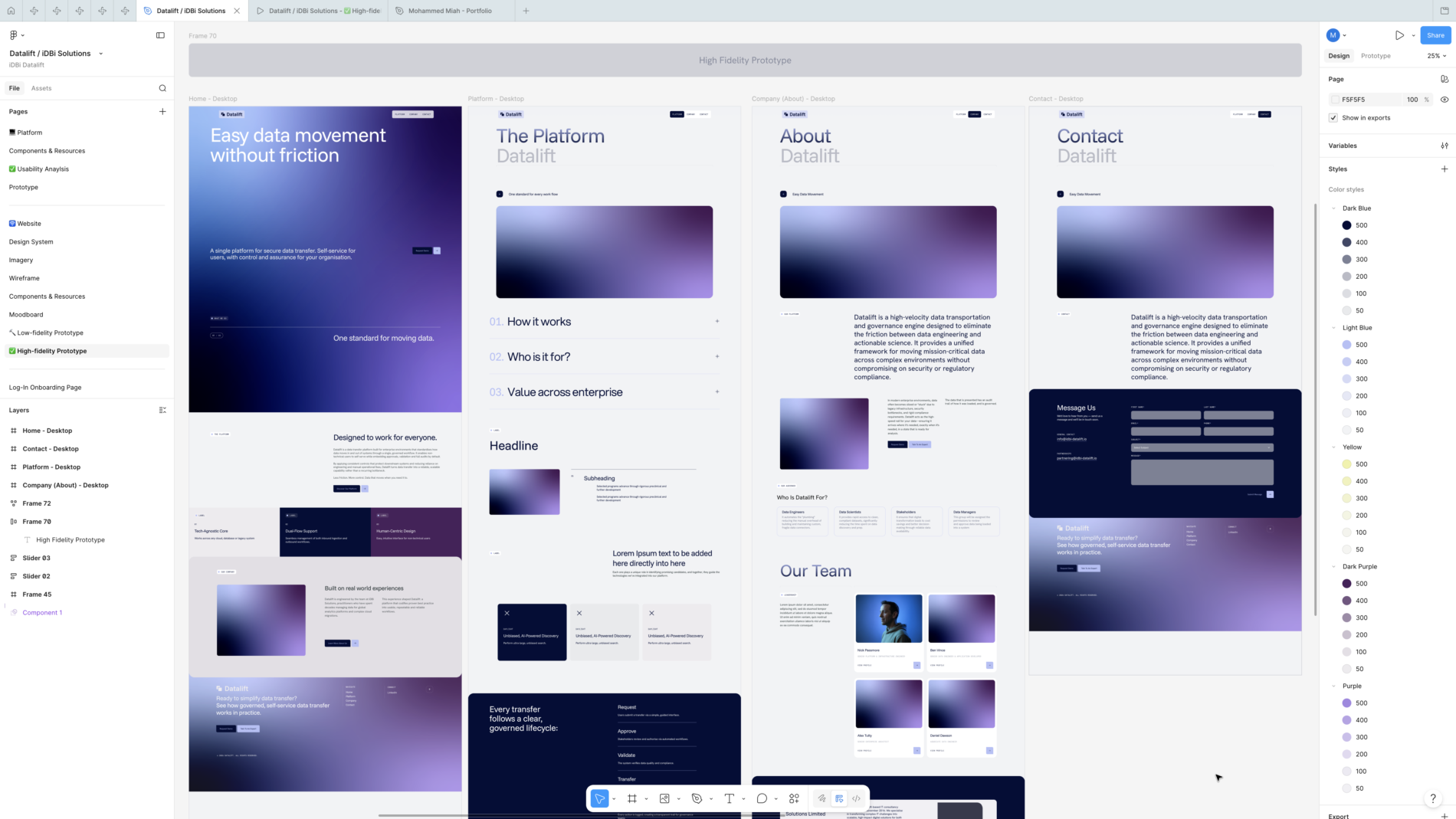
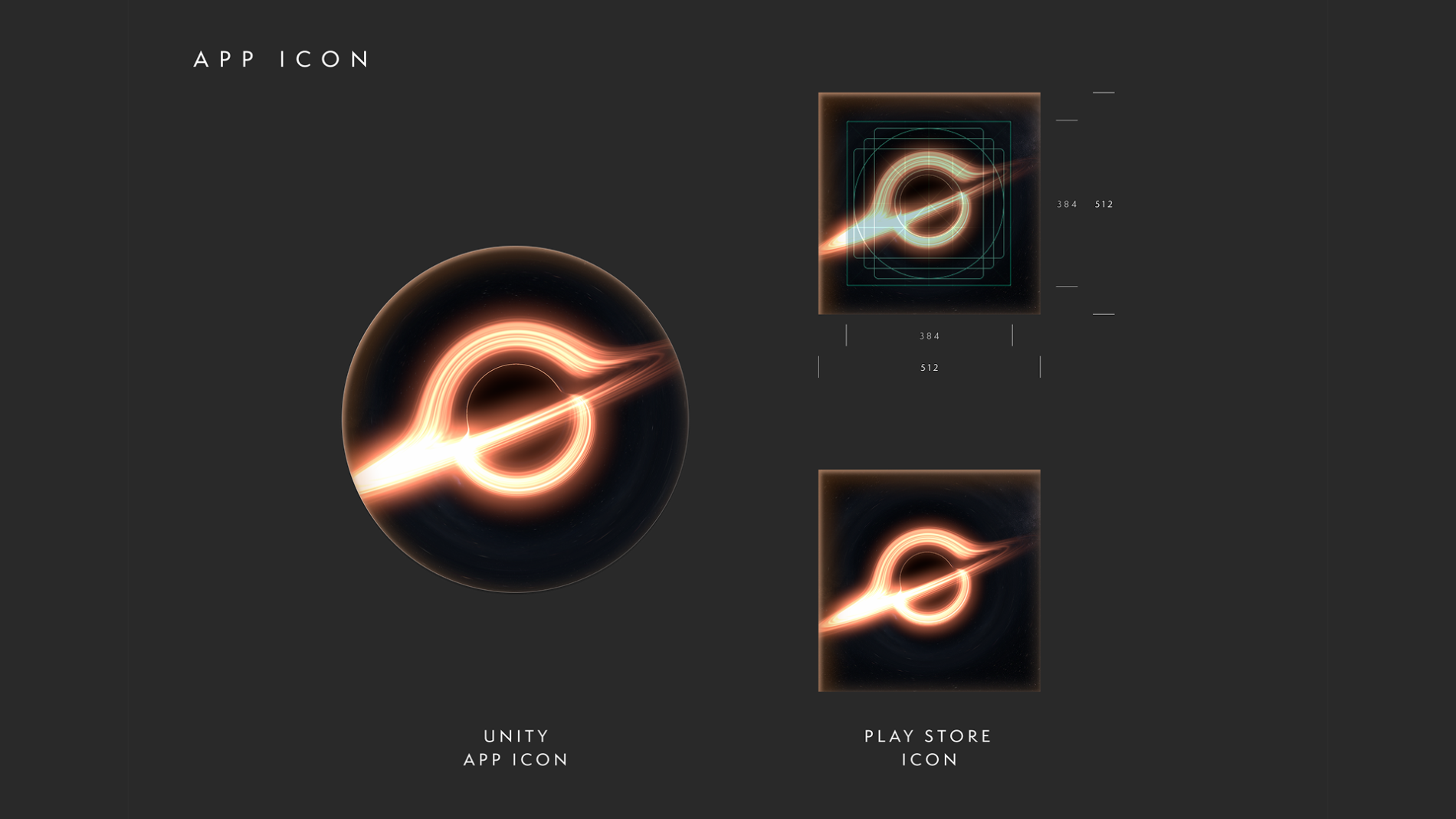
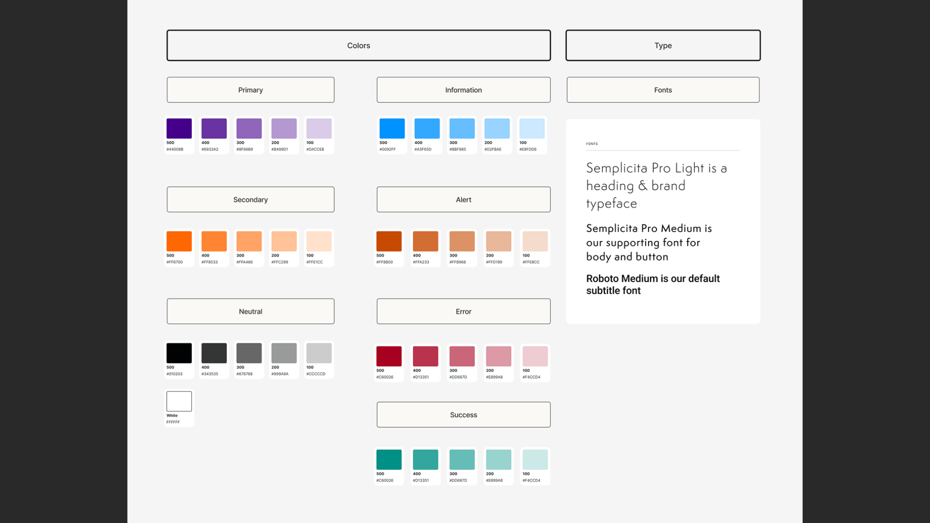
    I built the system in Figma around named colour styles (Primary, Secondary, Neutral, plus a full status set — Information, Alert, Error, Success — and a dedicated Arrows style) and a reusable Glow effect that gave the interface its atmospheric depth consistently. The file was organised into clear pages — Design System, UI Styles, Ideation, User Instructions HUD, App Icon, Credits and a dedicated Export page — so the work was navigable for everyone touching it.

    Components and states.
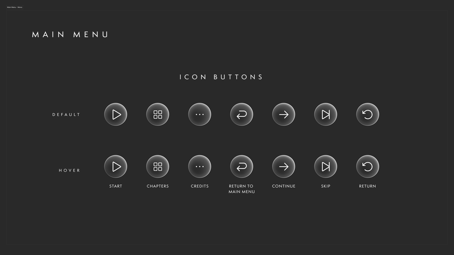
    The icon system was built with Default and Hover states across the full set of controls — Start, Chapters, Credits, Continue, Skip, Return, and Return to Main Menu — using Figma components and variables so a single change to a main component cascaded to every instance. With a narrative that kept shifting and feedback arriving each sprint, this wasn’t a nicety; it was what made iteration survivable without the design fragmenting.

    Built for handoff.
    Developers were given direct access to the Figma file, with open communication on updates and file/folder locations in shared team channels, and a dedicated Export page so assets could be pulled at 1x, 2x and 4x in PNG or SVG and adapted to whatever the Unity build required. The system wasn’t a designer’s private reference — it was a working handoff tool.

    Diagnosing problems with no ground truth.
    When something looked wrong in-headset, the hard question was whose fault is it? — the design, the export/implementation, or the headset itself. Without established conventions, isolating the cause took disciplined collaboration with the dev team rather than assumption.

    Matching UI to voice-over narrative.
    The interface didn’t stand alone — UI cues had to sync with the voice-over narrative, appearing and guiding at the exact right moment so story and interface moved as one.

    Staying ready for a moving target.
    To keep all of this shippable, I maintained clear “ready for dev” states, kept communication tight in team channels, and prototyped wherever possible to demonstrate how an effect or a stretch of the journey would actually feel — turning the unknown into something the team could see and sign off.

    For me, the lasting value is the proof that a design system can be built to thrive under uncertainty: when the platform, the specs and even the narrative are all moving, a semantic, component-driven system and a disciplined dev handoff are what keep the work coherent and shippable.

    What I’d carry forward: the experience reinforced how much spatial UI depends on timing and restraint — guiding attention in 360° is as much about what you choose not to show as what you do. With more platform maturity, I’d push further on formalising accessibility standards for gesture-based interaction, an area the whole category is still defining.

    Credits

  • Deft MD

    Deft MD

    Designing a clinically-validated VR assessment platform —
    from brand identity to spatial UI

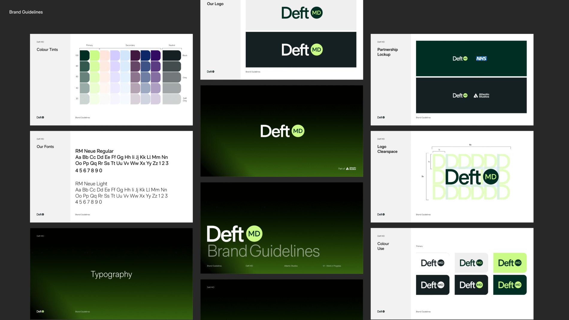
    Deft MD is a virtual, evidence-based platform that lets clinicians assess, evaluate and improve their procedural skills inside an immersive headset experience — starting with gastroenterology. I led the brand identity and translated it into a usable design system and interface for the headset, working directly with practising gastroenterologists from University College Hospital throughout.

    /

    Healthcare

    UK

    Brand Identity
    Brand Refinement
    Brand Strategy
    Brand Guidelines
    User Interface Design
    Website Design
    Website Development

    Clinicians had no good way to measure and elevate their procedural skill. The existing options fell short in two ways:
    • Books and observation don’t transfer. Reading a technique, or watching another doctor perform it, is fundamentally different from doing it yourself. There was no safe, repeatable way to practise the actual motions of a procedure and get assessed on them.
    • Plenty of training, almost no assessment. The market had training platforms, but very few that assessed, evaluated and scored skill-based learning and then fed that back into a personalised improvement loop.

    Research backed the premise: immersive VR learning showed better real-world outcomes than traditional study. The opportunity was to build something more innovative and approachable — an experience a clinician could run from the comfort of home, without booking physical theatre or lab time, that got them as close to a real procedure as possible while removing the real-world risk.
    The core insight: lower the risk-to-reward of learning. Let clinicians make mistakes in a place where mistakes are free.

    I want to be precise about ownership, because this was a cross-functional project:

    I personally owned:

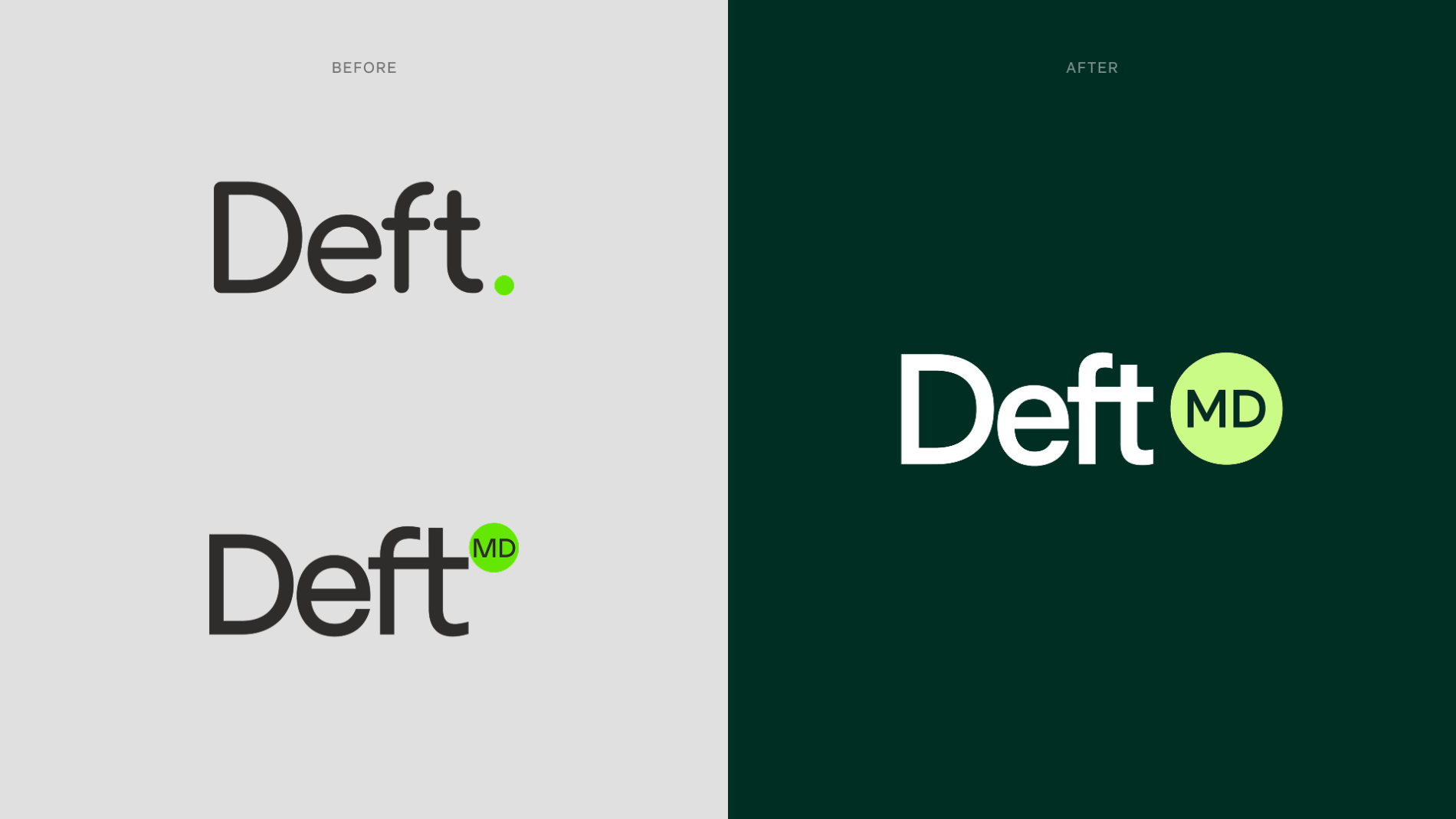
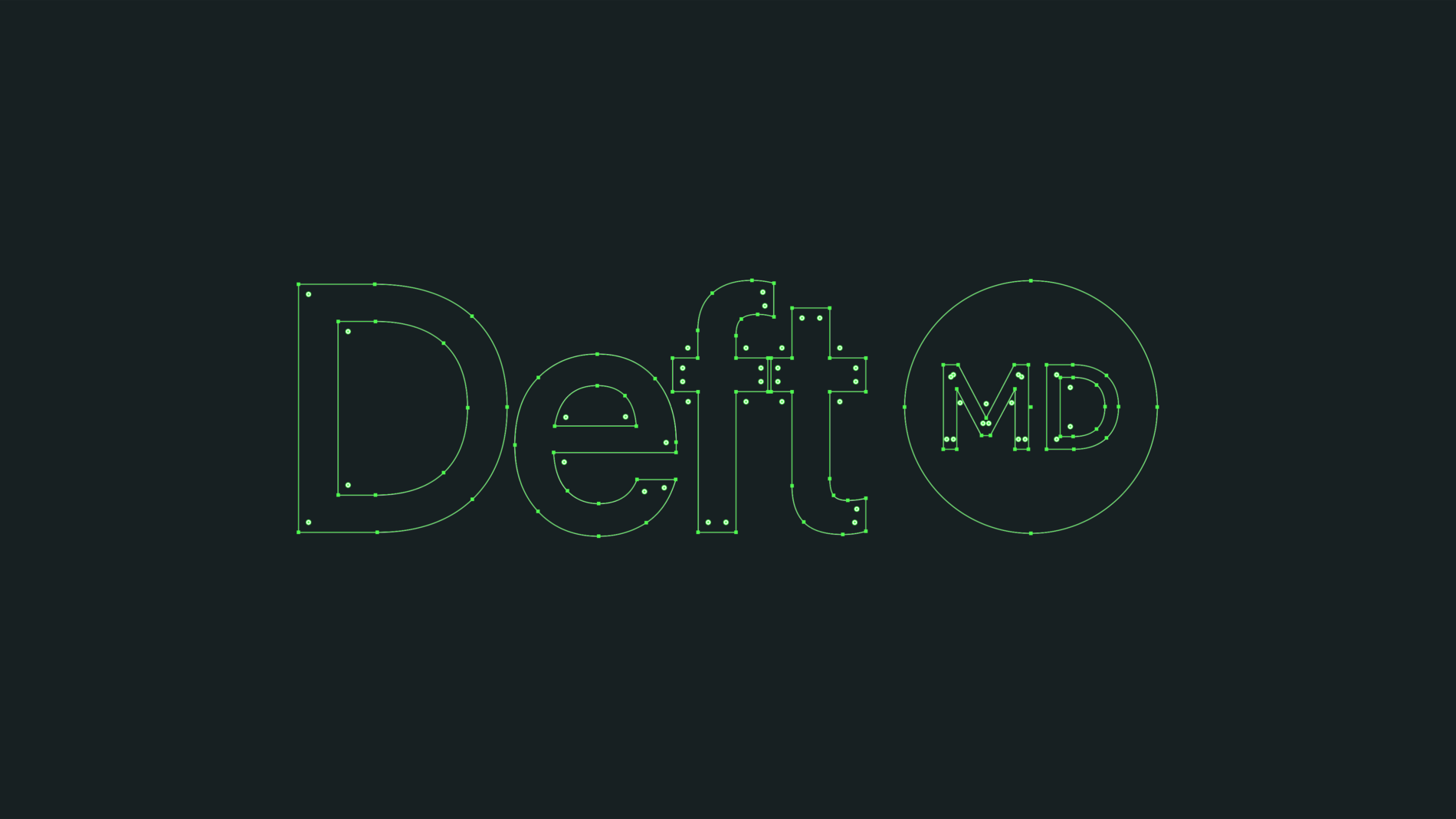
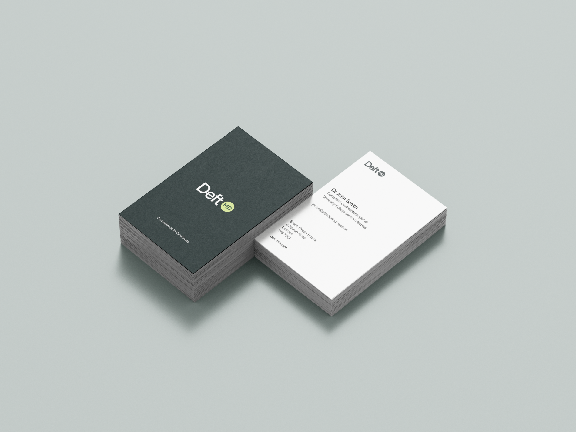
    • Brand identity — logo, colour system, type styles, and the overall visual language
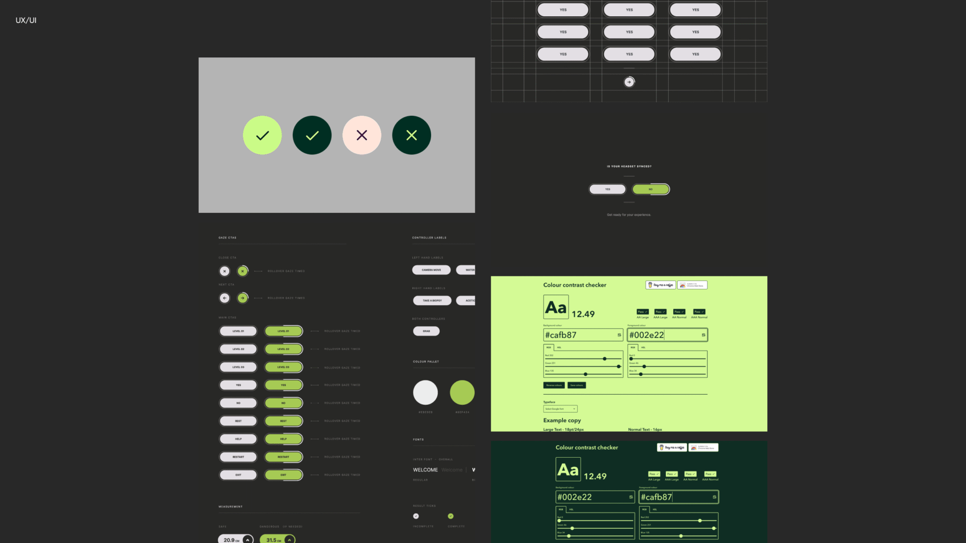
    • Design system — translating that identity into reusable UI: buttons and their states, navigation patterns, spacing/padding/gap systems
    • Interaction & flows — user flows for moving forward and back through the experience, error prevention, and loading states
    • Stakeholder communication — building and presenting concepts to stakeholders and the UCH clinicians, then iterating on their feedback in bi-weekly reviews

    I collaborated on: the headset implementation, via a structured handover to a developer who embedded the system into the live experience.

    I studied the two most relevant players — one direct, one aspirational benchmark — to find the gap we could own.

    FundamentalVR (now FundamentalXR) — A capable product, but the brand felt unapproachable, overly commercial and clinical-to-a-fault. It read as something built by domain experts without a design lens. Takeaway: there was room to win on warmth and approachability.

    Osso VR — The bigger, more established competitor, and an early mover onto Apple Vision Pro with a strong, distinctive colour identity (which we deliberately steered away from to avoid brand confusion). The experience itself looked excellent and was used globally — something we wanted to emulate in reach. But the surrounding product let it down: a laggy, desktop-first website that performed poorly on mobile. Takeaway: it functioned as a training system but felt out of touch across skill levels — not genuinely human-centric.

    What this told us: the market had capable technology but a missing human-centred design layer. Our differentiator wouldn’t be “another VR trainer” — it would be the contemporary, approachable, genuinely user-friendly one that worked for clinicians at every level.

    This is what kept the design honest. Rather than designing in a vacuum, I ran the work past practising gastroenterologists from UCH and let their domain expertise direct decisions I couldn’t have made alone.

    Their feedback reshaped the spatial layout directly. On the placement of interface elements and tools, they’d correct assumptions with real procedural logic — “you actually wouldn’t place things here, you’d be picking it up from here.”That turned abstract UI positioning into something that mirrored how a clinician actually moves and reaches during a procedure.

    The validation was just as telling:

    “This is as close as we’ve come to experiencing an operating theatre.”

    “This improves the risk-to-reward if something goes wrong.”

    The brand had to do something specific: feel contemporary and approachable in a category that mostly felt cold and clinical. That positioning — directly informed by the competitor gap — drove the logo, colour and type decisions, which then had to survive translation into a 3D, head-mounted environment.

    Designing a brand for a flat screen is one thing. Designing one that stays legible, consistent and on-brand inside a headset — at varying depths, sizes and viewing angles — is another. The identity wasn’t the deliverable; it was the foundation for a system that had to hold up in space.

    This was the hardest and most interesting part of the project, and the part I’d want any UX team to ask me about.

    Getting the spatial system right. Designing UI for a headset meant learning the correct spatial terminology and then holding button spacing, padding and gap systems consistent across a 3D environment — while accounting for transitions between different states. Consistency is hard enough on a 2D grid; in a headset, depth and head movement make it harder.

    Designing for comfort over time. A real constraint was duration: how do you keep someone in a headset long enough to complete a meaningful assessment without them feeling sick? That pushed decisions about pacing, motion, visual stability and how much was on screen at once — comfort became a design requirement, not an afterthought.

    Adapting to a changing interaction model. The experience began with gaze tracking, which dictated how buttons had to look — active/selected states needed to read clearly when the only input was where you were looking. Midway, the input model shifted to hand tracking, which was a genuinely difficult adaptation: the same interface now had to support reaching, grabbing and direct manipulation. Re-thinking button states and affordances for hands-instead-of-gaze was one of the most demanding iterations of the project.

    The core user flow. I designed the journey so a clinician could: sign in to their portal → choose to take the full assessment or select specific modules → complete the experience → receive their results and an overall score. Throughout, the priorities were error prevention (making the wrong action hard to take), and clear, low-friction navigation forward and back.

    Designing while advocating for design. Worth being honest about: I was sometimes working with team members who didn’t initially see design as valuable. Part of the job was demonstrating — through presentations and bi-weekly stakeholder reviews — why these decisions mattered to the end experience and the outcomes.

    Deft MD soft-launched and is ongoing. The platform is described as a clinically-validated immersive assessment tool, and the underlying approach has been published in peer-reviewed research (GIE Journal, 2025).

    Everyone who has used it so far has responded strongly — the clinician feedback above speaks to that. The next phase is funding a larger team to take it from a validated soft launch to a fully product-ready platform.

    What I’d take into the next iteration: the gaze-to-hand-tracking transition proved how much interaction-model assumptions ripple through an entire interface. With more runway, I’d want to formalise the design system documentation for spatial components and run structured usability testing across a wider range of clinician skill levels — closing the “human-centric for all levels” gap I’d identified in the competitor analysis from the start.

    Atlantic Studios

    Atlantic Studios
    Deft MD

    Brand Identity
    Graphic Design
    UX/UI Design

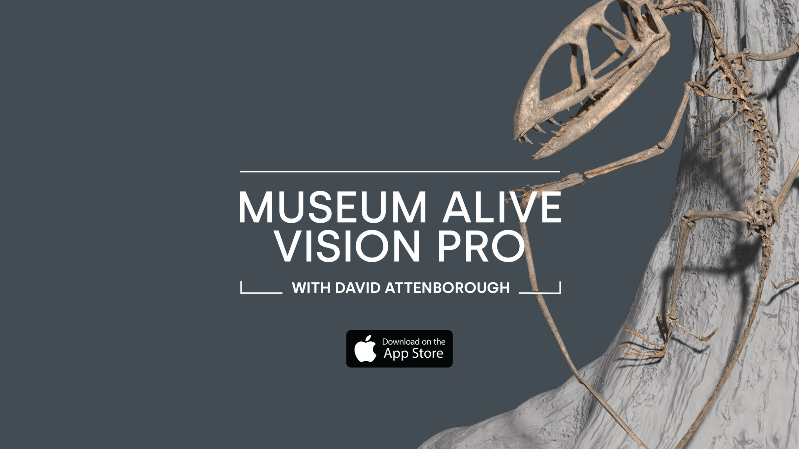
  • Museum Alive Vision Pro with David Attenborough

    Museum Alive Vision Pro with David Attenborough

    Museum Alive Vision Pro with David Attenborough

    / /

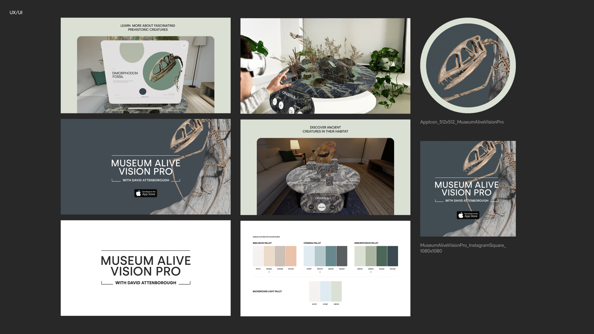
    David Attenborough takes the user on a journey to select a scientifically accurate fossil from the museum and watch it come back to life in mixed reality on Apple Vision Pro.

  • Atlantic Studios Rebrand

    Atlantic Studios Rebrand

    Atlantic Studios

    / /

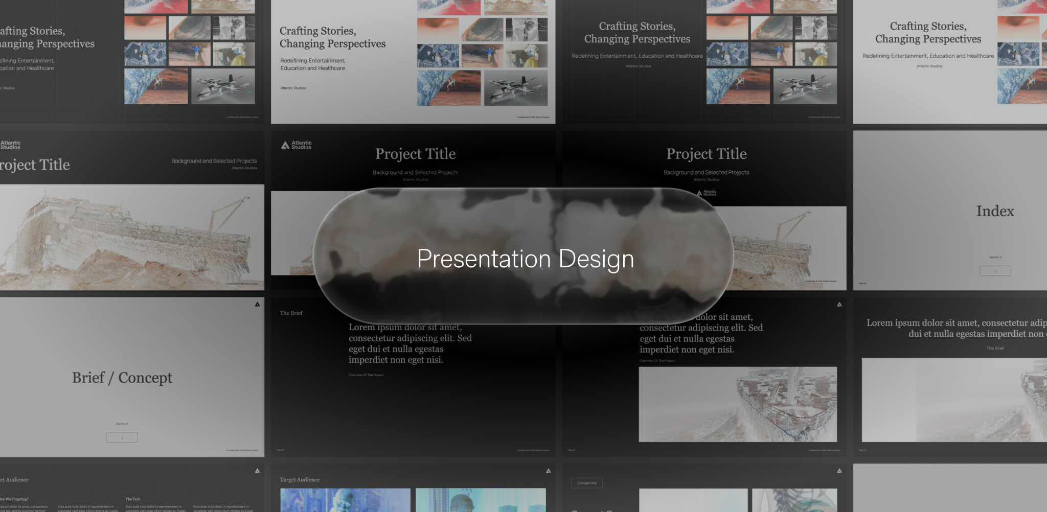
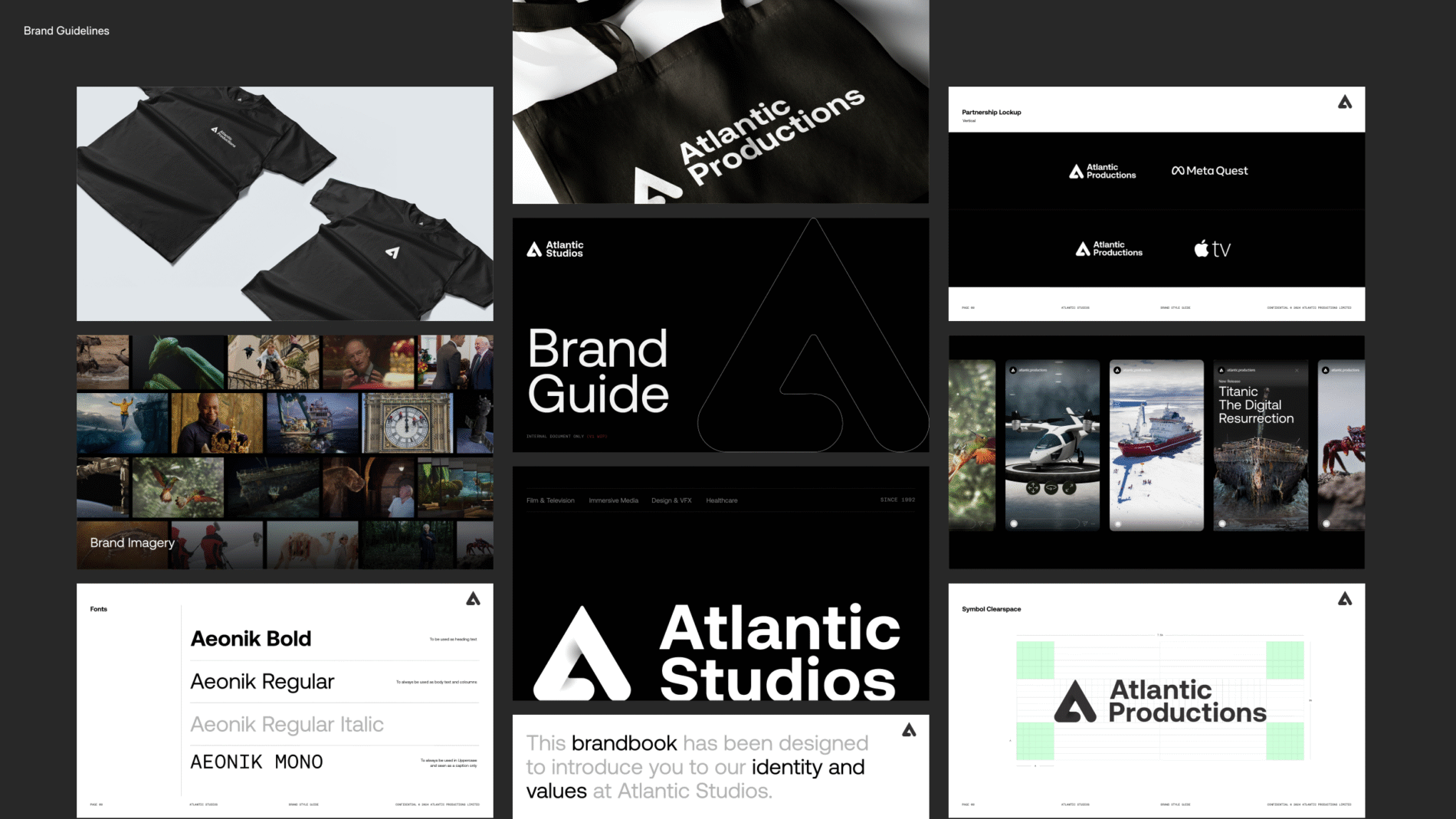
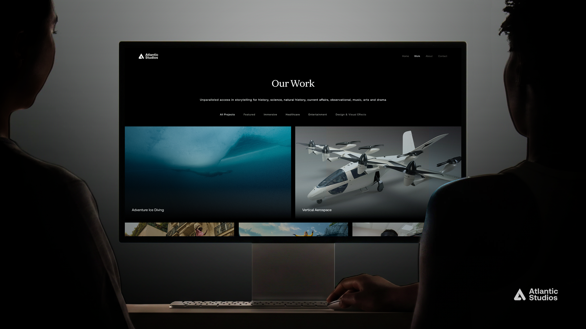
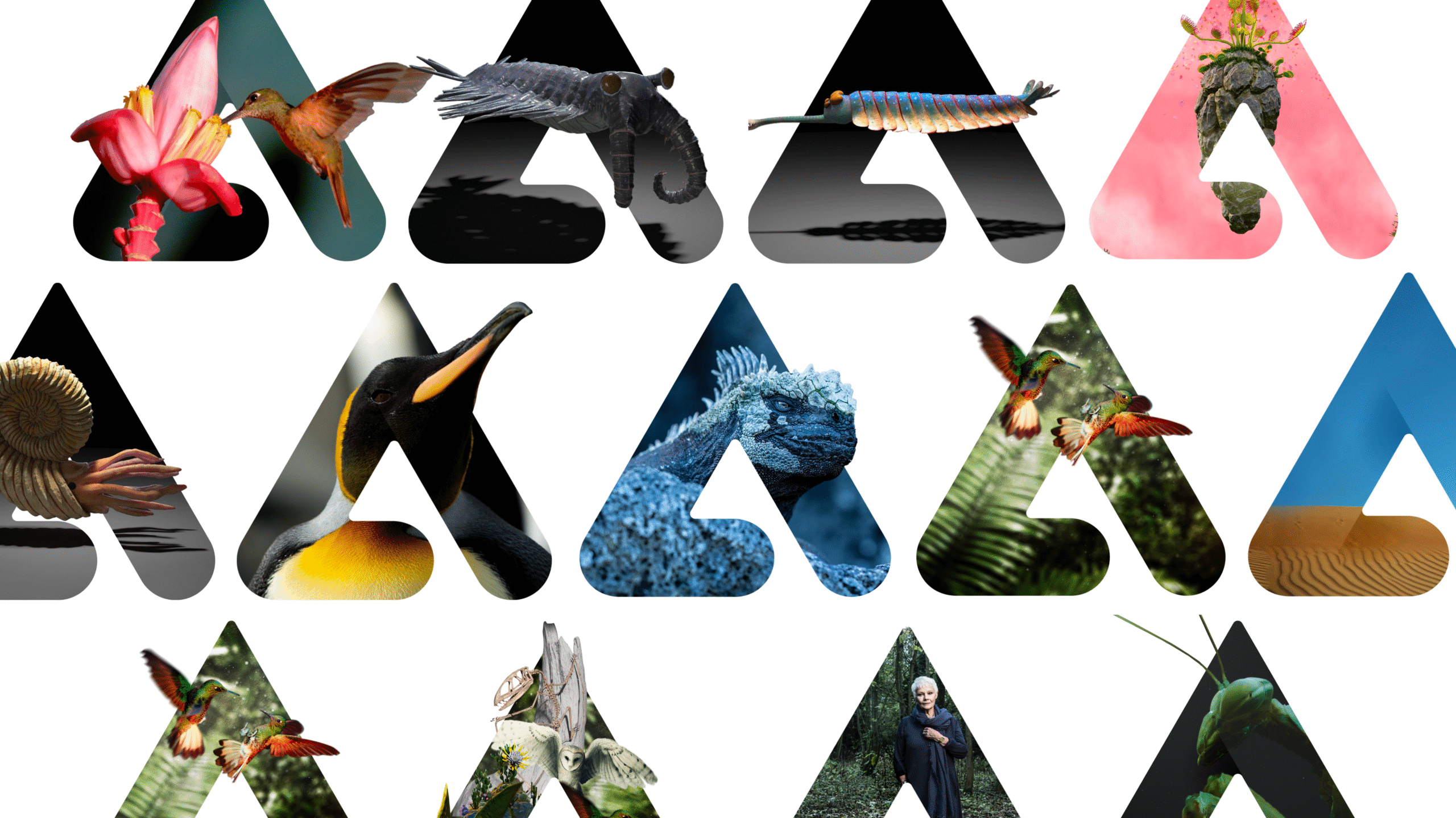
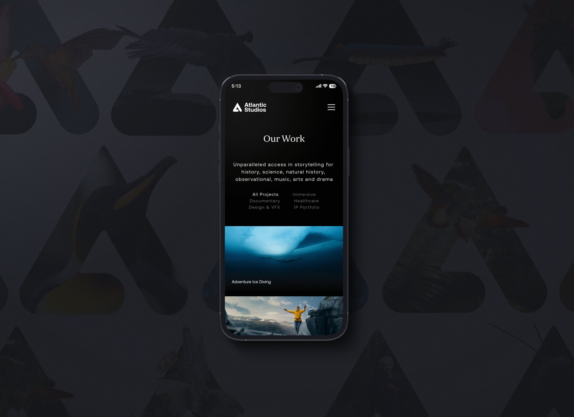
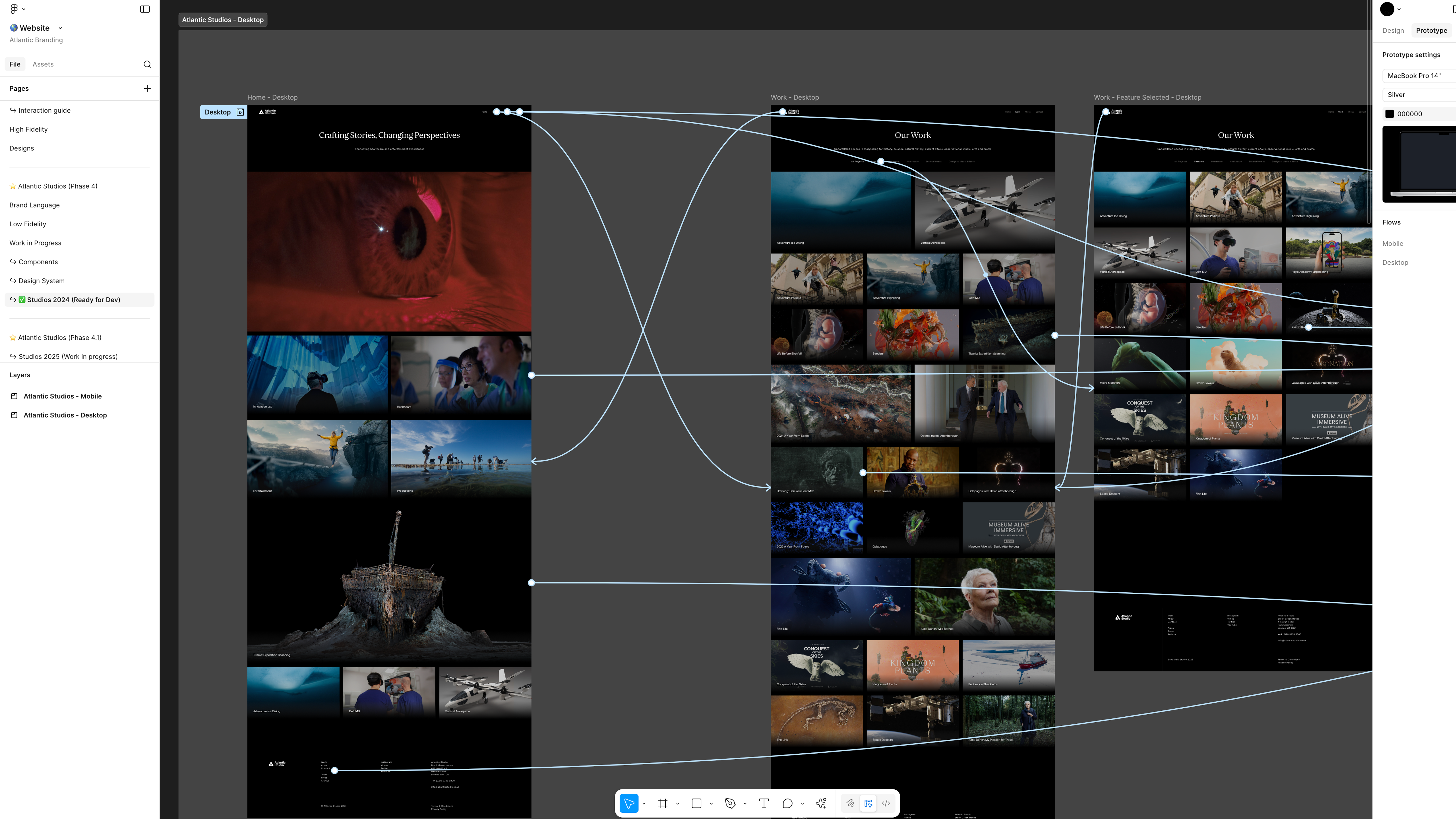
    Atlantic Productions transitioned into Atlantic Studios, aiming to further establish their presence in immersive technology and healthcare while reinforcing their reputation as leaders in innovation and storytelling.

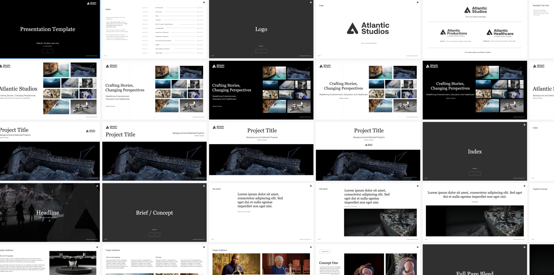
    I developed a design system applying atomic design principles to create reusable components and enabled both light and dark modes. Interaction testing ensured the experience was intuitive and mobile-friendly, aligning with modern usability standards. With the inclusion of updated brand guidelines, the refreshed brand identity not only improved usability, but also positioned the company as a future-facing leaders in technology.

  • Vertical Aerospace MR

    Vertical Aerospace MR

    Vertical Aerospace

    / /

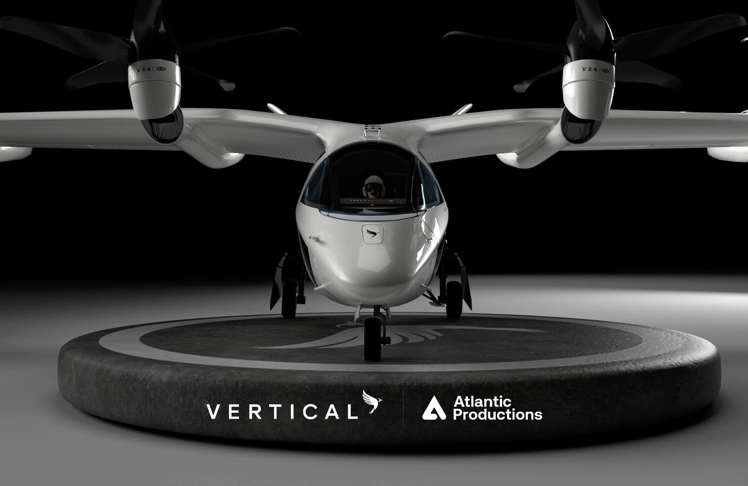
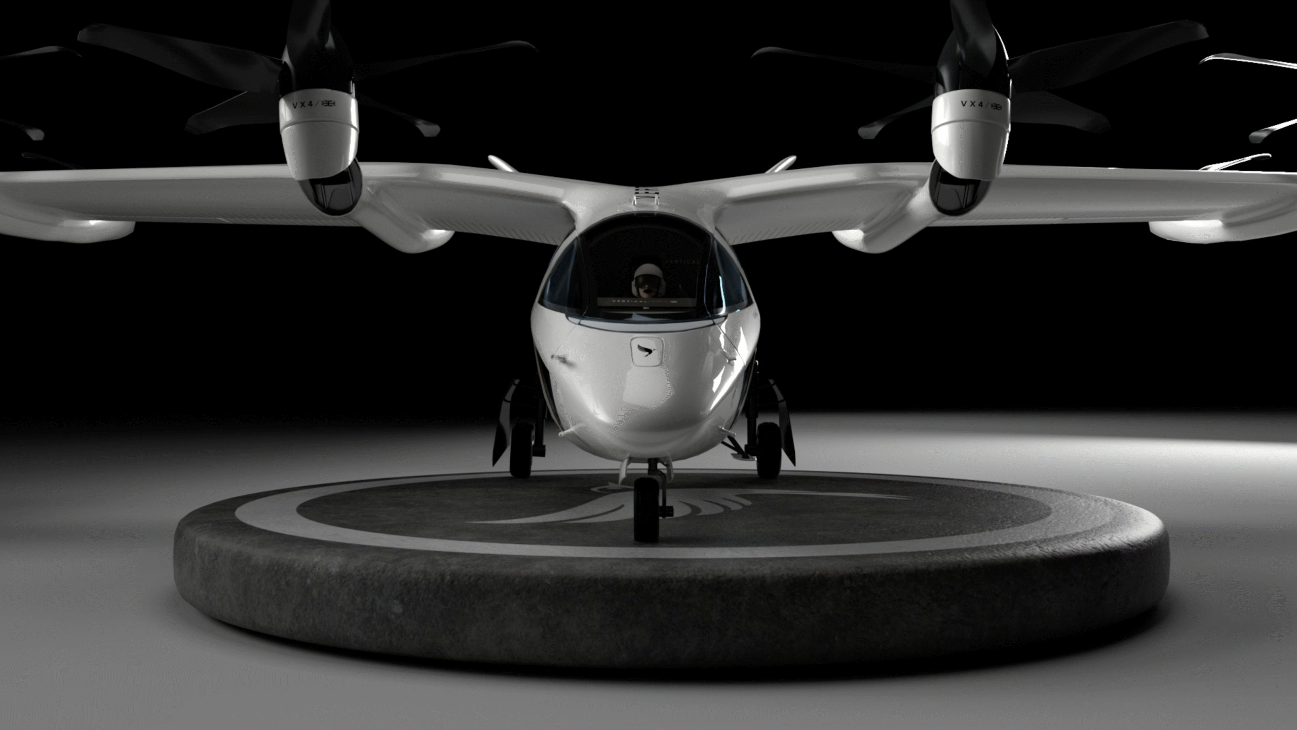
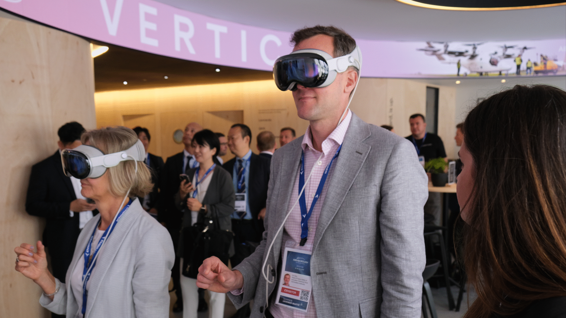
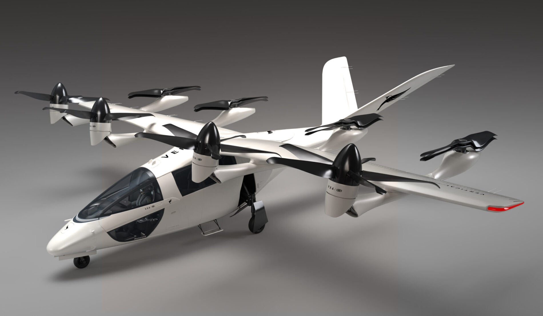
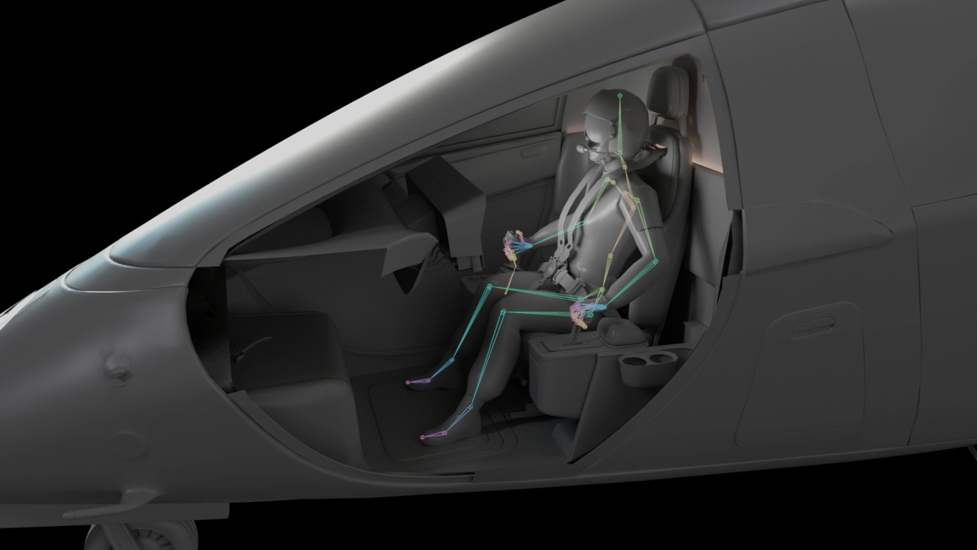
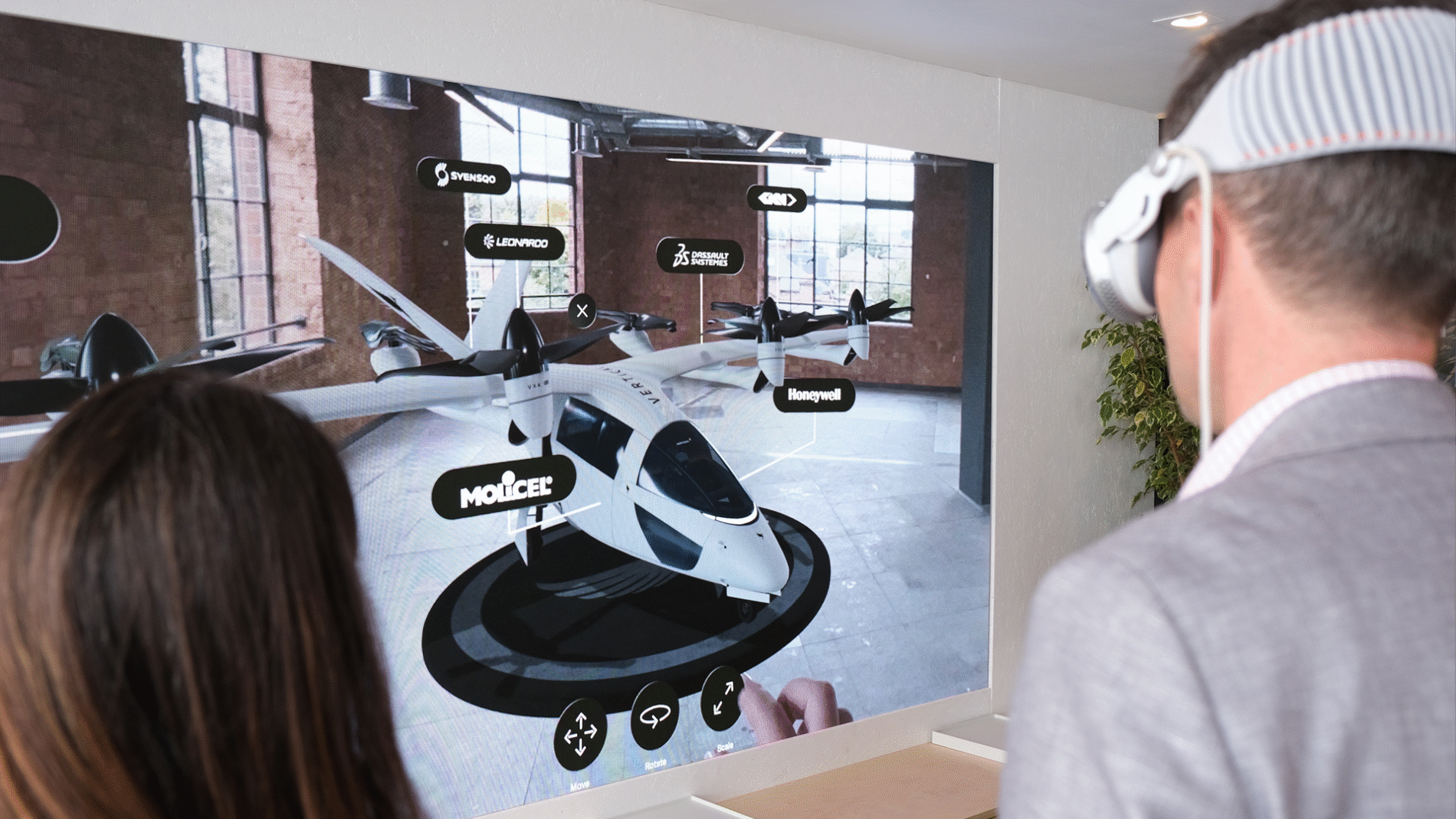
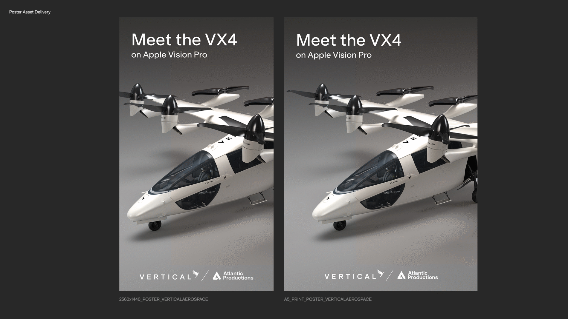
    Atlantic Productions partnered with Vertical Aerospace to bring their pioneering fully electric vertical take-off and landing aircraft to life on Apple Vision Pro.

    With deep research into the brand guidelines, my role was to create the user experience and interface to take you on the journey showcasing the aircraft working with the features and parameters of a spatial design.

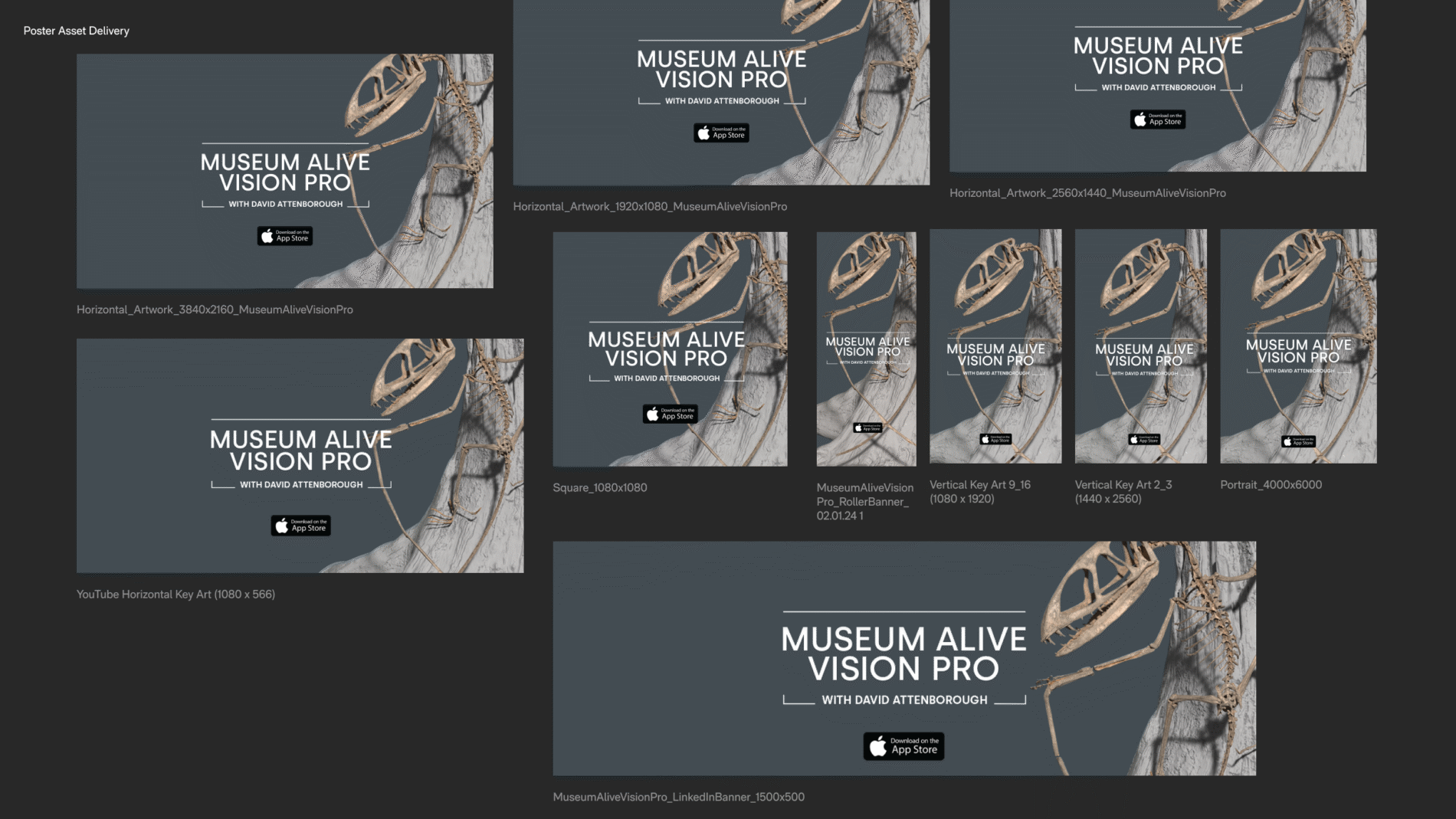
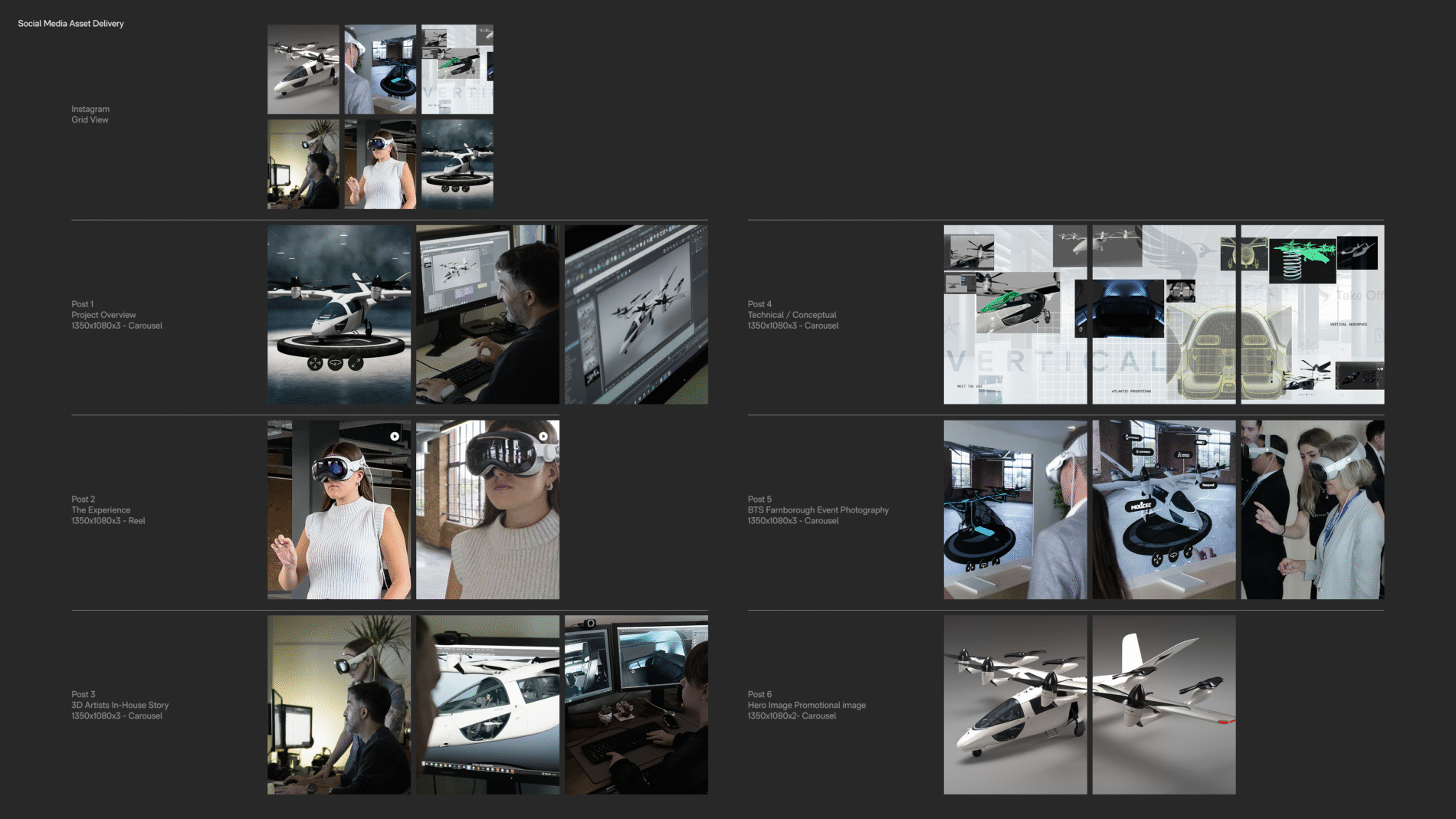
    My role was also present the production process across social media platforms for both Atlantic Studio and Vertical Aerospace.