
national geographic’ titanic the digital resurrection
Designing the visual identity and broadcaster-grade brand system streaming worldwide
2026 Emmy Nominated in Outstanding Graphic Design: Documentary

2026 Emmy Awards in Outstanding Graphic Design: Documentary
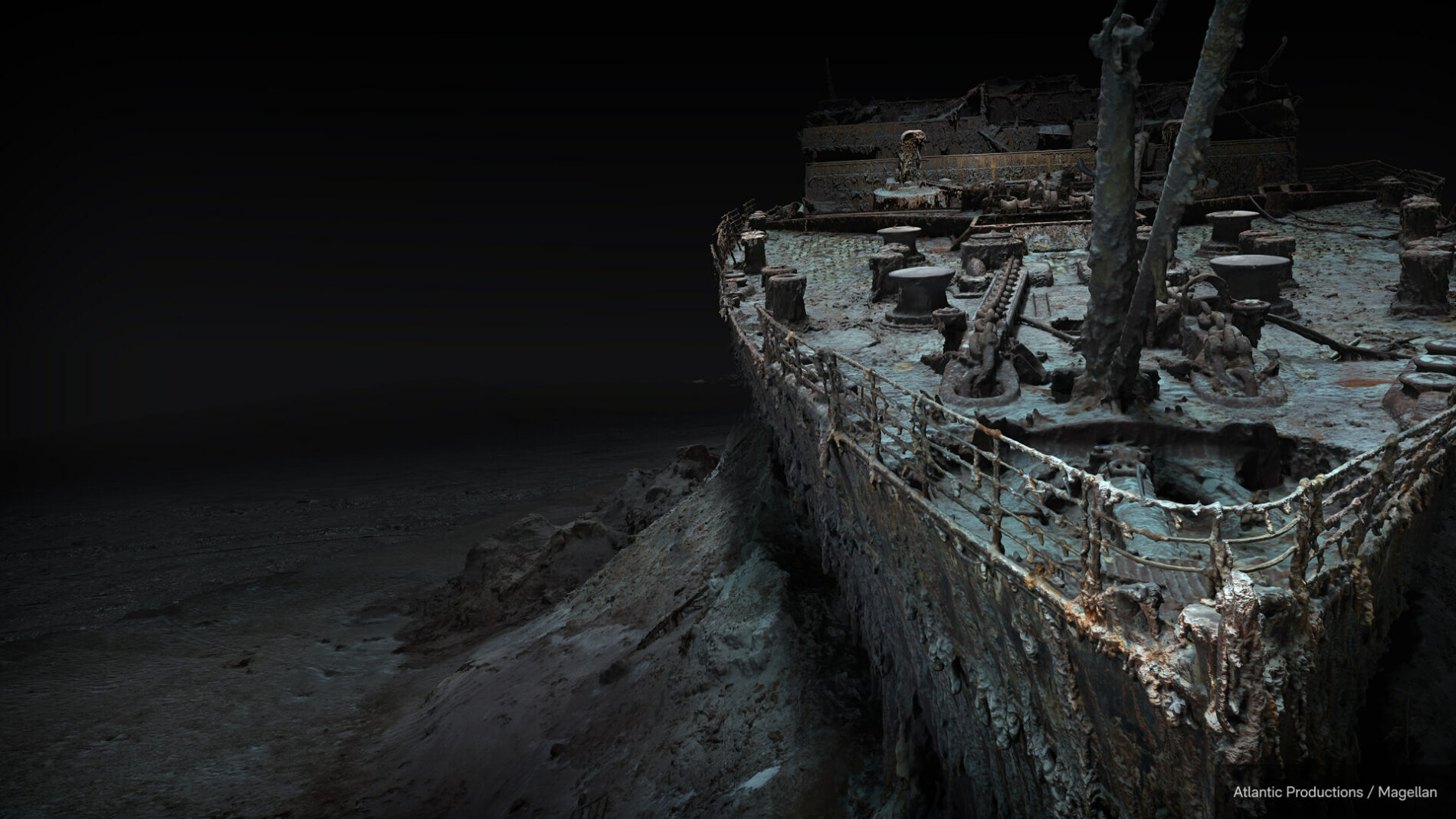
Titanic: The Digital Resurrection is a 90-minute National Geographic documentary from Atlantic Productions, premiered by National Geographic and streaming on Disney+. It reveals the most precise model of the wreck ever made — a full-scale 1:1 digital twin built from 715,000 underwater images, captured 12,500 feet down with deep-sea mapping partner Magellan.
Industry
Feature Documentary
Location
UK
Deliverables
Pitch deck proposal
Brand Identity
Title Design
Broadcast Graphics
Marketing & Social · Documentary Film
Highlight
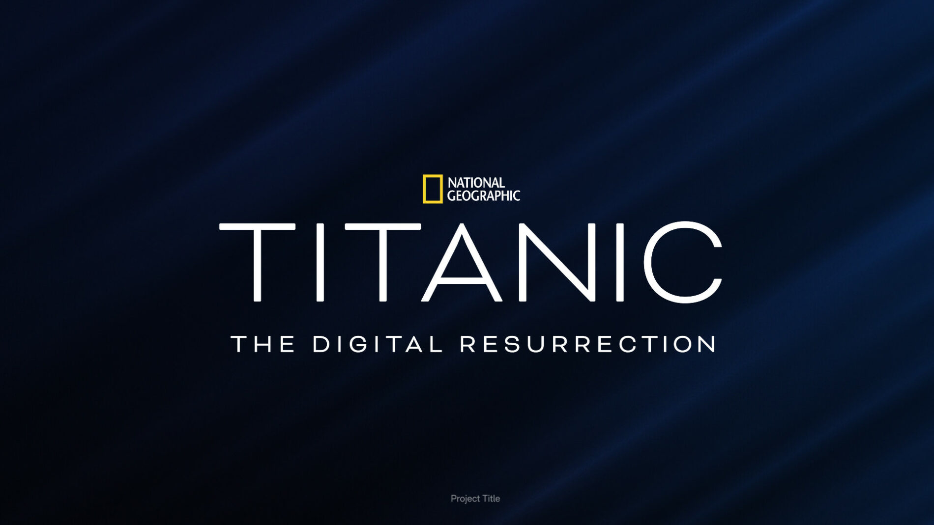
I led the visual identity from a blank page: the title-logo system, the broadcaster brand pack handed to National Geographic, the in-show graphics, and the marketing and social design that carried the film into a worldwide release.
Lead designer — visual identity, title-logo system, NatGeo brand pack, in-show graphics (lower thirds & supporting text), pitch-deck design, hero poster and marketing/social campaign, BTS photo selection
Available to Watch
Awards / Nomination
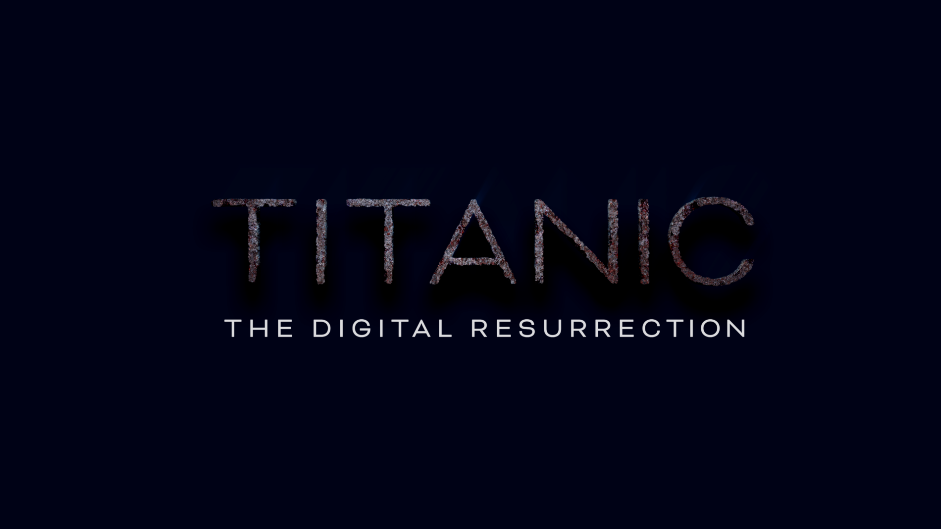
The Challenge
The brief sat at the intersection of three real constraints:
Standing apart from a saturated visual category.
This was the first documentary to reveal a 1:1 digital twin of the wreck — that scientific breakthrough deserved an identity that didn’t blend in with the wider Titanic visual canon.
Working to National Geographic’s broadcaster standards.
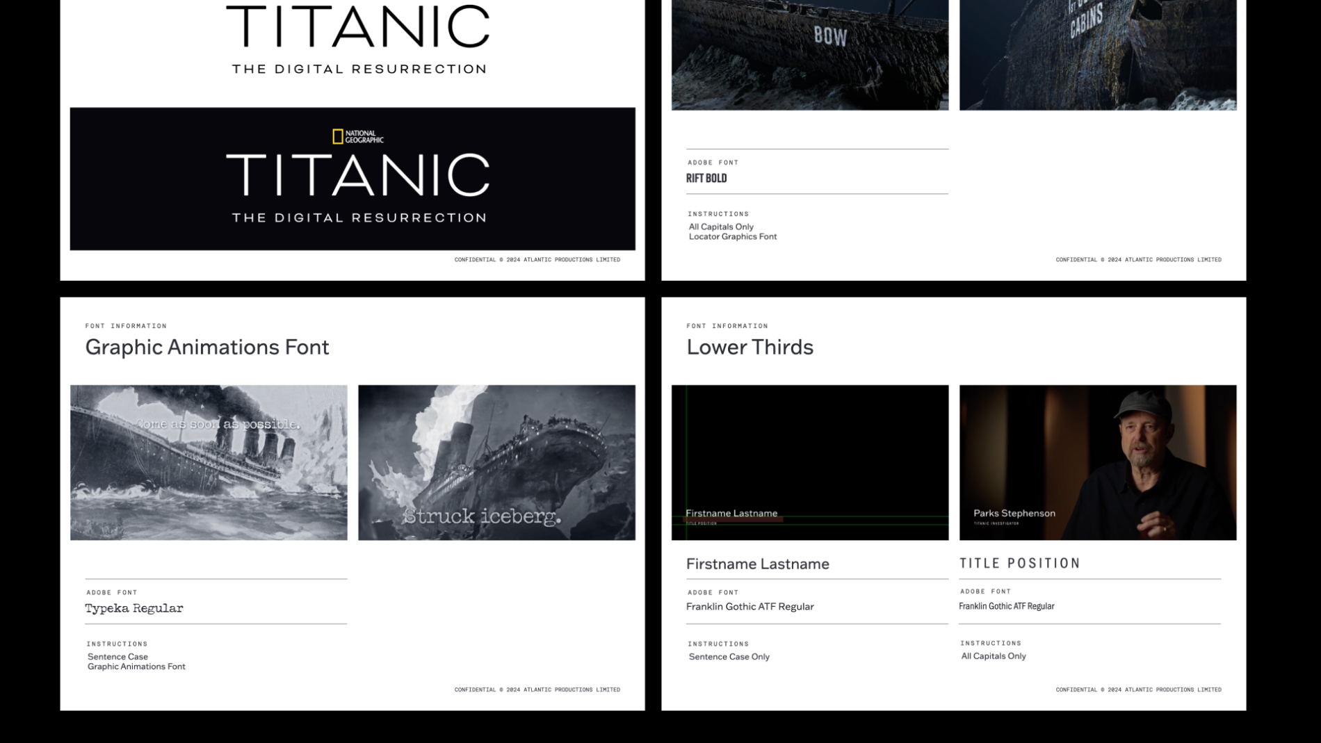
As a NatGeo title, every typographic and graphic decision had to be specified precisely enough to be reproduced consistently across the channel’s international and platform output, by teams I’d never meet.
Legibility and accessibility across every format.
From the broadcast cut to the Disney+ tile, from a 4K hero poster to a phone-sized Instagram thumbnail, in every territory — the system had to hold.
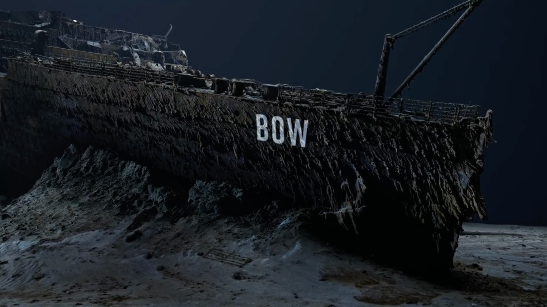
My Role
To be precise about scope on a production of this size:
I led:
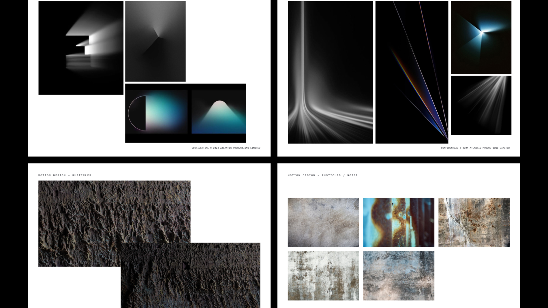
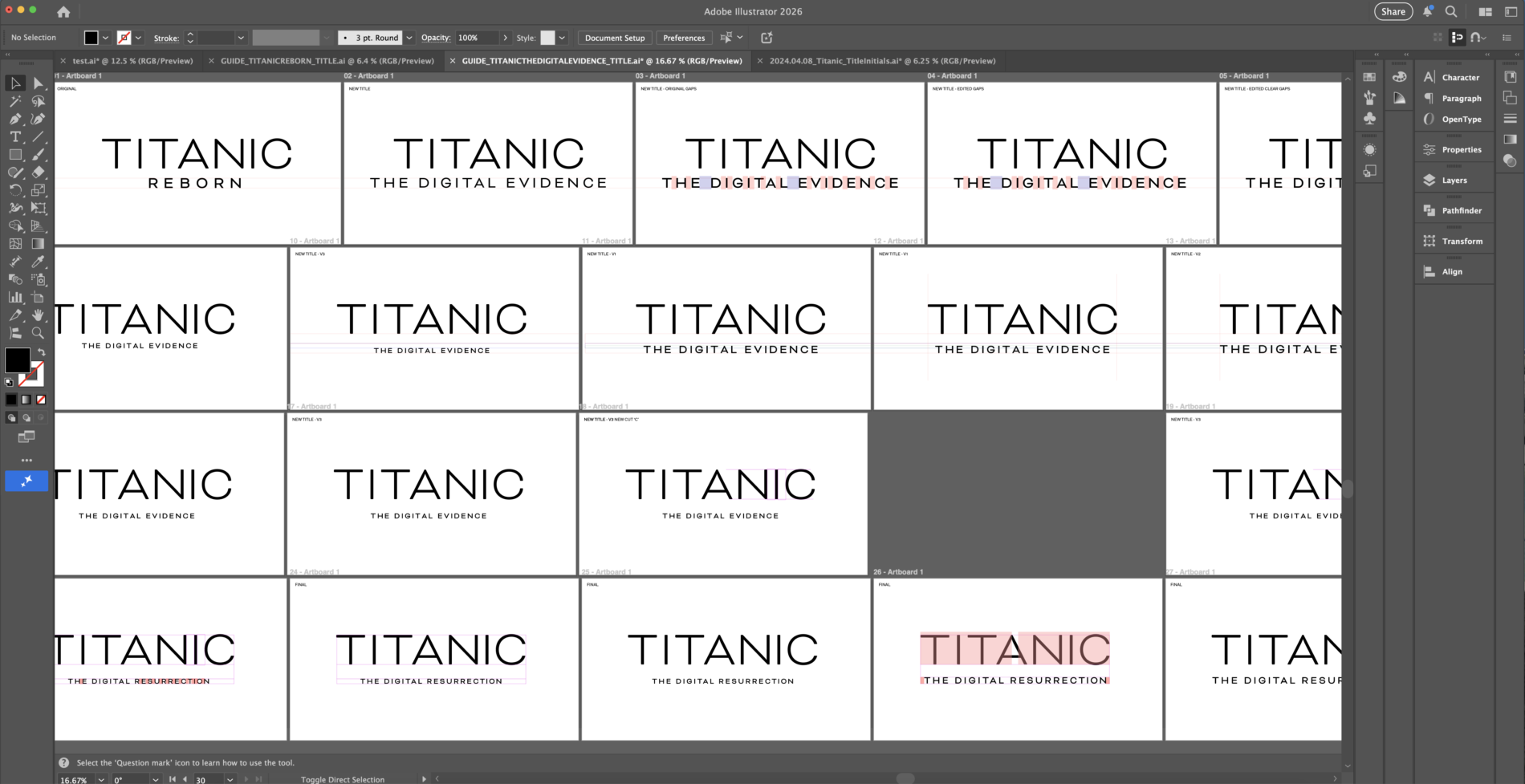
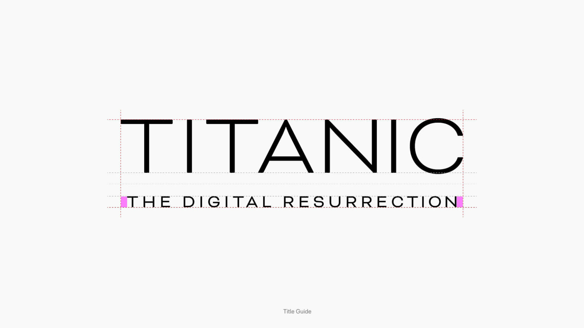
Visual identity — originating the title-logo concept and visual system from a blank page, then iterating through director, producer and broadcaster sign-off
Title sequence design — the 2D title-card system that opens the documentary
Broadcaster brand pack — the NatGeo-facing brand and font information document specifying lock-ups, lower thirds and typographic rules
In-show graphics — lower thirds and supporting on-screen text
Pitch deck — solo design of the original deck Atlantic submitted to National Geographic that supported the successful commission
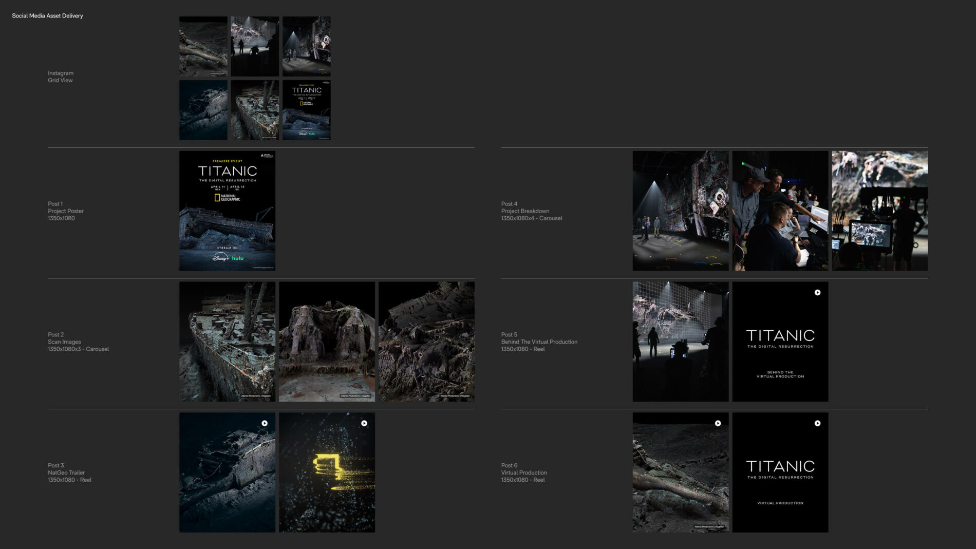
Marketing & social — solo design of the hero poster, its adaptations across formats and territories, the rollout campaign across Instagram and LinkedIn, and the BTS photo curation
Creative direction for motion — supplying direction to the motion designer who translated the 2D title-card system into the 3D opening sequence, informally as the brand owner
From Pitch to Global Rollout
The identity didn’t begin at delivery — it began at pitch. I designed the original pitch deck Atlantic Productions submitted to National Geographic, the deck that supported the successful commissioning of the documentary.
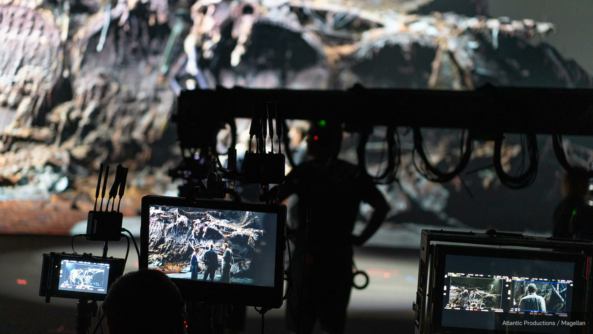
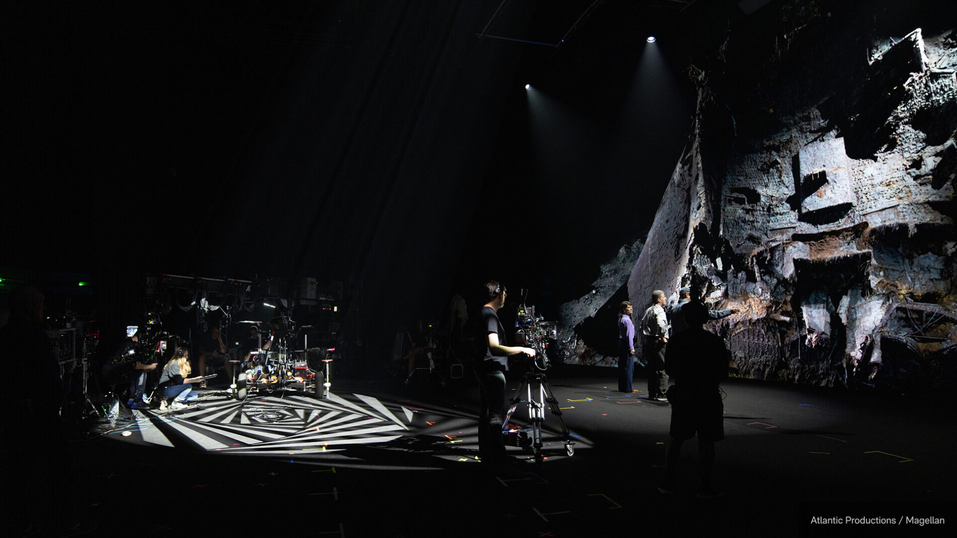
Curating BTS without spoiling the film. A real, often-overlooked craft challenge: the marketing team had hundreds of BTS images from the virtual production shoot (a 23m-wide LED volume at Garden Studios, the wreck rendered at 8096×2816 across the wall) — material strong enough to give the campaign visual life, but laced with moments that would spoil the film if released in the wrong order. I curated and sequenced the imagery so the campaign teased without revealing, and timed releases against the staggered international broadcast and streaming windows so nothing landed early in a market still waiting to watch.
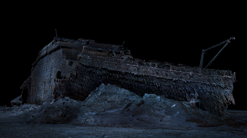
3840x2160_POSTER_TITANIC_THEDIGITALRESURRECTION

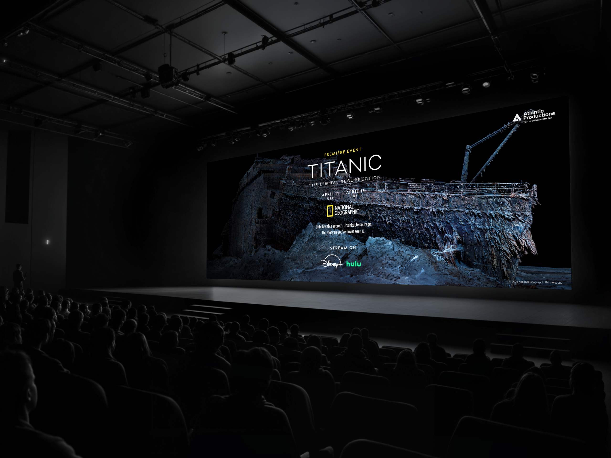
3840x2160_HERO_ARTWORK_TITANIC_THEDIGITALRESURRECTION
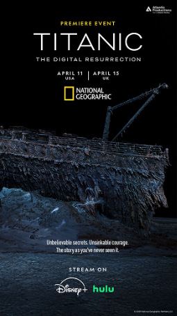
3840x2160_POSTER_TITANIC_THEDIGITALRESURRECTION
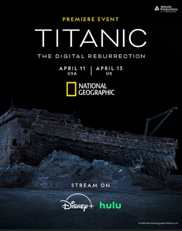
900x1600_POSTER_TITANIC_THEDIGITALRESURRECTION
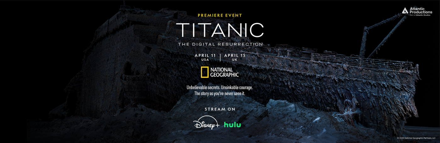
3840x2160_HERO_ARTWORK_TITANIC_THEDIGITALRESURRECTION
Outcome
The documentary went on to be nominated for the 2026 News & Documentary Emmy for Outstanding Graphic Design: Documentary — recognition for the design discipline itself, applied to this film.
The work shipped on the world’s largest factual-content platforms, in an identity that holds across every format National Geographic puts it into. For me, the lasting lesson is how much of brand work for broadcast is what you write down for other people to use: the title looks the way it does because of the design decisions, but the title looks that way everywhere because of the document specifying how it must be applied.
What I’d carry forward: the discipline of designing a system tight enough to be handed over and still hold. Documentary identity is unusual in that the designer rarely controls every surface it lands on — so the system itself, including its written rules, becomes a critical part of the deliverable.
Project Info
Credit
Atlantic Studios
Available to Watch
Awards / Nomination
More Available