google andriodxr
cosmos unseen: black holes
Designing the identity, design system and spatial UI for a narrative-led VR journey through the universe
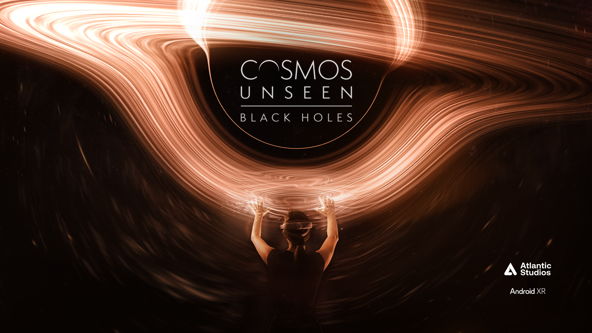

Cosmos Unseen: Black Holes is a narrative-led VR experience that takes you on a cosmic voyage through the universe — getting hands-on with galaxies, black holes and the very fabric of space and time. I defined the visual identity, translated it into a scalable design system in Figma, and designed the UI, interaction language and gesture guidance for the experience, working alongside developers building it in Unity.
Articles & Events
Download
Industry
Spatial Reality
Science & Entertainment
Location
UK
Deliverables
Brand Identity
Brand Refinement
Brand Strategy
User Interface Design
User Experience Design
Marketing & Social Strategy
Marketing & Social Design
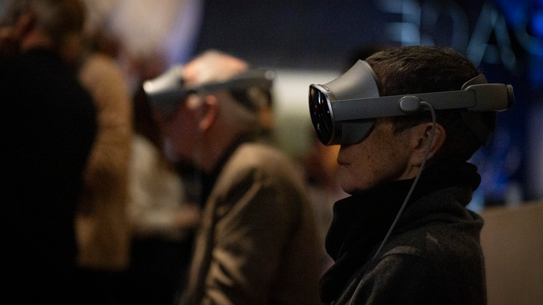
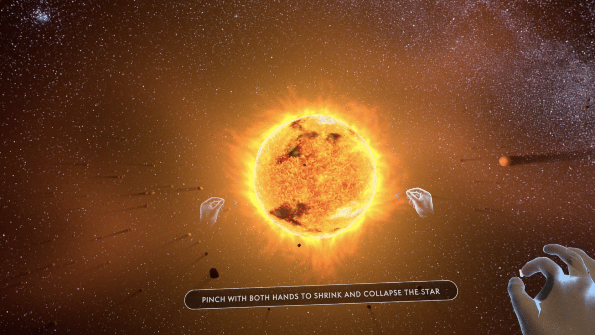
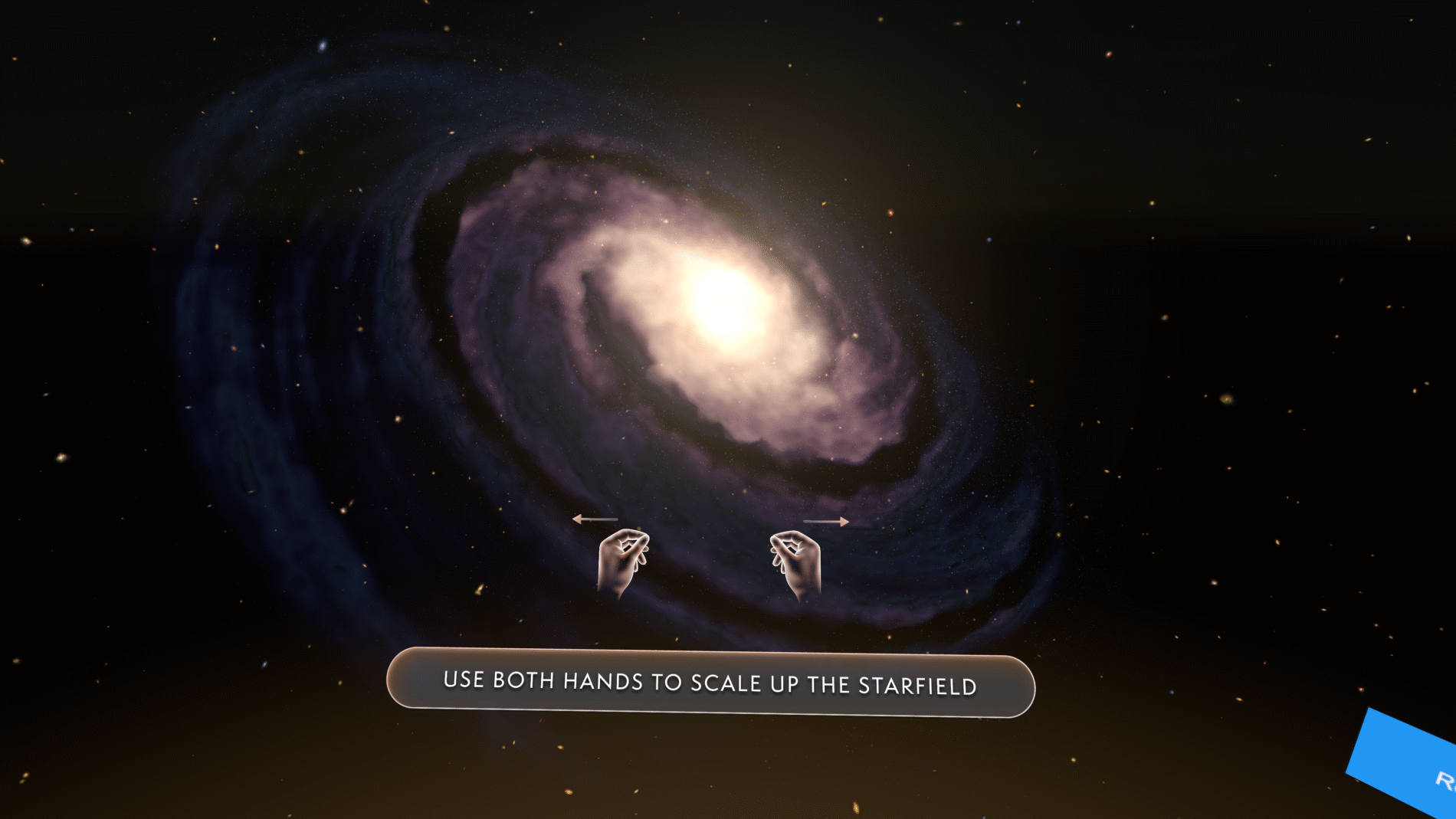
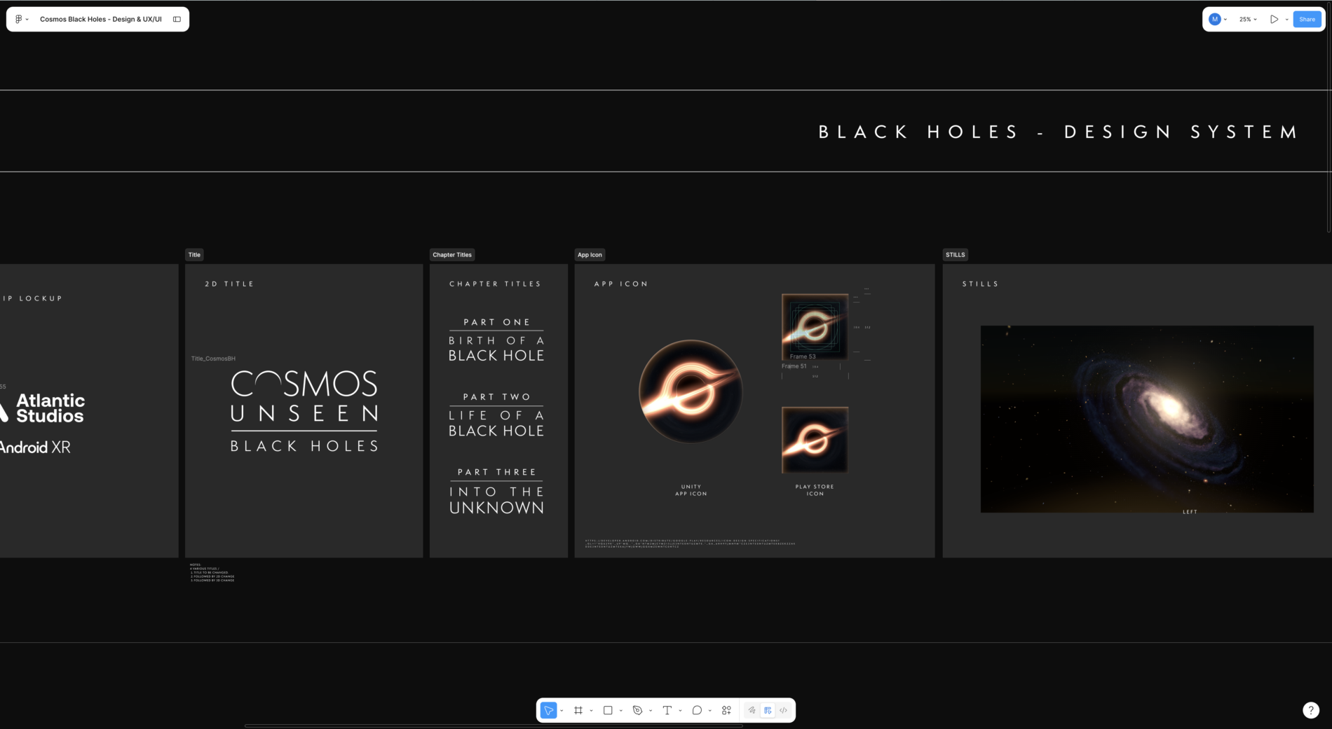
The Challenge
The brief sat at the intersection of two hard problems.
How do you guide someone through a story in 360° space without breaking immersion or losing them? In a flat app, the screen contains the user. In VR, the user can look anywhere — so the UI has to direct attention, signal what’s interactive, teach a gesture, and hand over control at the right moment, all without shattering the sense of being inside the cosmos. Every interface element is a potential intrusion into the experience.
How do you design an interface for a platform nobody has designed for yet? This was built for the early Android XR release. The conventions a UI designer normally relies on weren’t settled — and that uncertainty ran through every decision below.
On top of both: the UI had to feel like a natural extension of the identity of the cosmos itself — elevated, atmospheric, consistent — while staying intuitive, accessible, and resilient to a narrative that kept evolving through stakeholder feedback.
The real question wasn’t “what should the buttons look like?” It was “how much UI can disappear, and how do we guide without intruding?”
My Role
I want to be precise about ownership, because this was a cross-functional project:
I personally owned:
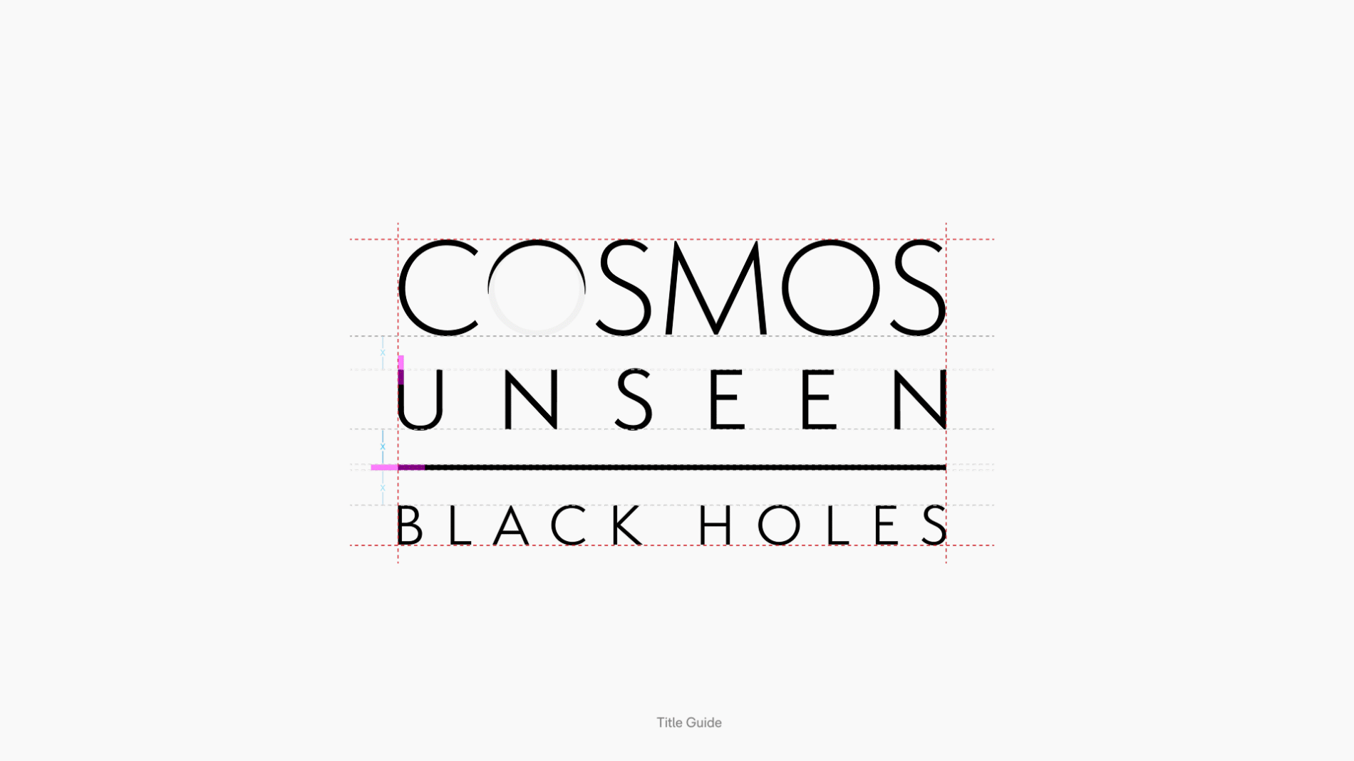
- Visual identity — translating an abstract subject (black holes, the fabric of spacetime) into a coherent, ownable visual language, including the 2D title lockup and chapter title system
- Design system — a scalable, component- and variable-driven system in Figma, built to be handed to developers
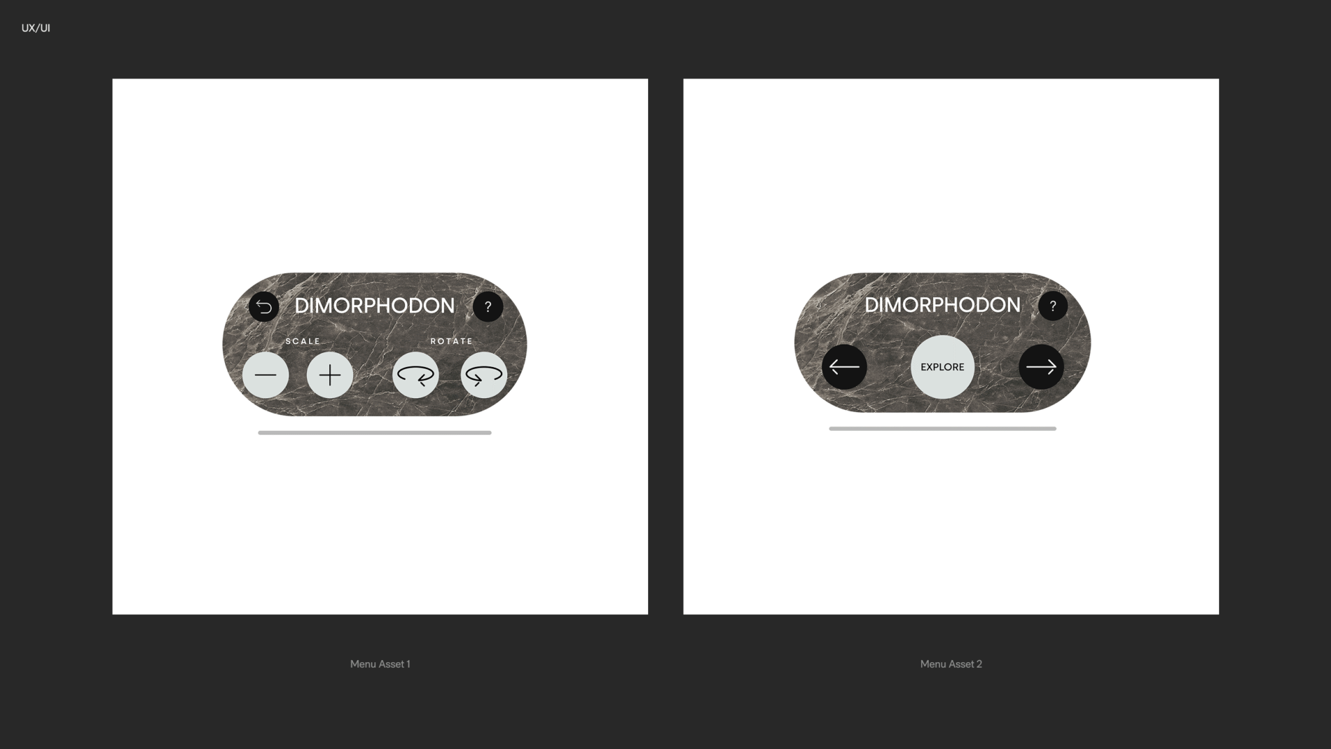
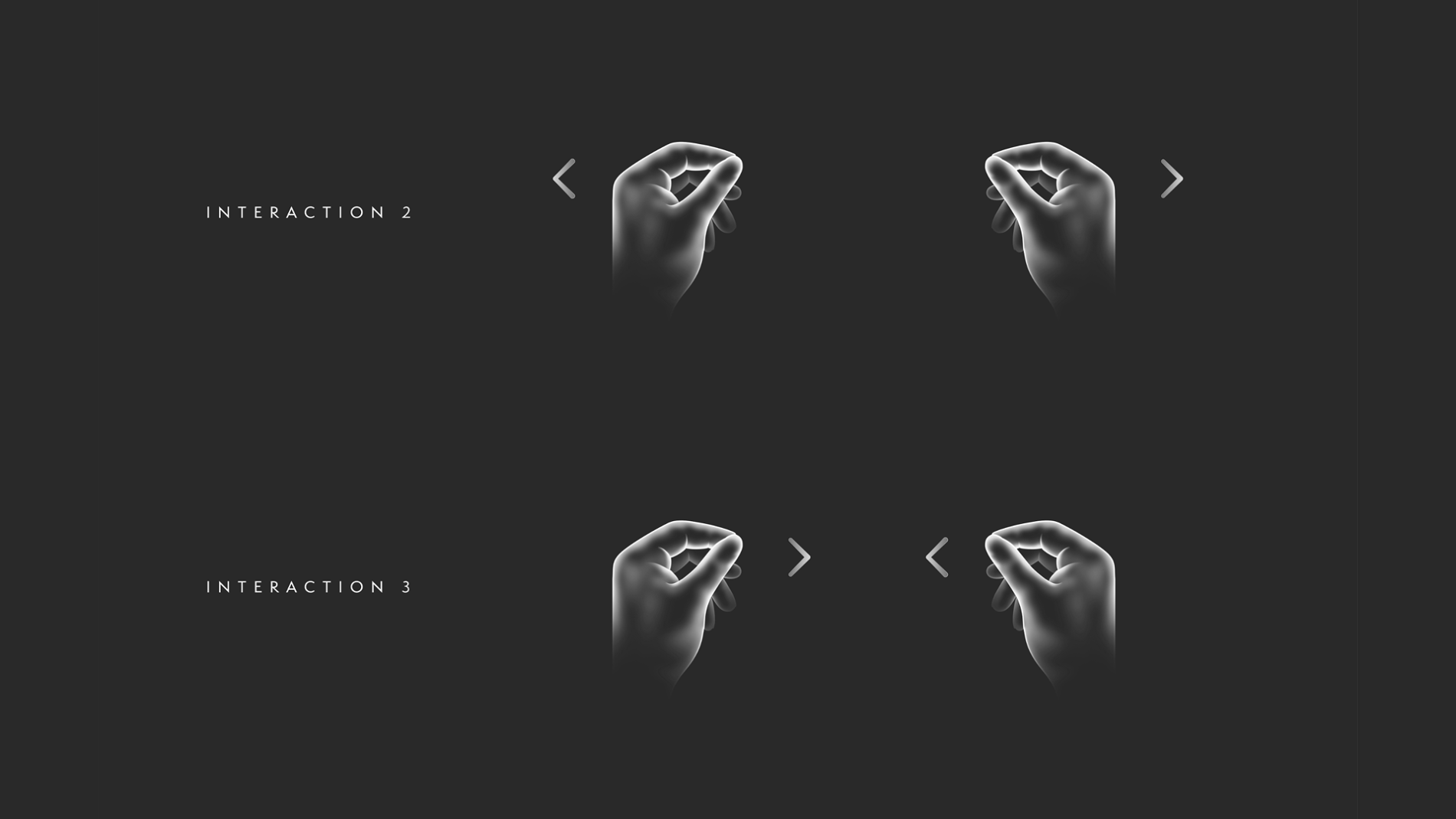
- UX/UI & interaction language — the interface and the gesture-guidance copy: main-menu and chapter navigation, hand-gesture cues, information placement, and the flow through the experience
- Marketing & social — poster asset delivery across multiple platforms and social content structures, all derived from the same identity
I collaborated with: Unity developers implementing the experience in-headset, and stakeholders across end-of-sprint reviews.
Discovery
A visual language for the invisible
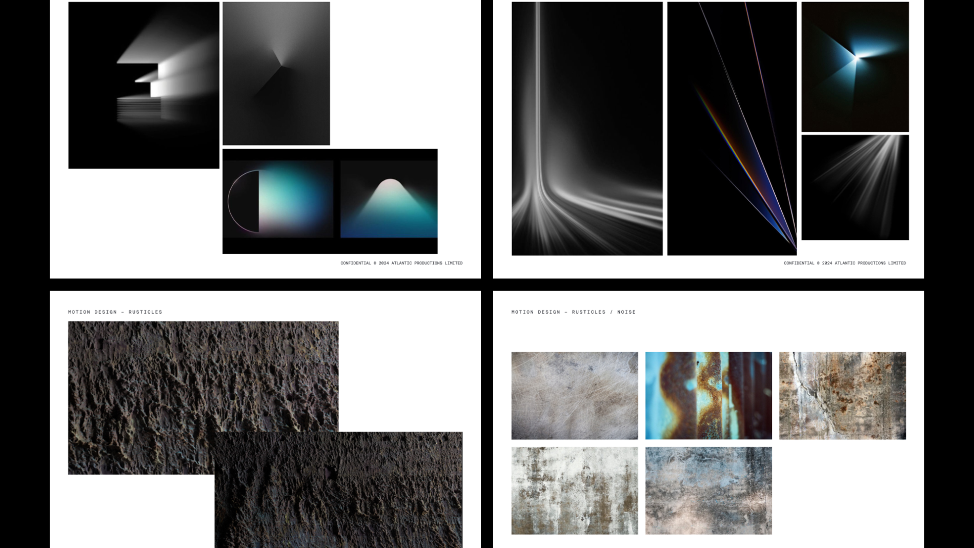
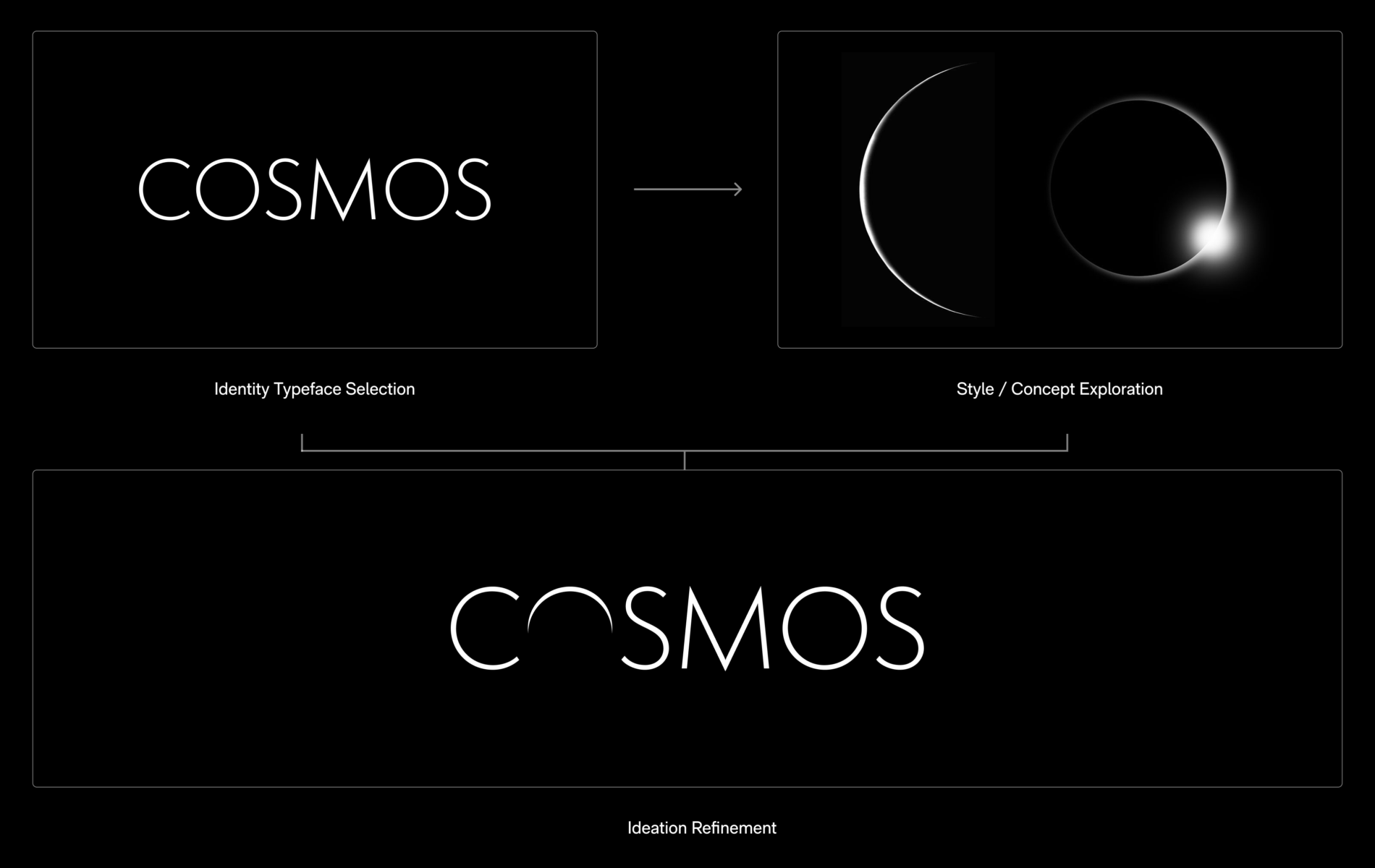
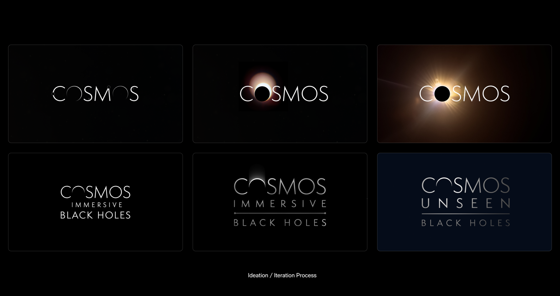
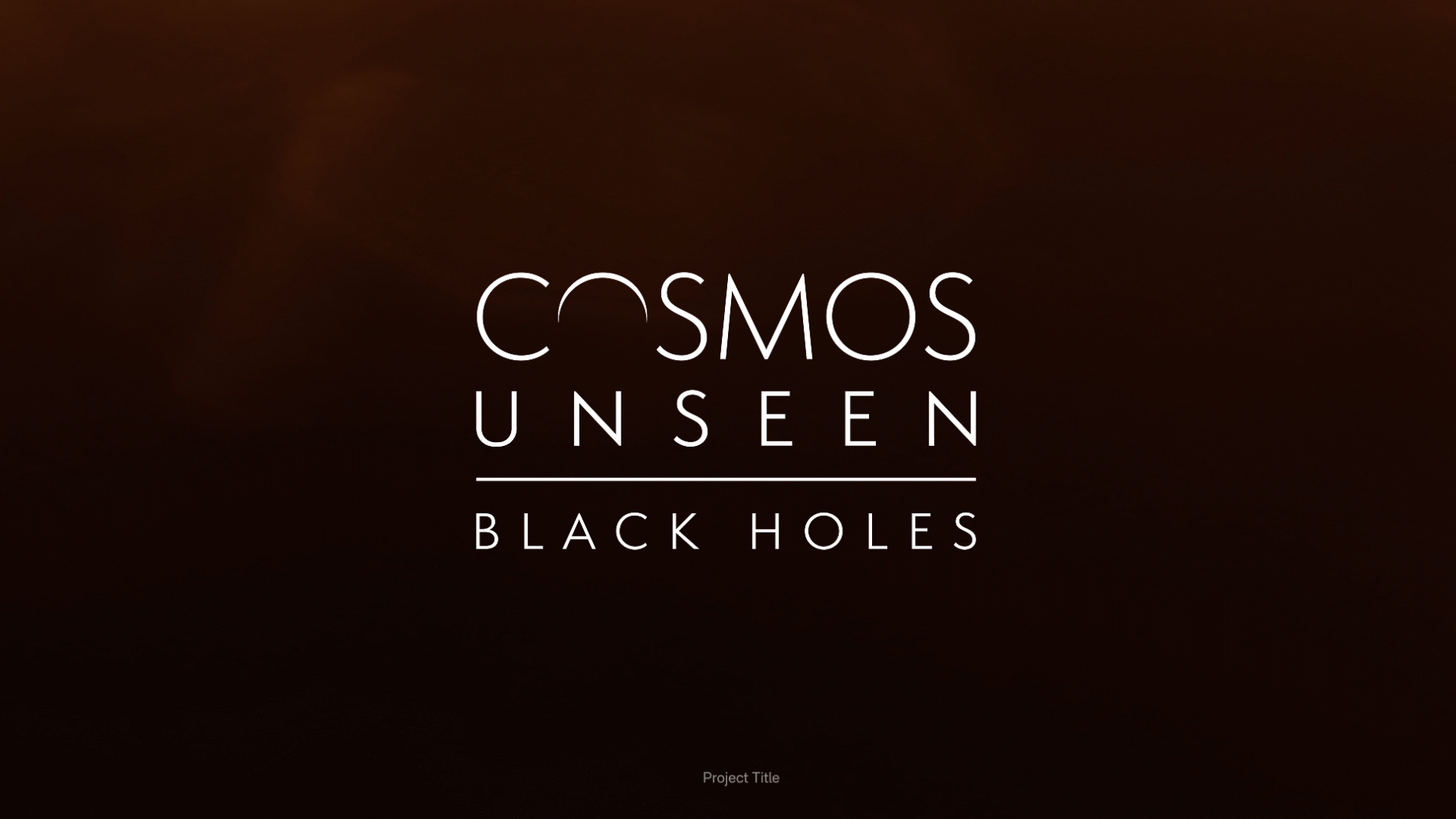
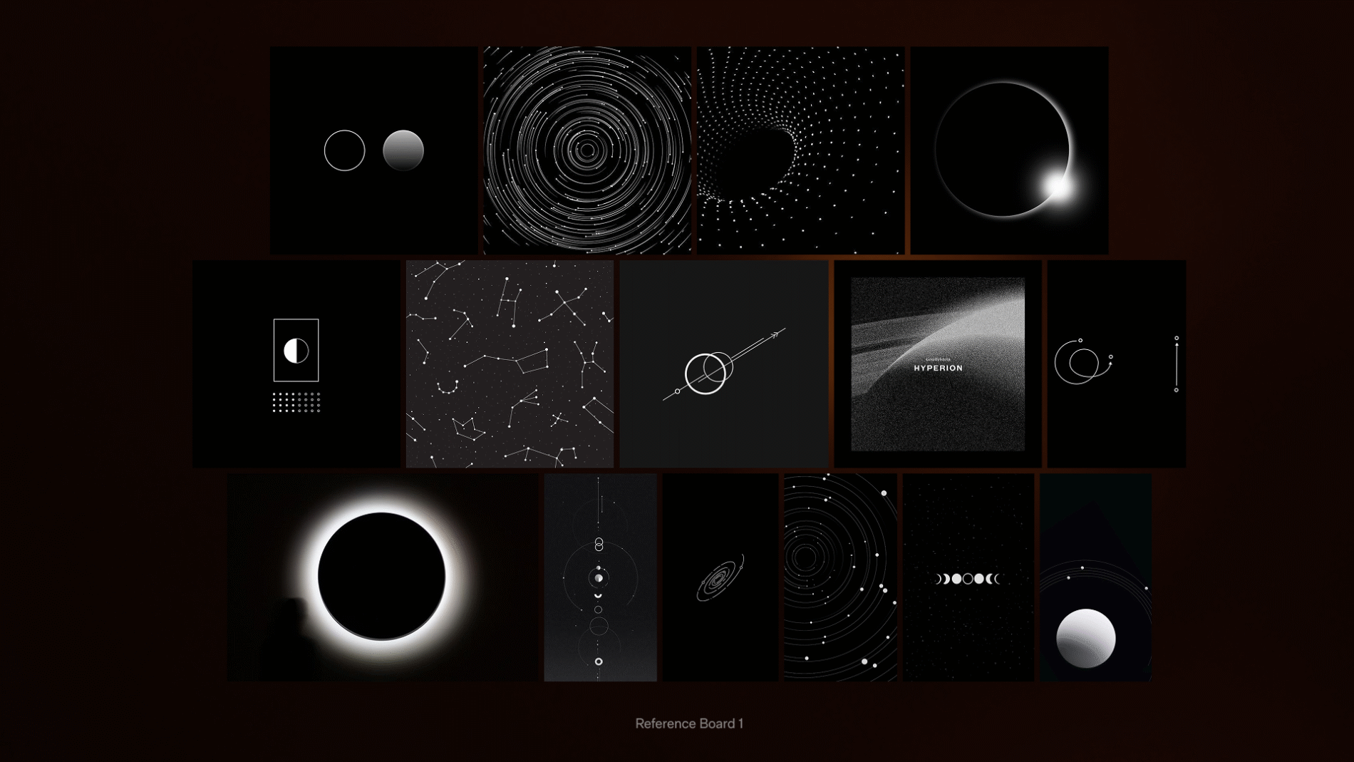
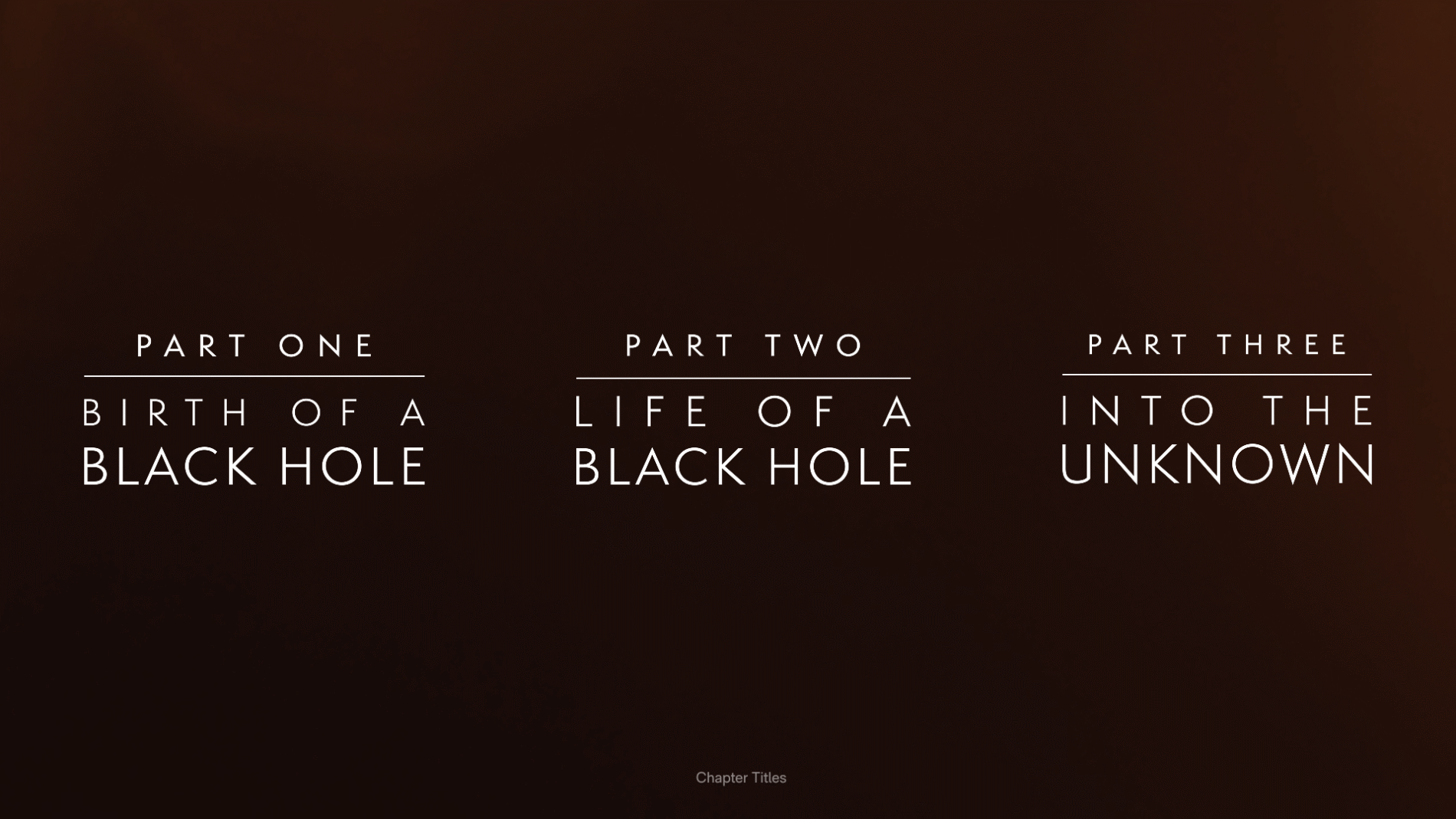
A black hole is, almost by definition, hard to picture. I built reference and mood boards — split into General, Identity and Intro Reference — exploring how cosmic phenomena form, and how light, gradient and motion could carry meaning. The way light bends around an eclipse, the way a starfield resolves into structure: these became the visual DNA tying the brand, the interface and the marketing together. From this, the identity resolved into a refined title lockup — Cosmos Unseen: Black Holes — and a three-part chapter structure: Birth of a Black Hole, Life of a Black Hole, and Into the Unknown.
Designing the marketing without the hardware
A real constraint shaped the marketing work: the Moohan headset was still under NDA, so the campaign couldn’t show the device. I ran dedicated exploration boards to solve this — Hand POV, Silhouette, Scale, Light Silhouette — working out how to convey an immersive headset experience through hands, light leaks, silhouette and a sense of cosmic scale, rather than the product itself. The discipline of selling the experience on atmosphere alone kept the identity focused on the cosmos, not the kit.
Grounded in real science
The experience was informed by serious astrophysics. Its scientific direction drew on work associated with institutions including the UCLA Galactic Center Group, the University of Sussex, and the Event Horizon Telescope collaboration, and the broader field shaped by researchers such as Sir Roger Penrose, Dr Priyamvada Natarajan and Dr Ziri Younsi. Working to an end-of-sprint cadence, the team confirmed and clarified tasks, secured sign-offs, and set responsibilities for the next sprint — keeping the creative work accountable to the underlying science.
From identity to system
The visual identity was never the end product — it was the foundation for a design system that had to survive translation into a headset and into developers’ hands.
A real, semantic system — not a sticker sheet.
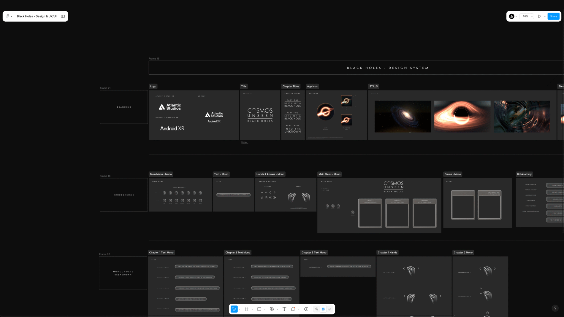
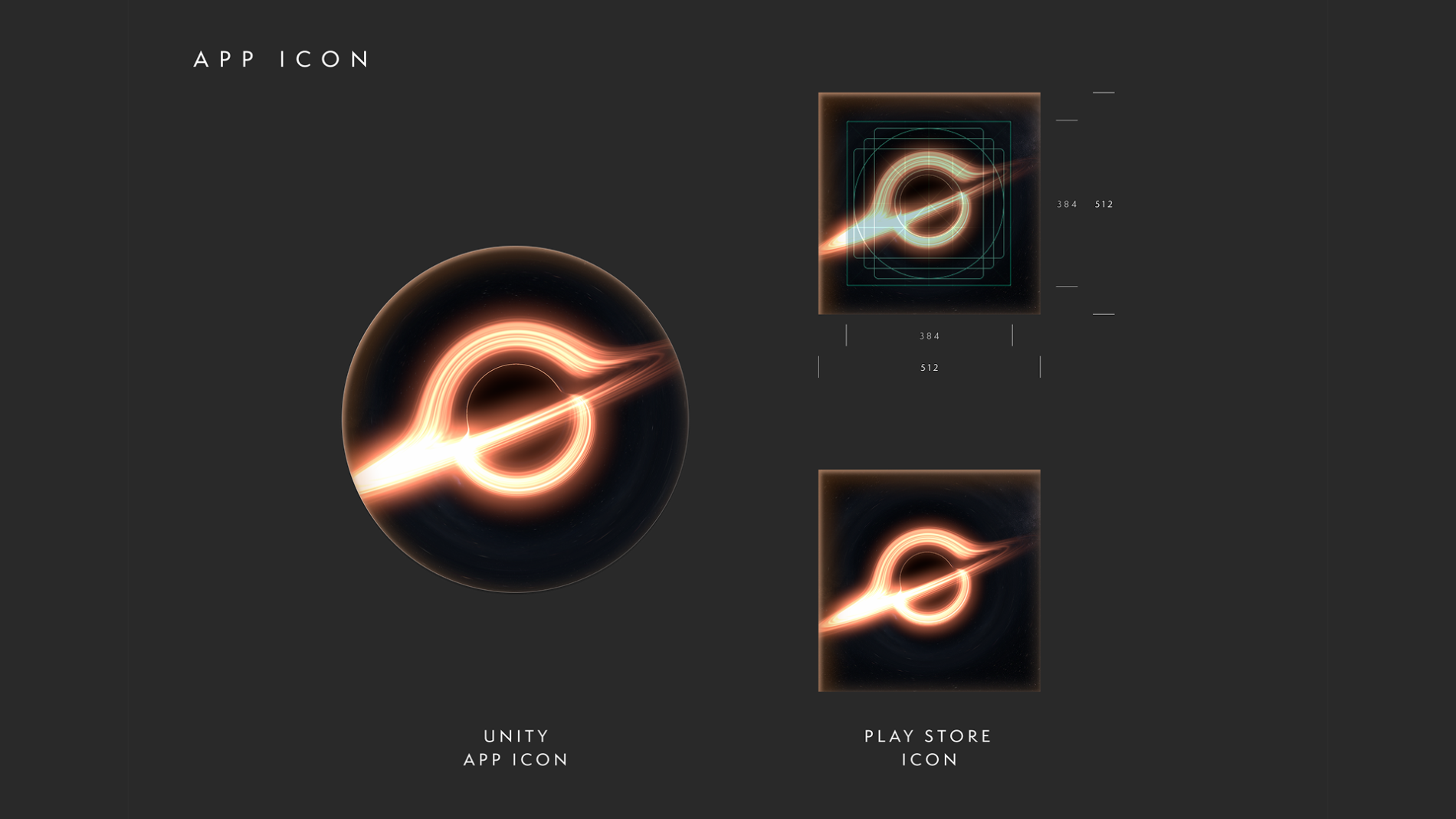
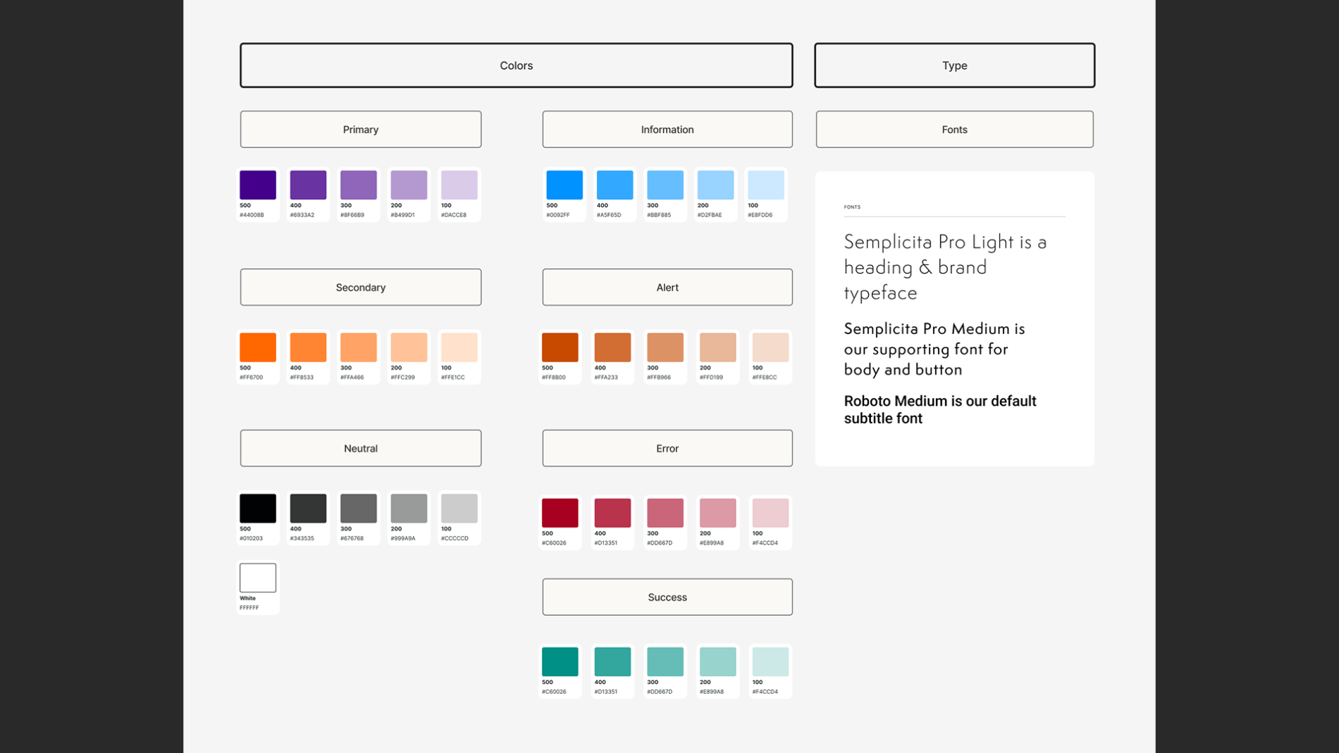
I built the system in Figma around named colour styles (Primary, Secondary, Neutral, plus a full status set — Information, Alert, Error, Success — and a dedicated Arrows style) and a reusable Glow effect that gave the interface its atmospheric depth consistently. The file was organised into clear pages — Design System, UI Styles, Ideation, User Instructions HUD, App Icon, Credits and a dedicated Export page — so the work was navigable for everyone touching it.
Components and states.
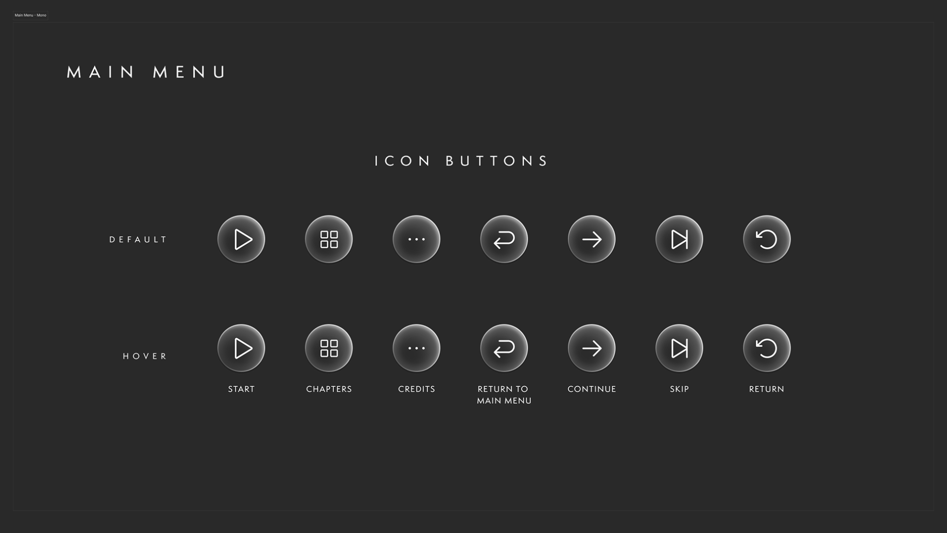
The icon system was built with Default and Hover states across the full set of controls — Start, Chapters, Credits, Continue, Skip, Return, and Return to Main Menu — using Figma components and variables so a single change to a main component cascaded to every instance. With a narrative that kept shifting and feedback arriving each sprint, this wasn’t a nicety; it was what made iteration survivable without the design fragmenting.
Built for handoff.
Developers were given direct access to the Figma file, with open communication on updates and file/folder locations in shared team channels, and a dedicated Export page so assets could be pulled at 1x, 2x and 4x in PNG or SVG and adapted to whatever the Unity build required. The system wasn’t a designer’s private reference — it was a working handoff tool.
Designing for the headset
Designing without a spec sheet.
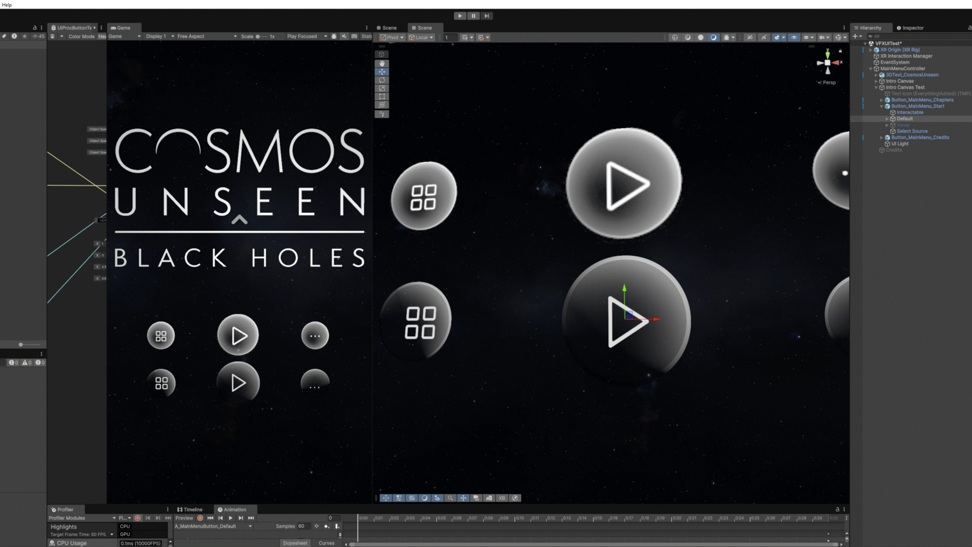
Normally you design to known technical specs — resolution, field of view, safe zones, input model. Here, much of that was unconfirmed. I adapted designs and export sizes in Figma to stay flexible, and built the system so it could flex as the platform clarified.
Diagnosing problems with no ground truth.
When something looked wrong in-headset, the hard question was whose fault is it? — the design, the export/implementation, or the headset itself. Without established conventions, isolating the cause took disciplined collaboration with the dev team rather than assumption.
Matching UI to voice-over narrative.
The interface didn’t stand alone — UI cues had to sync with the voice-over narrative, appearing and guiding at the exact right moment so story and interface moved as one.
Staying ready for a moving target.
To keep all of this shippable, I maintained clear “ready for dev” states, kept communication tight in team channels, and prototyped wherever possible to demonstrate how an effect or a stretch of the journey would actually feel — turning the unknown into something the team could see and sign off.
Outcome
Cosmos Unseen: Black Holes released on the Google Play Store for Android XR, and was showcased at SXSW London and the Goodwood Festival of Speed — putting a brand-new platform experience in front of public and industry audiences.
For me, the lasting value is the proof that a design system can be built to thrive under uncertainty: when the platform, the specs and even the narrative are all moving, a semantic, component-driven system and a disciplined dev handoff are what keep the work coherent and shippable.
What I’d carry forward: the experience reinforced how much spatial UI depends on timing and restraint — guiding attention in 360° is as much about what you choose not to show as what you do. With more platform maturity, I’d push further on formalising accessibility standards for gesture-based interaction, an area the whole category is still defining.
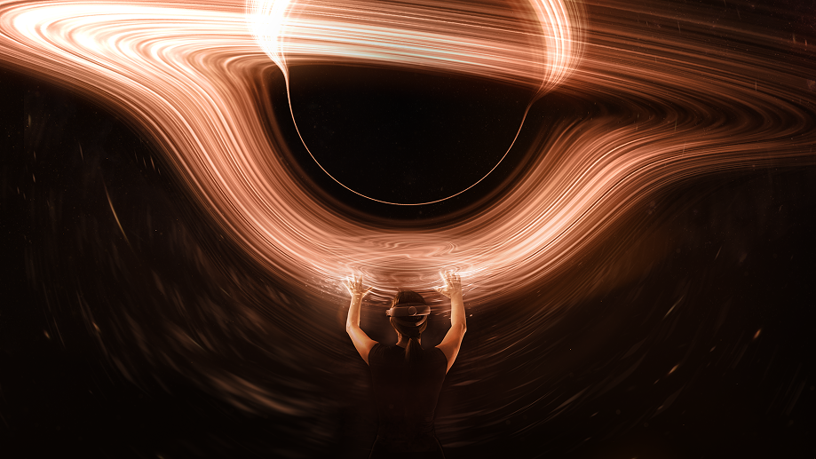
3840x2160_Untitled_Poster_CosmosUnseen_BlackHoles
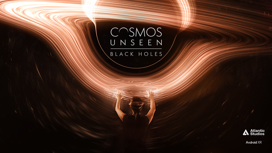
3840x2160_Titled_Poster_CosmosUnseen_BlackHoles

1920x1080_Poster_
CosmosUnseen_
BlackHoles
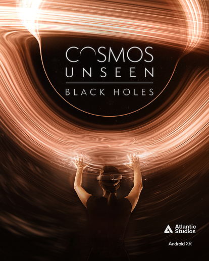
1350x1080_Poster_CosmosUnseen
_BlackHoles

2200x880_Poster_CosmosUnseen_BlackHoles
Credits
Credit
Atlantic Studios
Download
Services
Brand Identity
Graphic Design
UX/UI Design